Ali K. Brown’s Landing Page Shows You How To Boost Business with Your Own Ezine—and More
In business it’s location, location, location. And of course online, it’s your list, list, list. Back in the covered-wagon days of marketing when there was no Internet, the only way to communicate with your prospects or loyal customers was to contact them through mail, fax, phone or carrier pigeon.
Today, anyone with an online presence that has an in-demand product or service, (and if they know how to position themselves) can set up an ezine list of thirsty customers. Another way to grab market share is to grow rich within your niche.
And that’s what the very telegenic “Ezine Queen” herself, Alexandria K. Brown, has done. In consulting work I tell all my clients—regardless of the industry they’re in—to always get an ezine up and running with an effective name squeeze page attached.
The beauty of the ezine is that it’s probably one of the most cost effective marketing tools ever created. Just think: with the click of your mouse you can contact your customer in nano seconds with valuable information or a viable offer. And because they have opted in, you know you have an interested party as a subscriber.
[text_ad]
But how do you accomplish putting together a profit center, an ezine, when there’s so much competition? How do you navigate around the nuances of this particular type of marketing? Well Alexandria’s Boost Business With Your Own Ezine landing page shows you how to do that—and more, while at the same time “squeezing the name of the prospect” by giving them a FREE report.
- There’s no sense of urgency in the headline, but curiosity gets the job done.
- This copy presents a strong argument to keep reading all way to the last drop.
- Impressive array of testimonials, with photos of folks who vouch not only for Ali, but on the reliability of her program and how it changed their business.
- Yes, Ali has strategically placed the links to order buttons throughout the piece under the testimonials, BUT she did not make them stand out.
- This is an effective landing page. Ali impressively uses audio and some visuals to move the prospect to take action.
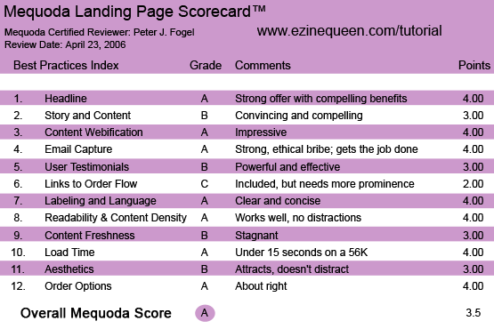
EzineQueen’s Boost Business With Your Own Ezine Landing Page Scorecard
1. Headline (Strategic Intent) – A
Coaches, Consultants, Speakers, Authors and Small Biz Owners:
No ambiguity here. You have a strong headline that announces exactly who this product is targeted to: Coaches, Consultants, Speakers, Authors and Small Biz Owners. It combines a strong benefit with just a touch of curiosity and “mystery.” There’s no mention of an ezine in the beginning. When the writer presents the idea of how a single email can get you the marketing results you need, you wonder what this is all about. There’s no sense of urgency in the headline, but curiosity gets the job done.
2. Story and Content – B
This landing page focuses more on the newbie who might never have heard of an ezine before, but it also hits the buttons of established Internet marketers who want to take their online marketing to a whole new level. So here you have strong copy that empowers the reader with the benefits of what they’ll get with an ezine, which include: instant credibility, the ability for you to command a greater fee, build a powerful fan base from people who will buy from you over and over again, and most of all, a convincing way for you to get into the hearts and minds and CHA-CHING the “wallets” of future clients.
The copy also raises obstacles you might encounter in wanting to have an ezine, and overcomes them with 14 reasons for having one. This copy presents a strong argument to keep reading all way to the last drop. Although I really never knew what business Alexandria is in, I believe she’s a copywriter. If I am correct, then I would’ve liked to have heard “her story” of how having an ezine catapulted her business to new heights.
3. Content Webfication – A
Strong use of an audio clip from the Queen herself asking you sign up for her ezine. You don’t even have a choice, you hear her soothing tones the minute the page loads onto your screen. Strong use of graphics of testimonials only.
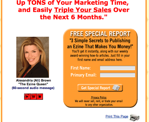
Strong use of an audio clip from the Queen herself asking you sign up for her ezine.
4. Email Capture – A
If the “Ezine Queen” can’t capture your name, then who can? Going back to Webfication, Ali (as she is like to be called), sets up the name squeeze form right at the top of the landing page. The Queen wants to get your email address NOW, and offers you a bribe, even before you read the letter. And she instructs you on how to do it immediately, walking you through the process. Well done.
5. User Testimonials – B
Impressive array of testimonials, with photos of folks who vouch not only for Ali, but on the reliability of her program and how it changed their business. Good move. Here’s what I would’ve like to have seen in these testimonials. You see, some of the testimonials, at least to me were a bit interchangeable. I did like the specific increase in business that some of the testimonials used in regards to using Ali’s program.
I would’ve preferred to have heard how a specific technique achieved the response it did. Or perhaps from an incredulous business owner who didn’t think that an ezine would improve their businesses bottom line, but after using Ali’s program, became a true believer.
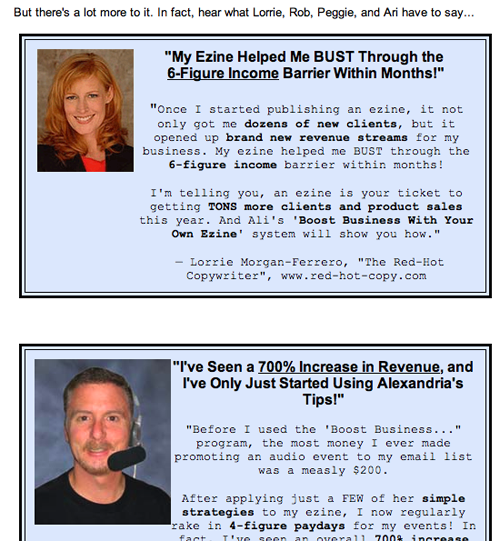
Impressive array of testimonials, with photos of folks who vouch not only for Ali, but on the reliability of her program and how it changed their business.
6. Links to Order Flow – C
Every good online marketer knows that you have to have as many links as you can throughout your copy so as to “prod” the prospect to action. Yes, Ali has strategically placed the links to order buttons throughout the piece under the testimonials, BUT she did not make them stand out. If there’s someone who’s read enough copy and has made a decision to buy, you want them to order now, and make it easy for them to do it. In this regard you want to have as many “CLICK HERE” to order buttond that are as BOLD as possible that grab the prospect’s attention NOW! On this landing site, they’re barely noticeable.
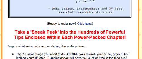
Yes, Ali has strategically placed the links to order buttons throughout the piece under the testimonials, BUT she did not make them stand out.
7. Labeling and Language – A
Clear, easy to understand, lots of benefits. Ali knows how to hit the prospect’s hot buttons.
8. Readability and Content Density – A
Very clean and pleasing to the eye that focuses on the benefits of the reader. This also reads as a long, #10 direct response letter.
9. Content Freshness – B
In fairness to the Ezine Queen it’s a little tough to comment on content freshness because this is a point-of-purchase website. The writer might tweak for better response, but if they are getting a decent response they might leave it alone. There is not much urgency, though. I would’ve liked to have seen more evidence of that. Perhaps mentioning limited amount of copies or how your competition will thrive because they use an ezine, and you won’t.
10. Load Time – A
Under 15 seconds.
11. Aesthetics – B
This landing page is simple in design. Other than using photos and different colors in the testimonials, it uses graphics sparingly. I would’ve tested using some other graphics to see if it improved response.
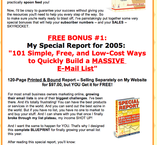
Other than using photos and different colors in the testimonials, it uses graphics sparingly. I would’ve tested using some other graphics to see if it improved response.
12. Order Options – A
Has the usual “bells and whistles” ordering options: secure website ordering, PayPal and a toll-free number.
Conclusion
I’d say this is an effective landing page. Ali impressively uses audio and some visuals to move the prospect to take action. There are tons of Internet marketing programs out there on “how to make money on the Internet”—but not many as far as I can see that focus primarily on the persuasive power of the ezine.


Very nice article!