“What’s not to like about an email newsletter that covers all aspects of wine enjoyment?” the reviewer asks herself as she sips a find Cotes du Rhone Rose. Okay, well maybe not so fine. But it sure does taste good on a quiet Friday evening when you’re writing on deadline instead of dining out with friends. But I digress…
Sips & Tips, a free weekly email newsletter from Wine Spectator magazine, has become one of my favorite things. It’s a small but mighty 2 pages that often includes:
- a brief wine review
- Dining or travel tips, with a link to a recipe or to an article about a fine-dining destination
- a video on a related topic (an interview with a wine maker, a tutorial on reading champagne labels, etc.) which you can view online
And the pictures! Intriguing wine labels, luscious-looking food and always an engaging image from the video. Not too big, not too small, but just right to support the printed text, which has a lovely voice.
There’s a lot here to please the senses, including:
- The subject line, which gives you just enough information to grab your interest
- The look, which is very rich and engaging
- The content, which has a friendly flair, not at all stuffy
But there are a few things that aren’t quite up to snuff:
- It’s so friendly and personable that not having a person associated with it seems odd
- A link to view the email online would be a good back-up for when images are blocked
- The footer should have a U.S. Postal Service address (why are they hiding from their readers?)
Bottom Line: A great experience for the reader, once which would be even better with just a little more effort on Wine Spectator’s part.
Delivery – B
Sips and Tips is almost perfect with regard to delivery practices. They send on a set schedule (every Tuesday), it makes it to my inbox and they ask readers to white list them. The only question I have is with their timing – right around midnight. Most of the traffic that time of night is spam; this email newsletter is hanging out in the inbox with the wrong crowd. Shifting the send to a less-spam-filled time would minimize the possibility of the newsletter being mistakenly deleted in the morning along with its companions.
From Line – B
Another great job here (Figure 1) – I would have liked to see the Wine Spectator brand featured more prominently (right now it’s just in the domain piece of the actual from address). But at least the “Sips and Tips” from line is used consistently (although I wish they wouldn’t repeat it in the subject line, not the best used of precious space).
Figure 1: From and Subject Line

Subject Line – A
The Wine Spectator newsletter scored well here – like a fine Bordeaux. The subject line changes (except for the Sips & Tips moniker) each issue. It’s engaging and they put the most interesting information (which usually includes a number) first. Also, it doesn’t sound at all spammy.
[text_ad]
Preview Pane – C
The preview’s pretty good with images enabled (Figure 2). But it quickly gets “corked” when images are blocked (Figure 3), and there’s no link to view the email online. They’d do well to give readers the option to click-through to a Web-based version and to incorporate some rich text in place of images at the top.
Figure 2: Preview Pane

Figure 3: Preview Pane with Images Blocked

[text_ad]
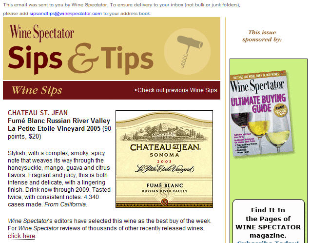
First Screen – D+
Everything else is so right just a little more time spent in a few areas, including this one, could catapult this email newsletter into solid B+ range. What’s lacking? The biggest thing here is a real person’s byline or signature. The personable voice is great but it’s currently disembodied. Due to the brevity of this email, partial credit was given for the opening paragraph and table of contents with links. While the newsletter would be better with these things, not having them isn’t such an issue when the content is just 2 pages long (printed out).
Figure 4: First Screen

Look and Feel – A
Four stars here for Wine Spectator (Figure 4). The newsletter is beautiful – images are used just the right amount and support the editorial content. It’s consistent with Wine Spectator Website and easy to skim, with lots of white space. Bravo!
Content and Tools of Engagement – A
The editorial content is superb. There’s no question that readers, even those who aren’t paying subscribers, get value. There are links to free online tools (like the Wine Spectator reviews database) as well as articles and videos. At 64% editorial, 27% promotional, 9% housekeeping, it follows the 60/40 rule very well.
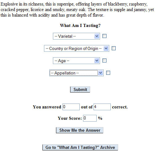
My favorite engagement tool, of all those I’ve encountered, is here – it’s the “What am I Tasting” challenge (Figure 5). Wine Spectator provides a “tasting note,” basically a description of what you would taste if you were sipping a wine. You are then challenged to guess “What you’re tasting” from a list of multiple choice answers.
The screenshot is from the Website; the link to it should be more prominent in the email newsletter – this has real viral possibilities for their target audience. It would be even better if you could challenge folks you know to a friendly competition.
Figure 5: “What Am I Tasting” Engagement Tool

Business Goals – A
- Earning another perfect score, Wine Spectator uses a variety of soft-sales opportunities in the email newsletter:
- A larger banner ad in the right column consistently promoted their recently redesigned hotel search database A “sponsored by” spot below the first article provided a second and more subdued pitch for the hotel/travel guide
- The bottom of the newsletter contained a standard current members login / join now call to action
- The right column below the ad was used to offer print and online subscriptions and ancillary products
Footer – C
The unsubscribe mechanisms, including a subscription management page, are all in place. What’s missing is a U.S. Postal Address (why are they hiding) and a copyright notice (why don’t they want to protect their content?). Small items, but easily fixed.
Other – B
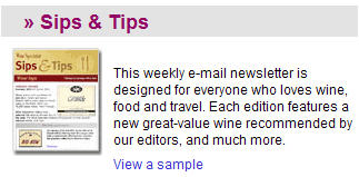
Sips & Tips delivers what it promises. In addition to a great description (Figure 6) there’s a nice image of the newsletter and a link to view a sample on the page promoting it. The weekly delivery schedule is a good balance and they do encourage readers to share the newsletter with a friend, which is an inexpensive way to boost list growth. It would be nice, though, if they closed the loop by including a link for those who receive the newsletter from a friend to opt-in for their own copy.
Figure 6: Email Newsletter Description

Conclusion – B
So close and yet so far. Wine Spectator’s Sips & Tips is a very good read which would be made excellent by adding just a few additional elements.


Great review of a newsletter, gave me a much better idea of how to use newsletter effectively for marketing..