Cameron Diaz, Tobey Maguire, Julia Roberts, Adam Sandler, Kate Winslet. If you are a consumer you read about these and other movie stars in People Magazine. But if you’re an industry insider (or just want to pretend that you are), you get the latest on them from the bible of the entertainment industry: Variety. And if you don’t want to pay for this information, you sign-up to receive Variety’s free daily email newsletter, Variety Headline News.
Full disclosure: Back in 2001, I developed and implemented an email strategy for Variety. I revamped their one existing email newsletter (an ancestor of today’s Headline News) and developed more than a half dozen other email titles for them. Their email program has gone through many changes since then, which makes it easy to review the current Headline News with an objective eye.
The sign-up for this email newsletter appears in Figure 1. The grammar could be better but you get the idea. Variety “builds” each day’s issue specifically for each reader, pulling in content dynamically based on the topic(s) chosen. If I check “News Headlines” and all the other boxes, I get top stories, hot topic and media jobs along with content from each of these topic areas. A reader who was only interested in “News Headlines” and “Legit” (Variety’s term for live theater) would get the same top stories, hot topic and media jobs plus the “Legit” content.
Figure 1: Sign-up

I reviewed a week’s worth of Variety Headline News (5 issues, including all topic areas) spanning from March 19th to the 23rd. “Breaking Top Headline” email alerts are also part of the News Headlines subscription; while none were delivered during this timeframe I reviewed a few that had been sent earlier in the month.
Variety Headline News turned in Academy Award-worthy performances in the areas of:
- Their footer, which hit all the marks for what should be there
- The from line, which is great except for one little glitch
- Their consistent send schedule and fulfillment of the content promises made at sign-up
But they should receive Razzie nominations for:
- Their first screen, which doesn’t include a table of contents, engaging opening paragraph or any sign of human involvement
- The preview pane doesn’t pull the reader in
- Their efforts to ensure deliverability, where they neglect to make a white list request
1. Delivery—C
First the good news: Variety Headline News was consistently delivered to my inbox during this period. It appeared on a regular schedule each morning. Now the not-so-good: when I say morning, I mean between 1:00 AM and 2:00 AM eastern time (10:00 PM to 11:00 PM on the left coast). I imagine that Variety wants to be there to greet their industry folks when they arrive in their office, but sending in the middle of the night puts them in the midst of some unsavory company (read: spam). I’d try a send time closer to office hours, based on the make-up of their list. If it’s primarily west coast folks, then 10:00 AM eastern (7:00 AM pacific); if a majority of the list is east coast, then closer to 8:00 AM eastern. Another missing item: a white list request. Getting through spam filters isn’t getting any easier and asking people to add your from address to their address book can help get you past desktop filters and into the inbox.
2. From Line—B+
All in all, Variety is doing a fine job on their from lines (Figure 2).Both the display and actual from lines feature the Variety brand prominently. This brand correctly identifies the sender and should be quickly recognized by the recipients. The only glitch: the breaking news alerts have a different actual from address than the daily newsletter (Figure 3), which means that readers need to white list both to ensure they get all the emails their subscription entitles them to. I would suggest to Variety that they use the same actual from address for both, while they maintain different display return addresses (to tell readers which email title they are receiving).
Figure 2: Headline News From and Subject Lines

Figure 3: Variety Breaking News From and Subject Lines

3. Subject Line—B
Variety succeeds in creating unique, engaging subject lines for each issue which do not sound like spam. But…they aren’t making the best use of the first 25 or so characters, their prime subject line real estate (Figure 1). By repeating the brand name (“Variety”) and the newsletter title (“Headline News”), both of which appear in the from line, they are pushing the unique part of the subject line to the end, where truncation may impede its being seen.
I’d recommend that Variety run some tests to identify the most effective way to utilize their from and subject line real estate to maximize open rates. Iterations I’d try include:
- From line “Variety Headline News,” without “[Variety] Headline News:” in the subject line
- From line: “Variety” with “Headline News:” in the subject line
- From line: “Variety” or “Variety Headline News” in the from line with “[VHN]” for Variety Headline News at the front of the subject line
4. Preview Pane—D
Variety does include their logo in the preview pane (Figure 4), but there’s not much else here to engage readers. We see a top navigation bar, an oddly out-of-place salutation (“Dear jj,”) and the op of a third-party ad. They’d do better to lose the navigation and then banner ad and put their fabulous content up to pull people in.
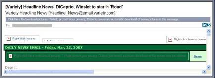
Other things to try: adding a “top headline” to pull in readers and including a link so that subscribers can read the newsletter online if there are any rendering issues. Speaking of which, with images blocked all you see in the preview pane is the newsletter title, date and salutation, nothing more (Figure 5). I gave Variety no point for this; pulling up the content so a headline or something else unique to the issue was visible would earn them full credit.
One more note: This email newsletter is both fixed-width and full width, meaning that if you view it anything less than full screen you have dual scroll bars, on the right and the bottom. This is a flawed design as people move toward reading email in the preview pane; it requires them to scroll back and forth, as well as up and down, to read the email. Variety should consider going variable width or going to a narrower fixed width.
Figure 4: Preview Pane
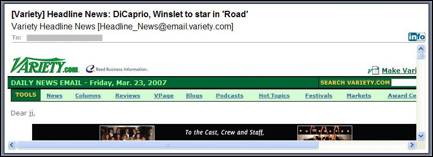
Figure 5: Preview Pane with Images Blocked
[text_ad]
5. First Screen—F
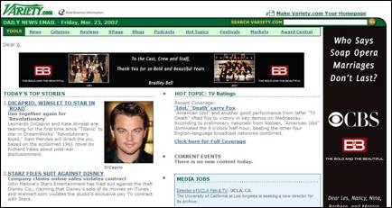
Variety’s first screen bombed with this critic (Figure 6). The newsletter lacks an opening paragraph, which would give the salutation purpose and provide the reader a taste of the contents, as well as a reason to stop now and read. It would also be nice if the newsletter appeared to come from a person or a group of people; just because an email newsletter is automatically generated based on content rules doesn’t mean it can’t look like there are people behind it.
Also missing: a bookmarked table of contents, which would take readers directly to stories of interest would be really helpful. There’s so much information here – 32 story blurbs plus hot topic and media jobs if you check all topic areas – that there’s a lot to sift through to find what you want.
Figure 6: First Screen
6. Look and Feel—B
Headline News is clearly part of the Variety family; its designs mirrors key elements of Variety.com nicely. The content, while long, is easily skimmed, since most of the blurbs are just a few lines. All that said, it’s overall look and feel is a little bit…awkward.
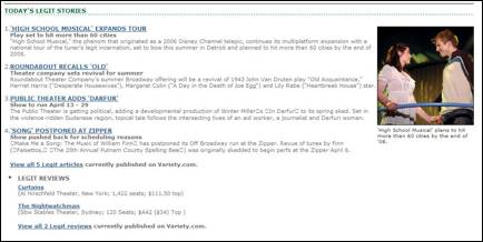
The first part of the email is full of banner ads, two vertical and one horizontal; the single editorial image (often a picture of Leonardo DiCaprio, Angelina Jolie, Tom Cruise or some other Hollywood royalty) doesn’t balance it out and often gets missed. There are three columns here (one of them for the horizontal banner), which is busy and look cramped. When the newsletter moves on to provide topic-specific content it goes to a single column with an image on the right (Figure 7), which is also hard to read since the lines are so wide.
All in all, it’s not bad but also not good, garnering a half point each for engaging design and use of images.
Figure 7: Single Column Topic Content
7. Content and Tools of Engagement—B
The newsletter has great content and is engagingly written; it does follow the 60/40 rule. In fact, it adheres to it rigorously, providing an overwhelming amount of free editorial content with a minimum of advertising. All of the ads appear in the first section that all readers see; after that it’s almost advertising free (except for some text ads above the footer). I wish they had spaced it out a bit, since you have to scroll past the ad-heavy beginning to get to the green fields of pure editorial.
There are some really interesting and engaging things on Variety.com – it’s a shame none of them are incorporated into the email newsletter. The ones that struck me most were “Pushy Question” and “Ask the Editors,” where Variety editors and readers share ideas. Adding this type of content to the email newsletter – and encouraging readers to “weigh in” — would give it a little more life and motivate subscribers to interact.
On length, Headline News is pushing the envelope. My issues, which are the longest that would be sent since they include all the topics, were a full 3 pages with the footer continuing on to a fourth page. We’re talking about more than 35 items each issue. It’s great they squeezed them all in (the full width helps with that), but it’s almost information overload.
I’d recommend looking at breaking these into separate email newsletters, one for each topic. That would shorten the length and allow for more advertising spaces in more targeted venues.
8. Business Goals—C
Historically, Variety has been a print publisher and supplier of paid content on the Internet – an annual subscription to Variety.com is currently priced at $165. But none of this information appears in the newsletter; I had to visit the Website to get it.
Another thing that never appears in the newsletter: a call to action to buy. When I create free email newsletters for paid sites I’ll often include links to some “subscriber-only” content and then provide a “sorry, subscribers only, but you can join for just $XXX” message when someone who isn’t a subscriber clicks through. But in all the links I clicked on, both in the email newsletter and on the Website, I never saw a message like this. Instead I landed…at a page with the full text of the content I wanted to read, for free.
Maybe this was just a fluke, maybe I was somehow granted a free subscription (but I doubt it). Or maybe Variety is changing its business model. Unknown. But I can say this: the newsletter, right now, does not appear to be an effective tool for selling subscriptions to either Variety or Variety.com. There’s no reason for anyone to buy what they get for free.
There is another revenue play here: advertising. This may be generating some cash for Variety, but it is intruding on the first part of their newsletter and should be more evenly spread across the entire issue.
On a positive note: the content of this email newsletter is fabulous and accurately represents the quality and tone of Variety. And since the calls to action are, except for the ads, non-existent, they don’t have a chance to be pushy.
9. Footer—A
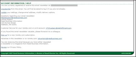
Perfect (Figure 8). The footer has everything that should be here. An unsubscribe link, a way to manage your subscriptions and personal information online, a United States postal address and a copyright notice.
Figure 8: Footer
10. Other—B+
Variety Headline News fulfills the expectations set at sign-up – and then some. When I looked at all I got and I looked back at the description, I felt they had under promised and over delivered. Not a bad thing, but I wonder if a more enthusiastic description that more accurately reflected what you get would boost sign-ups.
They send the email newsletter on a regular schedule and there’s a link for people who receive the email from a friend to sign-up for their own copy. There’s also a forward-to-a-friend message, suggesting that readers share the email newsletter with others. Here Variety received only half credit, as it was buried in the footer (Figure 8), not someplace most people look unless they want to unsubscribe or complain.
Conclusion
Variety Headline News has excellent content, but the format is a bit clunky and the business goals seem to be in flux. If its goal is to sell paid subscriptions, it’s not likely to accomplish that. If it’s ad revenue the publishing company is after, they should consider moving away from dynamic content and publishing a newsletter on each topic area, which would mean more ad spaces overall and more targeted spaces, for which they could charge advertisers a premium.


