For most publishers, trying to find the right balance of free vs. paid content is difficult. Give too much away and readers won’t be willing to pay for what’s left. Keep it all behind a subscription wall and readers don’t have enough information to know if it’s content they want or need.
The Wall Street Journal’s Media and Marketing Edition free email newsletter uses a very traditional model to sell subscriptions. It’s one of the best executions of this model that I’ve ever seen. And they seem to have found the perfect balance, at least for their publication, between free and paid content.
But it’s not a completely rosy picture. The substance of the email is great, but it’s lacking in style. The primary problem is that it’s only available in plain text format – there’s no HTML version. Another issue: while a personal touch is alluded to in the from line, they don’t follow-through on this expectation in the email itself.
There are some things that are exceptional about this email newsletter:
- The From Line effectively leverages the WSJ brand to get the open
- It includes some of the most valuable content I’ve ever seen
- This is an excellent implementation of a traditional subscription sales strategy
But there are also areas begging for improvement:
- The first screen is missing key elements that would engage readers
- The text-only format leaves the email looking flat and doesn’t adequately support the quality content
- The subject line has some good elements, but they are likely missed because of truncation
Bottom Line:
This is a great read and a good sales tool, but a little more attention to detail and presentation of the high quality content would go a long way toward improving the reader’s experience and, most likely, boosting subscription revenues.
1. Delivery—C+
The Media and Marketing email newsletter appeared in my inbox between 11:56 AM and 12:12 eastern time each day, perfect timing to reach business people during their work day.
But…two of the five issues I reviewed were labeled as spam – the other three, inexplicably, were not. I never did figure out what triggered the spam filter, but the fact that they did cost the WSJ .5 points in this category. One thing that would help – and which would have earned them an additional full point – is a white list request. There’s not one in sight, but it would help the email get past spam filters unscathed.
2. From Line—A
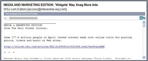
Your brand is how people recognize you. The WSJ does a great job of leveraging theirs in the from line (Figure 1). It appears in the display and actual from lines consistently from send to send.
Figure 1: From and Subject Lines

3. Subject Line—C
We go from a great from line to an average subject line (Figure 1). Actually, half the subject line is great – but it’s the last half, the part that’s most likely to be hidden from readers due to truncation. igure 1). It appears in the display and actual from lines consistently from send to send.
The last half is engaging. It’s unique to each issue and makes you want to open the email and read it. Some examples from the week I reviewed:
- GE, Microsoft Discussed Buying Dow Jones
- News Corp. To Get Revised Dow Jones Proposals
- ‘Widgets” May Snag More Ads
- Liberty, EchoStar Set Intelsat Bid
- Is iPhone AT&T’s Magic Bullet?
The use of big company names is key, as is the focus on topics of current interest.
The first half of the subject line is the same from issue-to-issue and seeks to differentiate this email newsletter title from their others. A worthy endeavor, but one better handled with an abbreviation in the subject line or as an addition to the from line. I’d recommend WSJ either:
- Shorten “MEDIA AND MARKETING EDITION:” to “[Mktg]” or something similar, or
- Change the from line to read “WSJ Media and Marketing Edition”
And the all caps? It should go. It’s so 1995, not to mention it’s shouting at the recipient.
4. Preview Pane—B
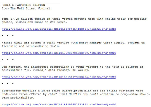
The Media and Marketing Edition earned high points for the preview pane, but something was still missing: a link to view the mail online. This is a text-only email, meaning they don’t have to worry about images being blocked, but they may face links not being live, which a link to view the email online would overcome.
What is here: a good restatement of the brand and a title to confirm which email newsletter title this is. Since there are no images to block it easily passed the “engages readers even if images are blocked” criteria. But while the WSJ gains a point for that here, they’re going to lose more than that in the next category when we talk about the first screen. Sometimes playing it safe isn’t the optimal strategy.
Figure 2: Preview Pane

5. First Screen—F
I can’t believe I’m giving the Wall Street Journal – a paper I respect and enjoy reading, online and offline – an F. But here it is. It’s not so much that the first screen (Figure 3) is bad, it’s just that it’s full of wasted opportunities.
Where’s the table of contents to let me know there’s an article here about Cusp, the Neiman Marcus-backed store that just opened in my neighborhood? Or that there’s coverage of the Soprano’s final episode, which I watched with my Uncle Bill, who’s a huge fan (maybe I would have forwarded the article to him). And don’t even get me started on the article that talks about trademarks, Germany and beer, three of my husband’s favorite things in the world.
I’ve no way to know from the preview pane or the first screen that these items are here. I have to scroll. And I hate to admit it, but…I don’t scroll without a good reason. And my experience is that most people are the same way.
Figure 3: First Screen

[text_ad]
Also missing here – any sign of human intervention. No opening paragraph providing me a highlight of the news to come, no personal name to feel like someone put some effort into this content. The WSJ alludes to it in the from line (“WSJ.com Editors”) but they don’t follow through in the email itself.
6. Look and Feel—D
It’s not an F, but it’s still a lower grade than I’d like one of my favorite publications to earn. Four letters – HTML – would make a huge difference.
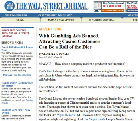
While the current email is easy to skim, that’s all it’s got going for it in this category. It doesn’t draw readers in by being engaging to the eye. It doesn’t look like the WSJ website (Figure 4), not a bit. And the most responsible and judicious way to use an image would be to include the WSJ logo, which is no where to be found in the email.
Figure 4: WSJ Website (Partial)

Every once in a while I still run into people who are anti-HTML. But used sparingly, for limited images, columns, bold, fonts and color, it’s head and shoulders above text for presenting information. Imagine a WSJ email newsletter with a logo, layout and type face that matches the website – it would be engaging and readable and an improved experience over the current plain text version.
7. Content and Tools of Engagement—A
Finally, an A. The WSJ Media and Marketing email has some of the very best content I’ve seen in a free email. The blurbs that describe each story are more than just headlines – they provide you the gist of the story, or at least get you interested enough to click-through for more. This is something many publishers have trouble with, but the WSJ has it figured out.
The emails are short enough to read online (3 printed pages or less) and they include links to blogs and forums which engage readers and make them part of the discussion.
The Wall Street Journal blows away the 60/40 editorial-to-advertising rule. They’re averaging 79% editorial, 9% third-party advertising and 12% housekeeping/customer service information. Their business model allows them to provide all this editorial because while it is non-promotional, in the end it’s there to drive a sale. More on that in the next section.
8. Business Goals—A
The Wall Street Journal’s business goals are very clear: to sell subscriptions.
It’s a traditional online subscription sales model. We used it at Reed Business Information back in 2000 when I was Director of Email Product Development. Unlike many who try it, WSJ’s execution is perfect.
Is anyone else a “Top Chef” fan? If so, you’ll know what I mean when I call the WSJ Media and Marketing Edition email an “amuse bouche” – a small bite that offers a glimpse into the Chef’s personality and approach to cooking. The WSJ email newsletter gives readers a taste of their content – and it doesn’t take long to find yourself wanting more and willing to pay for it.
The issues I reviewed contained three kinds of content (Figure 5):
- Free articles, no strings attached
- Subscriber-only articles
- Previews, where a few paragraphs of the story (more than what appeared in the email) are available for free but the full article is for subscribers only
The email doesn’t provide any clues as to which articles are which. You only find out when you click-through to read the full story.
Figure 5: Types of Articles
|
Type of Article |
Average |
Range |
|
Free |
54% |
17% to 77% |
|
Subscription-only |
4% |
0% to 6% |
|
Preview |
42% |
23% to 83% |
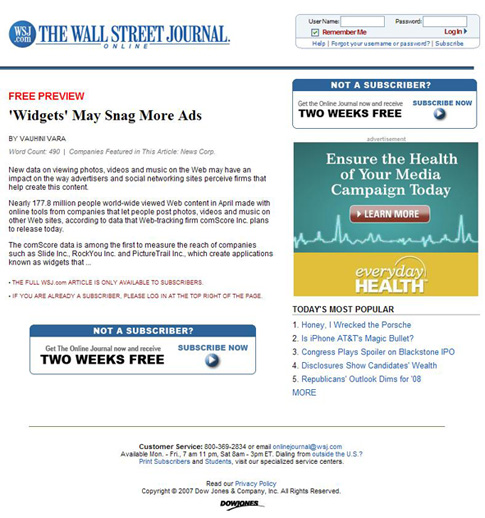
All the email newsletter items provide you value. More than half the time (54% of article links, on average) you can click-through and read the full article without being a subscriber. But the rest of the time (46% of article links, on average) you get some form of what we used to call a “soft door slam” (Figure 6). It’s a soft sell, with a free two week trial, but it’s a sell. Best of all, it’s not at all pushy; it doesn’t have to be. And it happens over and over again, creating multiple calls-to-action.
Figure 6: Free Preview with “Soft Door Slam”

This “soft door slam” is also interesting for what it doesn’t include: an option to buy just this single article for small fee. It’s an all or nothing proposition.
The WSJ is also earning some revenue on ads. But it’s clearly a secondary model. The emails I reviewed contained the same ad in each issue, at the end just before the footer. It must bring in some revenue, but they’re clearly not looking to leverage this or make it more prominent. It’s the icing on the subscription sales cake.
9. Footer—B
The footer would be perfect, if only it included a United States Postal Address. It’s not required by law, assuming that this list is 100% opt-in. But why not include it?
On a more positive note, links to unsubscribe and visit a subscription management page are here. Also here: a copyright statement.
10. Other—C
When you sign-up to receive the Media and Marketing Edition email newsletter, The Wall Street Journal promises “A rundown of the top news and features from the world of media and marketing. Weekdays.” They also make it clear that this is a plain text email which is not available in HTML (hopefully that will change). They live up to the content and frequency promises with flying colors.
But the other thing we consider here is viral marketing, where they fall flat. There is no “share-this-email-with-a-colleague” call-to-action. If I forwarded this email to you, you would not find a way to sign-up to receive future issues. Which means the Wall Street Journal is missing the opportunity to use this email newsletter as a tool to grow their email list.
Conclusion
The substance of this email newsletter is great, but its style leaves something to be desired. A little attention to detail would go a long way toward enhancing the reader’s experience and upping their engagement with the email newsletter. This, in turn, should increase the number of people who click-through to see the free preview marketing pages which should drive more sales.


