Looking for the best subscription website for cooking aficionados
Week after week, our editorial staff gets together to forage through the Internet looking for ideas and examples that could help our readers make their subscription websites more effective. In the process we often find ourselves getting on one soapbox or another, proving, once again, that there’s a lot of room for improvement out there. With the holidays fast approaching, we turned our attention to the many food and wine websites on the web, looking for the best subscription website for cooking aficionados—a challenging field for generating subscription revenues as there are so many free recipe sources out there. 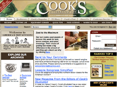
We looked at a vast array of food and cooking sites, using a variety of resources to determine which sites were most popular. We then browsed through those websites to see which had, in our opinion, the winning combination:
- Data rich content
- Excellent design from a usability perspective
- A subscription driven business model
To paraphrase the tagline from this month’s winner, we went through 28 food and cooking websites so you wouldn’t have to. Among the top sites we visited were some of America’s most venerable print titles: Better Homes and Gardens, Southern Living, Cooking Light, Martha Stewart Living and their spin-off, Everyday Cooking, Saveur, Bon Appétit and Food and Wine. The overall winner of the Editor’s Choice Award for best cooking subscription website was Cook’s Illustrated, whose print publication has long been a favorite of ours.
[text_ad]
A Google search for the term “cooking” yielded 17 million results. Many of which provide free recipes and tips. So how does Cook’s Illustrated differentiate itself? By being the impartial authority on the subject. GourmetSleuth.com, who describe themselves as a “highly focused directory” of gourmet food and cooking sites, described Cook’s Illustrated as a site which “provides detailed instructional style recipes with the intent to help you learn or polish your cooking skills… (and) detailed reviews on food and cooking tools.” Essentially, Cook’s Illustrated is the Consumer Reports of food and cooking. Like Consumer Reports, they do not accept any advertising in either their print or online publications and they charge a subscription fee for both. In an interview with Boston Common Press, publishers of Cook’s Illustrated, we learned that they have 675,000 print subscribers and more than 60,000 paid web members. About 50 percent are overlap subscribers, those that subscribe to both print and online editions. We also learned that their website plays a key role in the marketing of their print products. In fact, they have seen a 25 percent growth in online bookstore sales over 2003—certainly an impressive statistic for anyone who still doubts that the Web can be a huge driver of print sales. While they currently do not have an affiliate program, they are considering implementing one for 2005. Here are five things you can learn from their website:
|
1. “Said Simple Simon to the pie-man, let me taste your ware…”—using content sampling to help shoppers become buyers of your content.
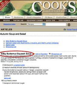
The major difference between print and online publishing is the problem of sampling content. If we want to sample the content of a print magazine before committing to a subscription, all we have to do is go to Barnes and Noble, get a latte and browse around their extensive newsstand. It’s not so easy online, as prospective subscribers of some pure-play websites soon discover. If everything of value is behind the firewall—or “curtain” as Time, Inc. has come to call it—there’s not much a savvy consumer can use to make a “buy” decision. Amazon.com realized this and that’s why they invested heavily in developing the technology—and acquired publisher permission—that allows browsers to virtually “look inside” a book before buying. Print publishers marketing online content need to do the same thing… give prospective subscribers enough of a taste of their content to convince folks that this is something they want access to (on a frequent-enough basis) to commit to a monthly or annual fee. In our opinion a canned “virtual tour” isn’t enough. The content, or inventory, you have in the “shop window” or showroom part of your website has to turn over to attract and persuade prospective subscribers. This also serves the purpose of providing “spider bait” for search engines—and if that isn’t part of your marketing strategy, shame on you. Cook’s Illustrated has new content from the most recent print issue available for everyone to sample. Links to full recipes, informative “How-to’s” and great kitchen tips are right there on the homepage. You absolutely get to see the depth and quality of their content. And if you want more, well… you’ll have to sign up! And at this point, if you are at all serious about cooking and food, you will because, for about $2 a month, you get it ALL… all the recipes, reviews, chat boards, advice from professionals, everything you can possibly imagine from the acknowledged experts in the field of food and cooking. After all… “We baked 38 lemon cheesecakes so you wouldn’t have to!” |
|
2. Help readers find what they’re looking for.
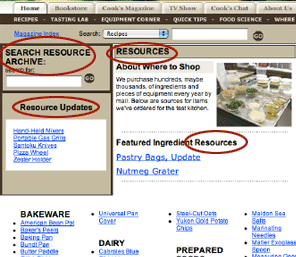
If we were looking for a poster-child website for good affordance, we would look no further than Cook’s Illustrated. A few of the other sites we examined also used blue, underlined links, although many did not… or were not consistent about it. But Cook’s goes further. Their magazine index, recipe database and quick tips all had logical, intuitive categorization schemes that made finding anything a piece of cake. The whole search experience on their site was transparent. The labels on their buttons and links were in clear, reader-centric language. Of course, this shouldn’t surprise us. After all, the mission of Cook’s Illustrated is to make the complex, and sometimes confusing, business of cooking as clear as crystal. |
|
3. Be THE authority in your knowledge domain.
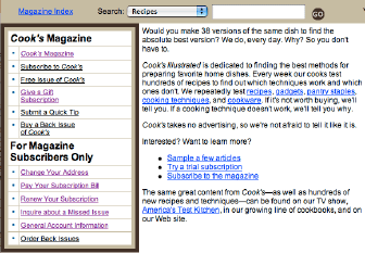
Don’t just have your own content. Be the portal to other marquis content in your domain. Sell things that relate to your domain. Build and encourage communities of expertise by establishing user forums. Make your site the one stop for anyone really interested in your topic. CooksIllustrated.com is not only a huge database of recipes and reviews, it’s also the one place where you can satisfy all your cooking information cravings. There are user forums, Cook’s Chat and Ask Cook’s, which provide access to America’s Test Kitchen and the editors of Cook’s Illustrated. They even have a Tips database and a free newsletter with cooking advice, test results, buying tips and recipes. They have a bookstore where they sell cookbooks and annual indexes to their print publication. They even have a link to their TV show. Ever wonder why chocolate is so addictive? You can find out in America’s Test Kitchen Science Desk (The Allure of Chocolate—Is there a scientific reason why we crave it?) |
|
4. Order flows—One size does NOT fit all.
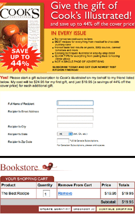
Often, the rationale for using a shopping cart order flow for subscriptions has to do with decisions made “upstairs.” If a publisher’s website already has canned software or the development group has already created a shopping cart and checkout module, why not use it to sell access and print subscriptions as well? After all, why should you pay twice for the same thing—it’s merely a matter of giving the subscription a SKU, right? However, nothing makes less sense to a magazine or online service subscriber than getting a catalog order flow when signing up for a subscription service. One deals with units, the other deals with time. One might argue that “number of issues” deals with units but not in the subscriber’s mind. If they purchase an annual subscription that sells them 6 issues, they do not expect to get those all at the same time in one shipment… they expect to see them show up in the mailbox over time. Use the right order flow for the type of product. Subscriptions—online or print—are sold differently than one-off products like pots and pans, unless, of course, you’re talking about a pan of the month club. Use a subscription order flow for magazines and newsletters or site access. Use a shopping cart and checkout order flow for catalog products. |
|
5. Use Pop-ups appropriately and sparingly. Recent research indicates that pop-ups that are expected, contextual, and which help users achieve their objectives are actually welcomed! While most, if not all, usability consultants abhor the use of pop-ups and advise against them, there is increasing evidence that not all pop-ups are perceived negatively. Two well-respected authorities, Caroline Jarrette and Forrester Research’s Carl Zetie, collected The Jarrett-Zetie Rules of Pop-ups:
Chances are you are not in the food and cooking business—if you were, you’d have to go a long way to compete with Cook’s Illustrated. That’s not why we’re going to the trouble of bringing them to your attention. We believe that no matter what your niche expertise is you can learn from the “best in class.” |
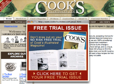 While Jarrette, in a recent article, maintains that these rules are often broken and pop-ups are still problematic, the fact remains that, if used appropriately, pop-ups can be a powerfully useful tool for generating subscribers for your print and online products. All you have to do is think like a user… did we come to this site to subscribe? Then giving us a subscribe invitation pop-up that gets us started is consistent with our goal and is actually a welcome intervention.

