Usability and design are two key factors in publishing great websites. You may have a clear strategy and great content, but if your site is unusable and unattractive, it will be difficult for users to find what they’re looking for, difficult for you to get users to do what you want them to do and difficult to get users to become loyal customers and revisit again and again.
Creating user-friendly websites begins by following the 14 Mequoda Website Design Guidelines for successful website design. By reviewing a site’s score for each of the 14 items, along with the overall average score, the areas of the site that operate well, and those that need work, become evident.
Labeling and Language
Far too many websites use labels and language that are better understood by the site’s sponsoring organization than by its audience.
Pay attention to the labels used in navigation and in page titles so that they are consistent—both within the site and with the audience’s mental models for the content—and to ensure that articles are grouped under the correct categories. Labels should be simple and easy to understand—that is, plain English. Their purpose is to help users find the information they want or get directly to a particular area of the site. No matter how appropriate the labels seem to the site owner, jargon should not be used as navigation labels. The easiest way to determine which words to use to describe the various departments, sections and categories on a website is simply to ask: “What would a user call this?” At the end of the day, the only words that will work are those that the intended users associate with what they are trying to find at the site.
[text_ad]
Determining common labels among Web users can be easy and absolutely free.
- Check your website’s search logs to see what terms your visitors are using to find information that isn’t easy to find from the homepage.
- Use a free keyword generator such as the Overture Keyword Selector Tool to find out the best words to use. Enter a word to find out its relative popularity ranking on search engines. The added bonus is that key phrases and words that the audience understands will also improve the site’s ranking on search engines, which are designed to evaluate relevancy as a “human” would.
The language used in a site’s articles, instructions and customer service pages also must be clear, concise and contextual. Again, speak the reader’s language! Don’t assume that everyone in the business or industry shares the same language and reading level, as this is generally far from the case. New people are always coming into the field, and seldom is any one person an expert in every aspect of the business or discipline. B2B websites are often the biggest offenders of overdoing the use of jargon, believing that the users all understand it; meanwhile, they often don’t have a clue.
Using audience-centric keywords and phrases, therefore, can be effective in building a relationship with users who appreciate a site that “speaks their language.” A little market research should help identify the words that users will immediately understand in this context. And for sites that must use a lot of technical terms or acronyms, add an easily accessible glossary or “ask us” section.

Website Examples
Best Practice Websites

ElementKJournals.com Website Design Review
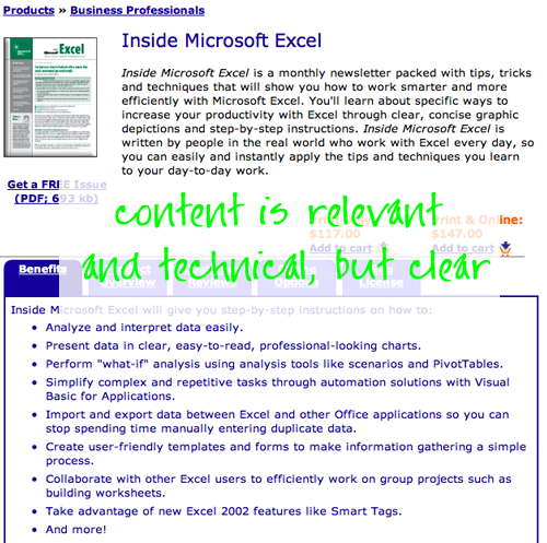
The subject matter of the Element K Journals publications can be highly technical. The content needs to be relevant and “technical” enough to convince visitors that these publications are credible.This site does a good job of balancing these competing requirements. This balance is achieved through a combination of effective copy and efficient page design.

Ragan.com Website Design Review
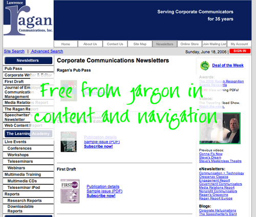
The language used throughout the Ragan.com site is—as would be expected, given the firm’s experience in corporate communications—clear and familiar. The site is free from jargon and acronyms in both content and navigation.
Not-So-Good Example

HCPro.com Website Design Review
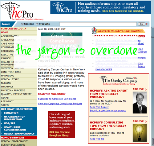
As is often the case, people who provide services to a specific industry or sector assume that everyone in that business shares the same language. This is generally far from the case. There are always new people coming in and seldom is one person an expert in every aspect of that business or discipline. The website publisher needs to be careful not to overdo the jargon in their language and labeling.


