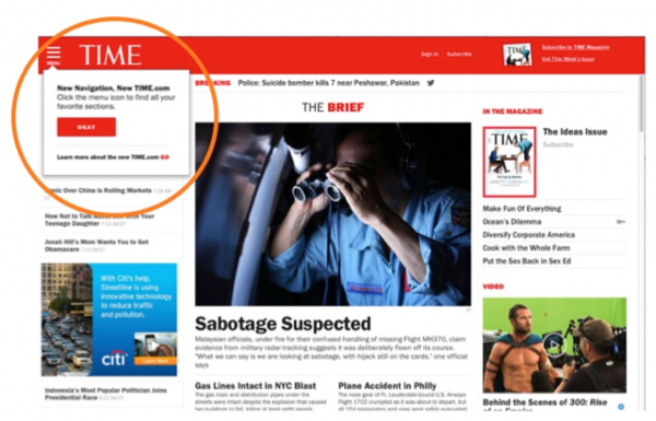
Redesign is an object lesson in how not to make more money

It’s all good until you see that money still lying on the table.
That’s how we think of TIME.com here at Mequoda. Last week it unveiled its new website design, to the general praise and adulation of the industry.
“The reading experience itself is good across platforms, with a large, albeit static, type size that makes lean-back reading comfortable.” (Steve Smith at min)
“The design is so mobile friendly that even the non-mobile version has a three-line navigation menu up in the top left corner that you see so often now on responsive websites. Hat tip to responsive design, perhaps?”(our very own Patrick Hughes, Mequoda)
Others didn’t actually review the site and were careful to mention TIME’s upcoming layoffs and the spin-off from Time-Warner, and expressed veiled skepticism about the rosy picture painted by Editor-in-Chief Nancy Gibbs about TIME’s path.
In other words, the site looks pretty good, but people aren’t convinced yet. We aren’t either, but unlike some of those other naysayers, who rarely give concrete reasons why they think TIME.com isn’t quite back on the rails, we have a very considered opinion.
The site is, as Patrick says, nicely designed and clearly aimed at a device-oriented audience. It’s “clean and offers an abundance of white space with large headlines and font.”
But at Mequoda, we’re less about aesthetics, which to us should simply be a given, and more about architecture and designing a site that meets the publisher’s (presumed) goal of making money.
 And this is where TIME.com is missing the boat. The new website does not …
- Make any attempt to get passing visitors to register and hand over an email address
- Offer any free newsletters to keep registered users engaged and give them a reason to keep coming back, laying eyes on the fancy new advertising units and buy TIME products
- Offer any products other than a subscription
- Make more than a cursory attempt to sell those subscriptions, via two tiny links at the top right – one of which seems to appear only randomly
- Tell users about any of the magazine’s current content to help them decide whether to subscribe.
[text_ad]
TIME by the numbers
OMI & unique visitors
TIME.com currently boasts a healthy Online Media Index (OMI), the ratio of a magazine’s unique visitors to its circulation, of 3.9. That’s a solid B in Mequoda world, and it’s one of the few large publishers to have an OMI above 1. It doesn’t drive traffic with optimized content, but it’s reputation as a news source keeps its traffic growing – averaging 12,828,935 unique visitors to the U.S. for the last six months of 2013 – the number we use to calculate the OMI versus the most recent audited circulation report for December 2013.
What’s more, February 2014 saw 24,296,753 U.S. visitors, up by 55% from February 2013, and double the average from those last six months of 2013.
TIME’s still got its news chops, that’s certain. But while we created a proposed brand wheel for TIME.com in a post last April, including a new blog/newsletter and special reports (these two free), plus books and an archive (these last two paid), we’re disappointed to see that nothing has changed in that department.
We even suggested that the marvelous videos they produce should be premium products. But no, any old visitor can still click there and enjoy.
And without these products, both free and paid, what does TIME.com have to offer its readers – and therefore its advertisers – that make it special? Editor-in-Chief Nancy Gibbs told Advertising Age recently that the new site is a “destination for 24 hours news coverage” that allows visitors to check in and see what’s happening in the world. “Time.com’s site will be one of the most essential news sites,” she said.
TIME’s specialty has always been in-depth, investigative journalism that helped readers understand – as its old advertising slogan went. And we suggested that doubling down on those roots would help distinguish TIME.com from competitors.
Yet with this redesign, says TIME.com Managing Editor Edward Felsenthal, the company intends for TIME.com to “do for the minute what TIME has always done for the week since it began, to bring you up to date in an extremely smart and readable fashion, quickly. The very name TIME is a recognition of the fact that people don’t have enough of it.”
Well, yes. Funny, but CNN and Yahoo do exactly that, too, and apparently they’re doing it better. Looking at international numbers (because Compete.com does not break out Yahoo’s U.S. traffic), we find that TIME.com saw 24,296, 752 visitors in February. It’s got a way to go to catch CNN at 27,792,727, and will probably never catch Yahoo News at a whopping 169,500,657.
Circulation
As for overall TIME circulation, which would be boosted by the regular use of that non-existent email marketing to that non-existent registered audience, that at least is fairly steady, moving up or down by fractional amounts since 2010 and currently at 3,289,377.

Revenues
Another number to consider is revenues, of course, but Time Inc. doesn’t report its revenue numbers by publication. And with 20 magazines in the Time Inc. stable, of which People is the largest driver of revenue at 20%, it’s particularly difficult to judge TIME by those figures.
But for the parent company, according to SEC filings, revenues totaled $5.4 billion in 2002, dropped slightly to $4.96 billion by 2007, and continued a steady decline every year, ending at $3.44 billion at the end of 2012. At the end of Q3 last year, reported revenues were $2.39 billion, on track to end 2013 at just $3.2 billion.
This is not a company that should be ignoring its revenue opportunities.
The website experience
To give credit where it’s due, the new TIME.com does appear to have achieved its goal of making itself an easier-to-navigate, mobile-friendly news site. I agree that it’s a crisp, user-friendly, intuitive site. I have not one complaint on that score. Steve Smith at min, having actually put it through its paces on a tablet and smartphone, gives the site a B+ overall.
But in our view, all these positive things are little different from its chief competitors, and not only is it refusing to separate itself from the pack, it’s actually trying harder to be just like those sites, when in fact it has characteristics all its own that it could be leveraging.
What do you think of the new TIME.com? Do you agree with their decision to become CNN? Or is there something else the company could do?


