TexasMonthly.com, While Offering Great Editorial Content and Interesting Features, Obscures Much of its Worthy Attributes with Mediocre Design and Undemonstrative Labeling, Making the Site Difficult to Explore.
The TexasMonthly.com website provides additional material that enhances the stories in the magazine of the same name, plus a whole lot more, but only if you know where to look. Like the Lone Star State itself, the TexasMonthly.com website is big, bold and brimming with life. The website says it has reinvented itself many times since it debuted in 1995. Perhaps it should keep trying until it gets it right. Its stated mission is “providing subscribers with additional material that enhances the stories in the magazine.” This may be true, but TexasMonthly.com has obscured much of its worthy features with mediocre design and undemonstrative labeling.
- Rather than focusing on the print magazine alone, this site is more of a portal to all of Texas, with links to weather, newspapers, radio stations, TV stations, other magazines, airlines, cities, parks and wildlife—even the Houston Metro—way too distracting
- While there’s plenty here to bring the paid subscriber back for more, there isn’t much that makes TexasMonthly.com very personal for the non-subscriber, except the links to all the other Texas websites
- Overall, the site is consistent, but uses dropdown menus, of which we disapprove because dropdowns are not search engine friendly, and they are difficult for many users to control
- It is not immediately obvious that some of the banner ads on the TexasMonthly.com homepage are “action” buttons, and some ads don’t open in a new window—they take the visitor off the homepage without a clear path back
- Placing the subscription signup box below the fold is a mistake—the top left quadrant is the ideal place on most sites
Introduction
The TexasMonthly.com website provides additional material that enhances the stories in the magazine of the same name, plus a whole lot more, but only if you know where to look.
Like the Lone Star State itself, the TexasMonthly.com website is big, bold and brimming with life.
Since 1973, Texas Monthly, the print magazine, has chronicled life in contemporary Texas, reporting on vital issues such as politics, the environment, industry and education. As a leisure guide, Texas Monthly is the authority on the Texas scene, covering music, the arts, travel, restaurants, museums and cultural events with insightful recommendations.
Texas Monthly has a reputation for providing its readers with a magazine of the highest editorial quality.
TexasMonthly.com, the magazine’s website, says it has reinvented itself many times since it debuted in 1995. Perhaps it should keep trying until it gets it right.
Its stated mission is “providing subscribers with additional material that enhances the stories in the magazine.” The site also provides subscribers with regular columns on history, food and travel.
And the TexasMonthly.com website states that, “Through Q&As with writers, editors, photographers and illustrators, readers learn how an idea becomes a story, and they get a behind-the-scenes look at the writing and reporting process.”
I didn’t see any evidence of this behind-the-scenes reporting process on the website. In fact, it might be there, but I couldn’t find it. TexasMonthly.com has obscured much of it worthy features with mediocre design and undemonstrative labeling.
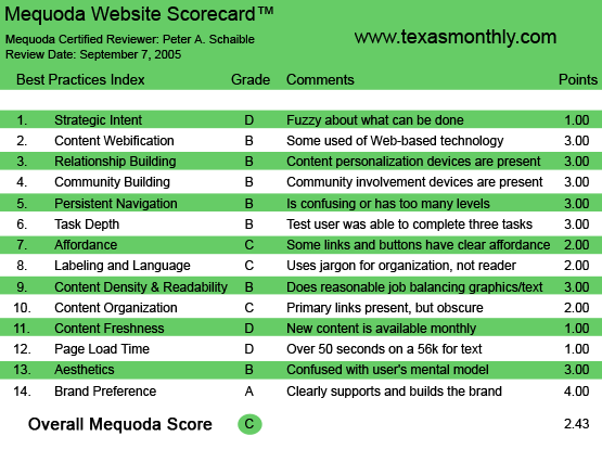
TexasMonthly.com’s Mequoda Scorecard
[text_ad]
1. Strategic Intent – D
Rather than focusing on the print magazine alone, this site is more of a portal to all of Texas, with links to weather, newspapers, radio stations, TV stations, other magazines, airlines, cities, parks and wildlife—even the Houston Metro!
And if that weren’t enough distraction from the magazine’s editorial content, and (presumably) the goal of enticing visitors to subscribe, the homepage includes numerous banner ads for everything from medical centers specializing in “Noninvasive Gamma Knife Brain Surgery” to thoroughbred horse racing.
So, as a portal, the site works OK. And if the intent is to get the casual visitor to subscribe to the print publication, it certainly offers a good sense of what the magazine will bring in the mail each month.
But the very small links to “subscribe,” “sign in/register” and “newsletters” in the top right quadrant of the homepage are barely noticeable and miss the mark by a mile. On numerous visits to the website during the course of preparing this review, I never even noticed them. And I was looking!
Eventually I discovered that the link labeled “newsletters” takes the user to a page offering a total of seven email newsletters. But I suspect many casual visitors never get that far. Nothing draws the eye to them. Nothing announces they are free email newsletters. Geeeeeesh! I actually had to phone Texas Monthly customer service to confirm that they are, indeed, free to non-subscribers to the magazine.
Can I possibly be the only one who missed these vital links initially? Certainly a little usability testing here would uncover this obvious (or not so obvious) problem, and would result in a larger, bolder, clearer offering.
Additionally, the homepage signup location is poorly placed below the fold—not helpful to the casual site visitor who might want a paid subscription.

2. Content Webification – B
The TexasMonthly.com website apparently reuses all the print publication’s classified ads online—many with full-color photos—and includes links to real estate websites, hair salons (more photos) and online gift shopping (still more photos).
Subscribers can try to find their Texas soulmate in TwoStep, the online personals column, or post community news, events or comments at TexTalk. Additionally, they can discuss books online at the site’s Texas Author Series.
Even so, the TexasMonthly.com website looks like an online magazine, which, I suppose, is appropriate for the website of a magazine. I had the sense that something is missing here. A video clip? Photo gallery? Something with a little more Texas pizzazz?
3. Relationship Building – B
All of the current issue’s articles are online and available to paid subscribers, as are a collection of Web-only stories. All are promoted using tantalizing teasers or snippets, which effectively whet the casual visitor’s interest, but cut him off from the entire content unless and until he buys a subscription or enters a password.
Also available to subscribers is an archive of all the issues that Texas Monthly has printed since 1973. You can learn all about the JFK assassination or scroll through the Texas Monthly’s scorecard of Best and Worst Legislators since 1973. Lots of content for the history buff here.
An online poll invites additional visitor participation. This month’s question: Who will win this year’s Red River Shootout: the UT Longhorns or the OU Sooners? (Presumably, football is the fourth major religion in the Lone Star, and neighboring, states.) This is the only area of the TexasMonthly.com website that does not require a paid subscription and password in order to interact.
While subscribers to the print publication can post to forums, non-subscribers have almost no way to interact with the TexasMonthly.com website except through its online contact form.
So, while there’s plenty here to bring the paid subscriber back for more, there isn’t much that makes TexasMonthly.com very personal for the non-subscriber, except the links to all the other Texas websites.

4. Community Building – B
Community building at TexasMonthly.com is accomplished with a discussion forum that enables recipe swapping—there’s a terrific-sounding formula for Lynn’s Famous Gazpacho this month, by the way. Another general forum, TexTalk, is devoted to all things Texas. Both require a subscription and password in order to participate.
There is some free content for the unsubscribed TexasMonthly.com website visitor, including a selection of restaurant reviews from around the state. Plus travel tips—selections of Arts & Entertainment listings from the most recent issue.
An extensive collection of a columnist’s recipes that were featured in past print issues is also offered. Perhaps there is just enough free content here to inspire the casual visitor to come back for more.
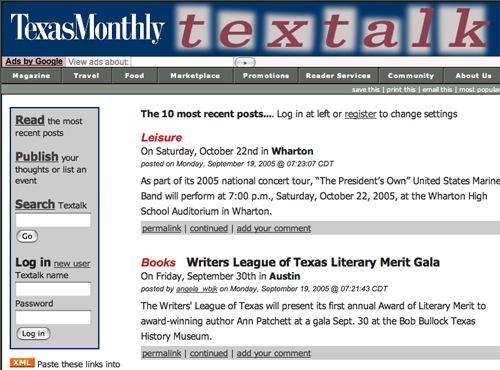
5. Persistent Navigation – B
Overall, the site is consistent, but uses dropdown menus, of which the Mequoda System disapproves. First, because dropdowns are not search engine friendly and can’t be recognized by the spiders. And second, because they are difficult for many users to control.
Older users in particular can lack the fine motor skills and hand-eye coordination to control dropdowns. The Mequoda System recommends building a website with the user in mind. Designers take note: just because you can achieve an interesting effect does not mean that it’s appropriate. Dropdowns are inconvenient and can contribute to driving users away.
Additionally, a few of the dropdown menu items on this site take the user far afield without a clear route back to the homepage. And there are a few links to other websites that don’t open in a new window—never a good idea.

6. User Task Depth – B
Casual users are able to browse, subscribe and participate in a poll. Most tasks require a subscription and a password. Subscribers can manage their subscriptions online, renew, pay, give a gift subscription and, in general, obtain excellent customer service on the website. But, as noted above (Strategic Intent), finding that offer of free email newsletters was difficult owing to poor design.
7. Affordance – C
The TexasMonthly.com site performs pretty much as expected, once you get a feel for it. But the traditional blue, underscored hypertext links that turn red when moused over, and maroon when visited (or “expired”), are not present. The sooner website designers make this an industry-wide standard practice, the better it will be for all—website publishers and users alike.
It is not immediately obvious that some of the banner ads on the TexasMonthly.com homepage are “action” buttons, adding to the confusion. And some ads don’t open in a new window—they take the visitor off the homepage without a clear path back.
8. Labeling and Language – C
This is the page at which you can sign up for the “free” email newsletters. Does the word “free” or “complimentary,” or any other synonym appear here? It does not. And signing up for one of the newsletters does not result in your receiving a confirming email message. This is a serious flaw.
Alternatively, there is one pleasant surprise at TexasMonthly.com by way of labeling and language. Many of the dropdown menus (not recommended, as mentioned above in #5) elaborate on the headings. For instance, under the Marketplace heading we find a link for Classifieds, which is then described as gifts, vacations, bed & breakfasts, and the general store. This is a nice extra touch that enhances communication and makes the site seem more friendly to the visitor (but not to the search engines).
Otherwise, labeling and language seem appropriate. You don’t need to know any special Texas jargon to use the site.
9. Readability – B
Like the print magazine, the TexasMonthly.com editorial content is very readable and easy to skim and scan. There’s plenty of white space. Texans appreciate wide open spaces, and this site reflects that in its design. If only that offer for “newsletters” on the homepage were clearer!
10. Organization (Marketing Quadrants) – C
TexasMonthly.com is designed with a narrower format than most sites. It’s offset to the left, resulting in a large unused section where one might expect a right navigation panel. The effect is to make the site seem a little lopsided and unfinished. But that also makes it less busy and easier to scan than many other websites.
Placing the subscription signup box below the fold is a mistake. The top left quadrant is the ideal place on most sites. The top right quadrant would be more effective, especially since much of the space there isn’t being used for anything else.
Additionally, I recommend deleting the Google search function entirely. It seems like an ill-considered afterthought and serves no useful purpose except to try to squeeze a little additional revenue from the site. But why would you want to take visitors away from the landing page? Again, this goes to strategic intent (see #1 above). Is TexasMonthly.com trying to be a portal or is it designed to sell subscriptions to the print magazine?
11. Content Freshness – D
TexasMonthly.com updates—you guessed it!—once a month when the new print issue is published. Links to the site’s other non-magazine content and features are updated as necessary. Previous issues are archived and may be browsed by subscribers, however, there is no site search engine apparent.
12. Load Time – D
TexasMonthly.com required 73 seconds to download on a 56K, according to the webpage analyzer. It seemed faster, even though there are numerous graphics files on the homepage.
13. Aesthetics – B
Much of the type on the TexasMonthly.com site is textured with a drab blue/grey background color that is unappealing and incongruent with my mental model. I expected brighter colors and graphics that are larger than life—something like my mental model of Texas itself. Overall, the site is not unattractive. It’s just a bit dull.
The menus items in the navigation panel are very small—a pet peeve of mine. You will hear this complaint increasingly from Baby Boomers like me as our eyesight diminishes. I have concluded that most website designers are under age 30 and/or derive some perverse pleasure in torturing their near-sighted elders.

14. Brand Preference – A
TexasMonthly.com supports the brand that originated with the print publication, carrying over the logotype and the look and feel of the printed magazine. It’s surprising that the graphic identification doesn’t incorporate a silhouette of the Lone Star State, but that’s a issue for a different design critique.
Conclusion
The TexasMonthly.com website boasts that, “All of the extra content on TexasMonthly.com is processed just as the stories in the magazine, which means articles are fact-checked and quality control is a top priority. Through our commitment to high standards and clear navigation we want to make your visit to TexasMonthly.com easy and enjoyable.”
That’s the site’s big promise. Overall, TexasMonthly.com succeeds at providing great stories but fails at clear navigation. It’s editorial content is enjoyable, but the site itself is not entirely easy.


Have you done a more recent review of the TX Monthly site? I would like to know how it has changed and if it improved.
Is there another well-known monthly consumer publication whoi does have what you would consider a “great to good” web site?