For the good of list-building: It’s finally acceptable to add a little “POP” to your website homepage design
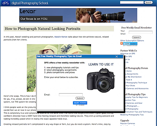
We don’t like to call them pop-ups; we like to call them “floaters”. Sounds better right? Although a Floater Order Form looks like a separate document floating on top of a website page, it is really just a layer in the HTML code.
To the user, it looks a lot like a magazine blow-in card. While printing blow-in cards and inserting them into print products is cheap, Floaters, like their Pop-Up predecessors, are virtually cost-less. Like blow-ins and Pop-Ups, Floaters can irritate users if over used or used to promote offers that seem out of context to website users.
There was a very long period there for a while when the social media folks—the anarchists of the online marketing industry—refused to use floaters. They shamed companies for annoying people with marketing. “Just talk to them”, they said. “Write good content”, they said.
The fact is, you can’t talk to everyone who visits your website. However, if you can get them on your email list, you’ll have a chance to talk to them later. You’ll be slowly growing a relationship that will hopefully end in one of those conversations they’re talking about.
Darren Rowse Did It
Back in 2008, we had written about Darren Rowse. You probably know him from his blog, ProBlogger, but he also runs a site called Digital Photography School. It was a true shock to many people when Rowse put up the in-your-face ads on his site, but he was proud.
“Before using this technique I was averaging around 40 new (and verified) subscribers a day to my email newsletter,” Rowse said in his blog. “To be honest I was pretty happy with that. 40 a day is over 14,000 per year—who would complain about that!”
“However last week I decided to experiment with a feature that Aweber offers its publishers that I’d resisted using previously—the ability to collect subscribers using a ‘Pop Over’ subscription form.”
“These Pop Over subscription forms are of course much more intrusive to readers than a sidebar form—this is the reason I resisted using them for so long. My fear was that they’d annoy readers, page views per visit would drop and that I’d end up with a lot of angry emails from readers,” Rowse admitted.
So what’s the result of Rowse’s test? “Average confirmed subscribers have risen to over 350 per day (over a year this would translate to over 125,000) so at least on that front it has been successful,” he says.
I didn’t witness any ads recently on his site, but maybe it’s because email subscribers evened out, or he tried tests on some ads that weren’t working. Remember that you’re going to see a spike in the initial days and weeks following the launch of a Floater, but they’ll even out after a while. Once you’ve captured your regular visitors, the steady stream that comes afterwards will be new visitors.
[text_ad]
Christopher Penn Did It
I’m a big fan of Chris Penn. He is the Vice President of Strategy and Innovation at Blue Sky Factory, a co-founder of my favorite yearly event, PodCamp, and co-host of the Marketing Over Coffee marketing podcast with John Wall amongst many other things.
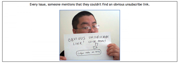
More importantly, he runs a fantastic marketing blog and an email newsletter with the headline, “Stuff you should have read on my blog long before now”. How true. His email newsletter always makes me chuckle at his funny and unique marketing efforts, especially his unsubscribe links:


But that’s all about keeping people on his list. How does he get them there? Yup, that’s right. Even beloved social media and online marketing guy Chris Penn is bowing down to the graces of Pop-Ups… or Floaters.
“Prior to installing the welcome pop-up on this site, I was averaging about 30 signups to my personal newsletter per month, give or take. Once I installed it, that average went up to 133, and is currently trending at 250 per month. That’s a 733% increase in subscribers.” Check out his blog to see the absurd graph that shows his giant spike in email subscribers.
That’s a pretty big increase. People must not hate pop-ups as much as we think they do, aye?
Should you do it?
Like both Rowse and Penn have said in their articles—you should always test.
Everyone hates Pop-Ups. Of course we do! They give one extra barrier between us and the content. The fact however, is that when many people and companies try adding one to their site, they see an immediate increase in email subscriptions. If you have a loyal user-base, why wouldn’t they sign up to get your content on a regular basis? It makes their lives easier—they don’t have to come to you. You come to them, in the form of an email newsletter.
One bit of advice I’ll leave you with is to get familiar with cookies. When someone signs up for your email newsletter and is quietly logged into the system… don’t show them another pop-up. Once someone has completed the task, reward them by giving them immediate access to your content.


Hard to argue with these numbers. Popups certainly work along with other floating optin forms and slider or “slideup” features.
Timed sales buttons are quote effective too.
I used timed popups with sales buttons on my sales pages. Once the sales presentation is finished I have the timed popup come up with a special offer and a “buy now” button. It’s really helped with a few of my sales pages.
Kevin
UpCreator.com
Awesome, thanks for sharing your tips Chris!
Thanks for the coverage. One other thing to make note of is that you can be selective in your use of popups. You don’t need to have them on all the time, on every page. Take some time to segment your traffic and wherever the greatest sources of new visitors (folks who aren’t subscribed) come from, make sure they see it, but see if you can tweak it so that regular, return visitors don’t.