“Testing is a no-brainer”, says Bob Brady of Business & Legal Resources
Brady told those in the audience today during a Landing Page Optimization session, that “a good ad makes a big difference—fast”. He told publishers that a change to a single word in his ads have increased conversion rates by 3x the original conversion rate.
“In the golden age of direct mail, there was a lot of A/B testing – headline, color, copy – and it worked, but it was very limited. The problem was that it could take 4-5 months to analyze the results, and the cost to create so many version was just plain expensive,” Brady reminded publishers.
Brady told the audience that he’s been in many conversations with other publishers who insist that certain colors or headlines work, but reminded us that every company is different and what works for one, might not work for another. This is why Brady stresses that everyone conduct their own tests.
In comparison to their original multi-variate testing platform, Vertster, Brady suggested that the while the tool is useful, it costs 18k a year and Google Analytics is free.
Josh Baker of Business & Legal Resources went on to show the results from a few of their multivariate tests.
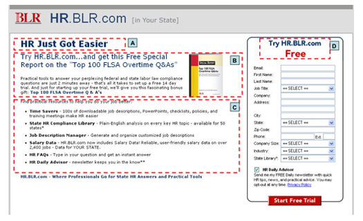
In the following case study, the folks at BLR were performing multivariate tests on their membership website sign up page that offers a free trial to their robust library of HR resources.
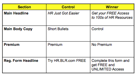
They swapped several elements in the test, including the main headline, main body copy, premium (with or without), and the registration form headline.
In this test, which was receiving traffic from paid search, the user would get several of variations of these elements, but otherwise, the registration form itself was identically the same.
According to Baker, the top combination of all four elements increased conversions by 52%. The winning registration form headline improved conversion rates 15.74% all by itself.
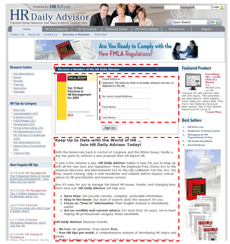
In another test that Baker showed the audience, he was testing an email registration page that currently saw 3,000 visitors a month with a 37% conversion rate.
Baker told the audience that “the winning page combination brought us from a 37% conversion rate to a 63% conversion rate”.
Here is the winning page combination, which included body copy that was previously an empty space, along with a much shorter sign up box and a new headline: Become a Member of the HR Daily Advisor. Baker noted that the new headline only showed a small increase in conversions, but the overall combination is what made the difference.
Baker also offered publishers a few quick tips:
- Test the pages that will impact your business.
- If you can’t test certain page areas or elements due to technological hurdles, test what you can.
- If you’re not testing, you’re guessing. Baker joked that it’s fun to make bets within the workplace to see which combination will win. He also noted that you’re usually going to be wrong.
- If you don’t beat your control it’s still a win if you walk away with lessons learned about your page and visitors that can be applied in the future.
- Always run a head-to-head follow-up test to confirm results.


