Is Jean Chatzky, the Latest Pop Personal Financial Adviser, Well Served by a Website that Confuses Visitors with Too Many Options and Stale Content?
Jean Chatzky is the latest in a series of popular, photogenic (and telegenic) female financial advisors that includes Jane Bryant Quinn, Suze Orman and the late Sylvia Porter. Ms. Chatzky writes regular personal finance columns for United Features syndicate, Time, Money and USA Weekend, and is a regular contributor to NBC’s Today Show.
She is the author of four books on personal finance, including her latest bestseller, Pay It Down: From Debt to Wealth on $10 a Day. In it she explains how to eliminate debt from your life, and introduces a simple plan—the idea of saving just $10 dollars a day—as a way to create capital for saving and investing.
Starting her career in 1986 at Working Woman, Ms. Chatzky has worked on staff at Forbes and SmartMoney, and in the equity research department of Dean Witter Reynolds. She has appeared on The Oprah Winfrey Show, Live With Regis, The View, Imus in the Morning, NPR’s Morning Edition and numerous other programs.
- Your Road to Financial Security with Jean Chatzky, is one of several sites operated by Waterfront Media.
- These subscription websites, based on brand-name, self-help books and their authors, are designed to help drive online book sales.
- Waterfront Media’s other self-help experts include Dr. Arthur Agatston (Lose Weight with The South Beach Diet Online!); Heidi Murkoff (What to Expect); Dr. Barry Sears (Lose 10 pounds in 5 weeks with the Zone Diet Online!); and Denise Austin (Get Fit Forever with Denise Austin!).
- Additional Waterfront Media partners include Dr. Andrew Weil’s Optimum Health Plan; Bishop John Shelby Spong on the News and the Christian Faith; The Left Behind Prophecy Club; and Beliefnet.
- Let’s see how Your Road to Financial Security with Jean Chatzky performs as measured against the Mequoda System Website Design Guidelines

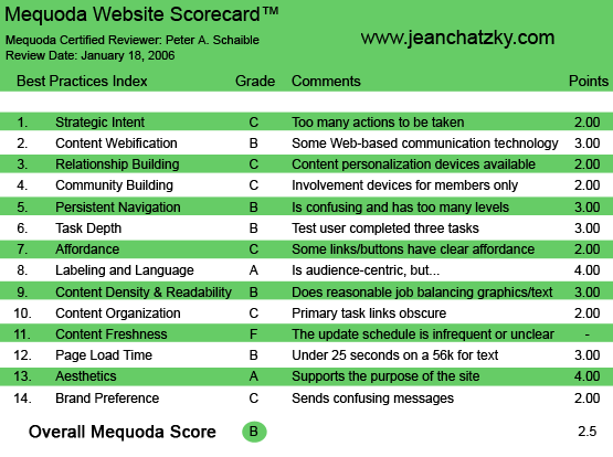
JeanChatzky.com’s Mequoda Scorecard
1. Strategic Intent – C
The first questions a visitor to your site asks are, “What do they offer here?” and “What am I supposed to do here?” (i.e., What’s the story, Jean?)
Presumably this site is designed to sell books and online memberships. But there are other things going on that compete for the first-time visitor’s attention.
First item, top of the page, asks for a member login and password. But if you’ve never visited here before, you don’t have a membership. And the problem is, the site doesn’t clearly and immediately tell you how to remedy that. It would be easy to add a button or hypertext link that says “Join Now,” but there isn’t one immediately apparent here.
So the next choices are a) take a free financial personality test, b) go for a tour, c) read a free Q&A from Ms. Chatzky, d) get your FICO score and e) buy the Pay It Down! From Debt to Wealth on $10 a Day book.
If this weren’t enough to overwhelm the new visitor and drive him away, the last two offerings are particularly counterproductive. Both take the visitor off the Jean Chatzky site—to Amazon if you want to buy the book. Worse, to the myFICO – Credit Education site if your want your FICO (an acronym for Fair Isaac Credit Organization) score, because there you’ll find an advertisement for Suze Orman’s FICO Kit, price: $49.95. It’s not a great idea to send business to your competitors unless you have some kind of pre-arranged affiliate relationship in place.

2. Content Webification – B
The FICO credit score simulator is a great use of Web-based technology, but why not build your own online calculator instead of linking to another site?
Similarly, the free financial personality test is an attention-grabbing use of online technology, as is the Go for a Tour popup. But here, again, the free financial personality test takes the visitor to another site.
3. Relationship Building (Personalization) – C
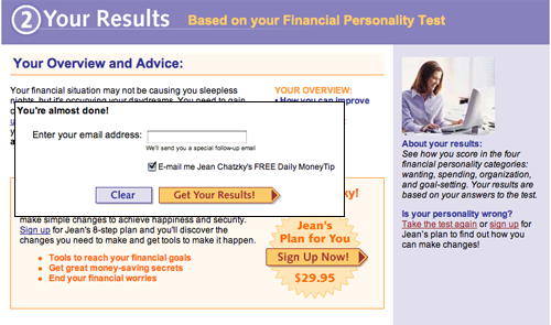
Following the completion of 15 multiple choice questions (the free financial personality test), the visitor must surrender an email address before he gets the results and is then offered Ms. Chatzky’s eight step plan for making simple changes to achieve happiness and financial security.
Join Ms. Chatzky’s membership website and your credit card will be billed $29.95 for the first eight weeks of the program. After that your subscription will be auto-renewed at a rate of $6.95 monthly. (That’s a total of $99.45 for the first year.) You may cancel any time.
One of the features to this quiz that I like is the ability to take it again. It’s like a post script to a traditional sales letter that says, “About your results: See how you score in the four financial personality categories: wanting, spending, organization and goal-setting. Your results are based on your answers to the test. Is your personality wrong? Take the test again or sign up for Jean’s plan to find out how you can make changes!”
Good second effort at closing the sale!

4. Community Building – C
Ultimately, this is a paid-membership website, after all. So only if you become a paid member do you get access to all these benefits:
- Daily advice from Jean Chatzky
- Expert chats and Q&As
- Tools and calculators to help you manage your money
- Information and exercises to help you reach your goals
- Bonus workshops to reduce debt and improve your credit score
- Online journal and message boards
One intriguing technique that some subscription website publishers have been using recently is to enable casual site visitors (non-members) to view the content of the members’ online discussion forum. They can read but not post. This is another way to motivate users to join, become involved, ask their own questions and contribute comments.
5. Persistent Navigation – B
This site is not a train wreck, but it sure could be a whole lot easier to use.
A more organized site would result in a greater number of membership sales. And that improved structure would be reflected in the site navigation. See #1 Strategic Intent.
6. User Task Depth – B
With enough persistence, the user can take the tour, complete the test and join. But I suspect a usability test lab would determine that too many visitors click away before getting all the information they seek and before joining the program.
7. Affordance – C
There is an inconsistency in the use of caps vs. upper and lower case, and in the color of the hypertext links. Plus, some links use typography that is set flush left and some use type that is centered. It’s entirely unnecessary to confuse the visitor this way. Pick a design, choose a style sheet and stick with it!
8. Labeling and Language – A
I didn’t find any financial or investment technical jargon here. No references to “dollar cost averaging” or the like. It would be smart to explain what a FICO score is and why the user should care about his FICO score—before sending him off to discover what his score is. See #1 Strategic Intent.
9. Readability (Content Density) – B
This is as good a place as any to rail about the silliness of putting banner ads on your own site. Trying to squeeze out a few extra dollars by selling Google AdWords is counter productive to selling your own, more expensive and profitable products.

10. Organization (Marketing Quadrants) – C
The hypertext links are in too many places, owing to the general disorganization of the site and its attempt to do too many things, taking the user in too many directions. Once you discover a failure in precise strategic intent, you find it reflected in all the other components of the site design and architecture.
11. Content Freshness – F
It would be easy to design this site so that it updated with a new free tip each day. But it does not—and the site is stagnant.
An ad in the lower left quadrant says it is sponsored by “Smart Decisions with Fleet—Programs for achieving financial confidence.” That’s a mistake for three reasons.
First, because one more time it takes the user off the Jean Chatzky site. Second, because the Fleet brand disappeared and became Bank of America more than a year ago. And third, because the redirect to the now Bank of America website is dead—it goes to a non-existent webpage. How many ways does this have to be wrong before someone changes or eliminates it?
12. Load Time – B
JeanChatzky.com downloads in 17.2 seconds at 56K according to the webpage analyzer.
13. Aesthetics – A
Ms. Chatzky is very attractive, with a million-dollar smile and an overall appearance that projects a “brains and beauty” persona. But does her picture need to appear three times on the homepage (four if you count the book jacket)?
Overall, the site looks just fine, but inasmuch as I don’t agree with how it executes its strategic intent, I’d like to see more substance to match the style.
14. Brand Preference – C
Ms. Chatzky ought to be her own brand, but seems to have subjugated her image and message to Waterfront Media. This may or may not have been a good career move, but she is not well served by this website.
Conclusion
Waterfront Media helps self-help experts and their publishers publish their content online and aggregates self-help content for advertisers interested in reaching self-help seekers, a $10 billion market, according to Marketdata Enterprises.
Marketdata Enterprises Research Director John LaRosa says, “There is no let-up in demand for products and programs that will allow Americans, especially affluent female Baby Boomers, to make more money, lose weight, improve their relationships, improve business skills, cope better with stress or obtain a quick dose of motivation. Now more than ever, Americans are turning to gurus for stress management, personal coaching, life/family skills counseling and starting their own business.
“They want to be more in control of their emotional and financial lives. An elite handful of multi-millionaire celebrities have leveraged their names to build multi-media empires consisting of books, tapes, CDs, public seminars, workshops, catalogs, infomercials and consulting—and more gurus are coming.”
Last month (January 2006) HarperCollins Publishers and Waterfront Media announced they are joining forces to develop and market personalized content online based on HarperCollins authors and their books. The collaboration affords consumers exclusive access to customized content from these bestselling authors, specific to the consumer’s individual goals, on a subscription basis.
Each program will provide consumers with a personalized, interactive, health or fitness program that augments the general methods presented in the author’s book. Subscribers will receive fresh content each day about their specific areas of interest, and have access to an array of interactive tools and online communities where they can share information and do research.
Stay tuned.


Very insightful review. However, Jean has since then launched a new website… Maybe it’s time to write another review 🙂