How a more robust registration headline on this membership website brought conversion rates from drab to fab
The folks at Business and Legal Reports (BLR) are gluttons for A/B and multivariate testing. Similar to Google, their pages are designed based on numbers and results, not opinions or a creative web designer.
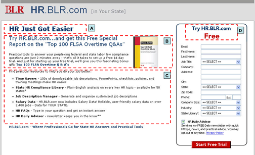
In the following case study, the folks at BLR were performing multivariate tests on their membership website sign up page that offers a free trial to their robust library of HR resources.
They swapped several elements in the test, including the main headline, main body copy, premium (with or without), and the registration form headline.
We’re going to show you just the registration form headline test below. To see the rest, register for our upcoming Landing Pages that Work webinar.
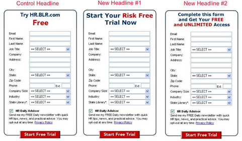
Here are the registration form headlines they tested:
- Control: Try HR.BLR.com Free
- New Headline #1: Start Your Risk Free Trial Now
- New Headline #2: Complete this form and Get Your FREE and UNLIMITED Access

In this test, which was receiving traffic from paid search, the user would get one of these three registration headline variations. Otherwise, the registration form itself was identically the same.
According the Bob Brady, CEO of BLR, the top combination of all four elements increased conversions by 52%. The winning registration form headline improved conversion rates 15.74% all by itself.
Which registration headline do you think won?
[text_ad]
“Complete this form and Get Your FREE and UNLIMITED Access” was the winner.
Now, this doesn’t mean, “Complete this form and Get Your FREE and UNLIMITED Access“ created an immediate 15.74% increase in sales, Bob told us.
“On the end you’re going to lose some of those people. The job of this page is to move them along to the next page, and unless you’ve done something dramatically different on the next page—like change the offer—the results still stand. The important thing is to get them to the next page and then let that page do its work”.
In a couple weeks, on June 10th, Bob Brady from BLR and Greg Krehbiel of Kiplinger will join us for a co-sponsored SIPA/Mequoda Webinar called Landing Pages that Work: Using a Proven Testing Method to Increase Conversion Rates which will feature many more case studies like this.
So, multivariate tests aren’t smart enough to tell us why things work better. What’s your theory on why the winning headline converted best?


Liz is half right. Trying something for free … is not as good as getting something for free. I always do better when I can sell a FREE PREVIEW as opposed to a RISK-FREE PREVIEW. The former, you don’t have to send any money up front. The latter you do; it’s just that you get a complete refund if you’re not happy.
Here, if you’re saying get free and unlimited access, that’s a pretty soft offer. It’s would be misleading if they actually had to pay. My clients, and their attorneys, would make me use risk-free, if they had to fork over any dough up front.
To me its the same as the long copy short copy arguement. You have to use as many words as it takes to say what you mean in a way that your customer gets it.
Great feedback, I agree 100%!
The clear difference is the use of “unlimited access.” People are no longer fooled by “free” or “risk free” – they figure that yea, this is free but anything else will cost me. “Unlimited access” sounds bountiful and ongoing.