Let the Good Times Roll: GuyKawasaki.com is a Marketing and Branding Website for its Namesake
According to his website, Guy Kawasaki is a managing director of Garage Technology Ventures, an early-stage venture capital firm, and a columnist for Forbes.com. Previously, he was an Apple Fellow at Apple Computer, Inc., where he was one of the individuals responsible for the success of the Macintosh computer.
Mr. Kawasaki is the author of eight books including The Art of the Start, Rules for Revolutionaries, How to Drive Your Competition Crazy, Selling the Dream and The Macintosh Way. He has a BA from Stanford University and an MBA from UCLA as well as an honorary doctorate from Babson College. Let’s examine GuyKawasaki.com through the prism of the Mequoda System Website Design Guidelines.
- GuyKawasaki.com is both a content and a commerce website, but it appears to exist primarily to help Mr. Kawasaki brand himself by offering small samples of his book writing and speech making talents.
- There is no immediately obvious way to add your name to the GuyKawasaki.com mailing list.
- Overall, the navigation of this site is straightforward and easy.
- The website design of GuyKawasaki.com is clean and elegant.
- GuyKawasaki.com could be viewed as an attempt by Mr. Kawasaki to further brand himself, as he so skillfully does with his books. If so, he succeeds.

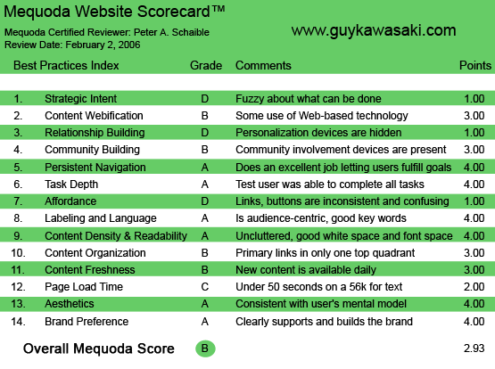
GuyKawasaki.com’s Mequoda Scorecard
1. Strategic Intent – D
GuyKawasaki.com is both a content and a commerce website. But it appears to exist primarily to help Mr. Kawasaki brand himself by offering small samples of his book writing and speech making talents.
There is an opportunity to buy books, but little else is done to monetize the visitor. Surprisingly, there is no obvious email capture device, although the user can get on Mr. Kawasaki’s mailing list with a little effort (see #3 Relationship Building below).
2. Content Webification – B
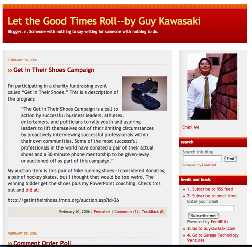
Mr. Kawasaki is a self-described Macintosh evangelist, venture capitalist, author and speaker. The content of his blog, which he started January 2, 2006, and updates regularly, ranges from the profound to the self-indulgent. Overall, it’s a very good read. Examples:
Profound: You’re going to get tired of my obsession with great products but pitching, demoing, bootstrapping and executing are a lot easier if you’ve created something meaningful. It’s hard to stay motivated and excited about executing crap. It’s easy if you’re changing the world. So if you and your team are having a hard time executing, maybe you’re working on the wrong thing.
[text_ad]
Self-indulgent: A new goal to execute: that someday Jackie Chan will be stopped at a light in Hong Kong, and a car full of teenage girls will ask him to roll down his window. Then one will ask, “Are you Guy Kawasaki?”
Mr. Kawasaki also offers an RSS (Really Simple Syndication) feed, and a demonstration video of his speaking ability.
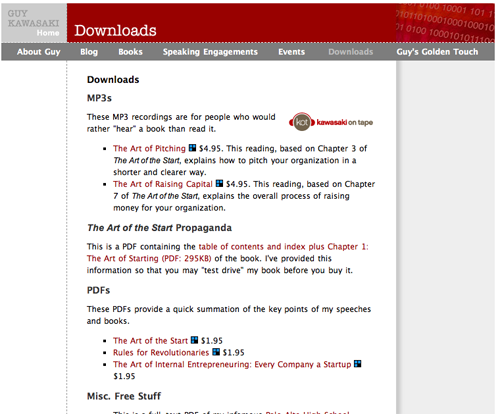
Additionally there are some MP3 recordings for people who would rather “hear” a book than read it (US$4.95 each) and some PDFs (Adobe Portable Document Format files) that provide a quick summation of the key points of his speeches and books (US$1.95 each). I question how much of a profit center this is for Mr. Kawasaki vs. how many more speaking engagements he would get, and books he would sell, if these were free downloads. In fairness, he does offer a free download of the table of contents and index, plus chapter one of The Art of the Start.
And there are two additional free PDF downloads, one of which is self-described as his “infamous” Palo Alto High School baccalaureate speech. Very insightful!

3. Relationship Building – D
There is no immediately obvious way to add your name to the GuyKawasaki.com mailing list. On the site’s About page (and some of the other text pages, as well), hidden at the bottom of Ms. Kawasaki’s official biography, is an opportunity to “sign up for the news.”
Here is his offer: “I’d like to keep in touch with you, so if you’d like to subscribe to receive news, updates and special offers from me, please subscribe to Guy’s List. I’ll only send you an email four to five times a year. I promise!”
This link opens your browser’s email client, enabling you to send a message directly to a list server. I signed up. There was no immediate acknowledgment or email confirmation. A sign-up box on the site’s homepage, strategically placed in the upper left or right quadrant, would garner far more names that would enable Mr. Kawasaki to follow up with visitors more frequently at a later date.
Why Mr. Kawasaki promises to send email only four or five times a year is unclear. Most online marketers would recommend a much greater frequency of email contact.
4. Community Building – B
Subscribers to Mr. Kawasaki’s blog are invited to comment on his pithy insights. Some of the guest’s posts are almost as profound as the host’s.

5. Persistent Navigation – A
Mr. Kawasaki’s blog is powered by TypePad. Accessing the blog takes the visitor off his main site, but opens in a new browser window. Similarly, the links to buying Mr. Kawasaki’s books on the Amazon or Barnes & Noble websites also open new browser windows.
Overall, the navigation of this site is straightforward and easy.
6. User Task Depth – A
Despite some deficiencies in affordance (see #7 below), it doesn’t take much thought or effort to navigate around this site, read the bios, download the PDFs, read the blog, buy a book, watch the video, etc.
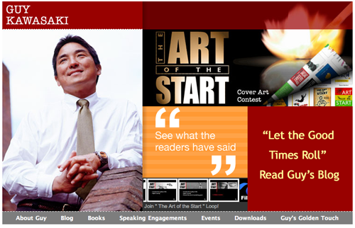
There is an unexplained and ill-defined link on the homepage that takes the user to a cover art contest, where we find alternative designs for the cover of The Art of the Start.
Another homepage link is labeled Join “The Art of the Start” Loop! FilmLoop is free software that displays photos in moving “loops” on your desktop. Mr. Kawasaki is a director of this photo broadcasting service that enables people to share, broadcast and find photos.
7. Affordance – D
The user must mouse over some of the homepage to find the graphical hypertext links. It is often unclear where one link ends and another begins. Imprecision is not good affordance.
8. Labeling and Language – A
No users are likely to be confused by the simple, unambiguous words used on this site. Then again, it is unlikely anyone will find this site searching any keywords other than “Guy Kawasaki.”
9. Readability – A
The design of GuyKawasaki.com is clean and elegant. The column width is perfect and the use of white space is exemplary. The designer has also done an outstanding job with the typography, breaking up long text that might otherwise be overwhelming and off-putting with boldface, sub-headlines and bullets.
It is clear that Mr. Kawasaki is an outstanding thinker and writer. His words have been skillfully brought to life on the pages of his website.
10. Content Organization – B
It appears that Mr. Kawasaki’s primary intent is not to capture the user’s email address (see #1 above), or he would have an email capture device in the top left quadrant of the homepage.
The seven text links on the homepage appear at the bottom of the page, which is not deep and can be viewed in its entirety on one screen without scrolling. On the subsequent pages, the primary text links appear at the top of the page. Despite this inconsistency, users won’t have much trouble finding their way around.
11. Content Freshness – B
Mr. Kawasaki seems to be updating his blog on most days, and visitors are posting their reply comments regularly. Otherwise, the site is relatively stagnant. Essentially, it’s an online brochure for Mr. Kawasaki’s books and his availability to deliver your group’s next keynote address.
12. Load Time – C
Download time was 25.37 seconds at 56 K as measured by the webpage analyzer. As with many graphics-laden sites, this speed probably could be improved with the judicious use of a graphics compression program.
13. Aesthetics – A
If clean-looking, information-rich and intuitive is the goal, GuyKawasaki.com succeeds. Typography, colors, layout and overall design are congruent with the user’s mental model of the publisher’s personality and image. See also #9 above.

14. Brand Preference – A
GuyKawasaki.com could be viewed as an attempt by Mr. Kawasaki to further brand himself, as he so skillfully does with his books. If so, he succeeds.
Conclusion
GuyKawasaki.com, like its namesake publisher, is attractive. But while Mr. Kawasaki himself is clearly deliberate, focused, inspiring and business-like, his website is unfocused and generally weary.


