
One of the most profitable subscription website business models is a magazine subscription website.
It’s not because it’s cheaper to build, or brings in substantially more revenue than other business models, it’s more profitable because once your platform is up and running, you can recycle content you’ve already paid for, and create a content bundle that’s priced higher while you’re adding very little cost and work on your end.
A magazine subscription website is built to increase subscriptions for a related print or digital magazine and provide access to the magazine’s back issues, upcoming issues, and curated premium content. When the Internet dawned, the magazine subscription website was one of the first subscription websites invented, as mass media magazine publishers quickly jumped on the bandwagon.
[text_ad]
A website is only a magazine website if the user can view an issue of a magazine in HTML—one that is linear and periodic with a table of contents and a regular frequency. For a magazine subscription website to prosper most effectively, we recommend pairing it with a Portal subscription website. This is your free site where you publish free content to attract search visitors and convert them into email subscribers. From email, you convert them into paying subscribers of your magazine website.
Features of great magazine subscription websites
Magazine subscription websites come in all shapes and sizes, but for the most part, they’re consistent in what they offer — a way to buy and read a magazine on any device, with a consistent table of contents, and an archive of content that can be searched for by topic and/or date. But usually, there is much more to offer. Here’s a list.
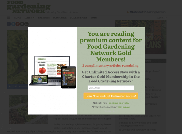
Magazine subscription website feature #1: A metered paywall that gates access.
For example, if your want to read an article in Food Gardening Magazine, you can access up to three for free per month, but with just a few clicks in a single session, you’ll be prompted to subscribe to continue to view content. This gives readers the digital equivalent of a free trial issue.
Magazine subscription website feature #2: Current issue marker
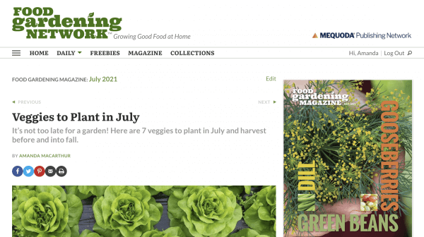
In the next few features, we’ll talk about all the ways you can help your user understand where they are in your web magazine, and one of the first is to always say which issue they’re in, above the current article.
Magazine subscription website feature #3: A table of contents that’s consistent on every page of the web magazine.
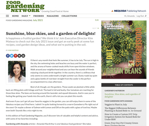
On the right-hand side of your magazine pages, there should always be a table of contents. This helps the reader know exactly where they are, and in what issue they’re viewing, should they bounce out of the premium content and into the free content. Keeping that persistent navigation is user-friendly and keeps the integrity of the magazine content intact. Without it, a user has no easy way to know how to read the rest of the issue.
Magazine subscription website feature #4: A place for advertising so you can continue to sell it, but without annoying premium subscribers.
If you’re also ad-driven, there can be ads in your navigation and even on-page. Sponsored content is a great way to sell advertising in a way that pleases both advertisers and readers, but if you want to sell banner ads, keep their placement visible but tasteful. If you can make them relevant to the content on the page, or sell ads by the category so that you can partner with an advertiser related to the specific type of content you’re publishing, that’s even better.
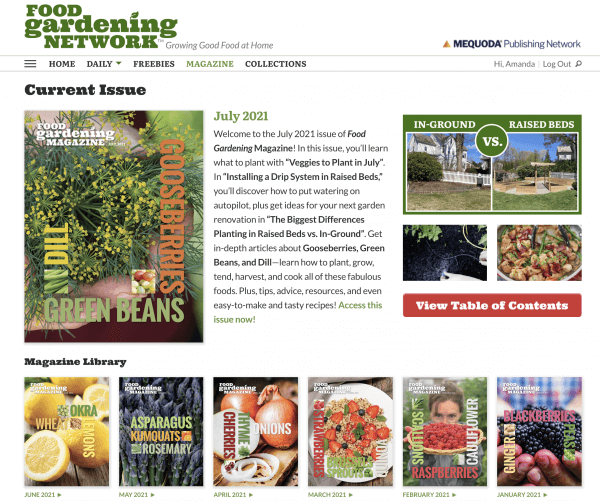
Magazine subscription website feature #5: An archive of old magazines that can be read online and sorted by topic and/or date.
There’s no more useful feature of magazine subscription websites than an archive. This allows users to peruse a vault of information that they would have no other way to access.
Magazine subscription website feature #6: The ability to page through archived content online.
Finally, once you’ve gotten into the archive and used the navigation to select an issue, there are previous and next buttons that allow you to “page” through the issue like they would in a traditional magazine.

Magazine subscription website feature #7: Bundling content to leverage contrast pricing and increase conversions.
If you also have a print magazine, you can bundle it with your digital edition to get a higher price point. You can also leverage contrast pricing. The general principle behind contrast pricing is that you offer three price points. The bottom price is the lowest, but the middle and highest price points are much higher. However, because the middle price point is so close to the highest, more than 60% choose the highest price option.
Magazine subscription website feature #8: Include a search function.
The reader can spend an hour or so with Food Gardening Magazine just browsing through. And although we’re organizing magazine content by date, when you bring your content online, there’s no reason to hinder users from searching for content on an individual article basis. As long as when they arrive at the article, they can see they’re “in” a magazine issue, using the features above, like a table of contents.
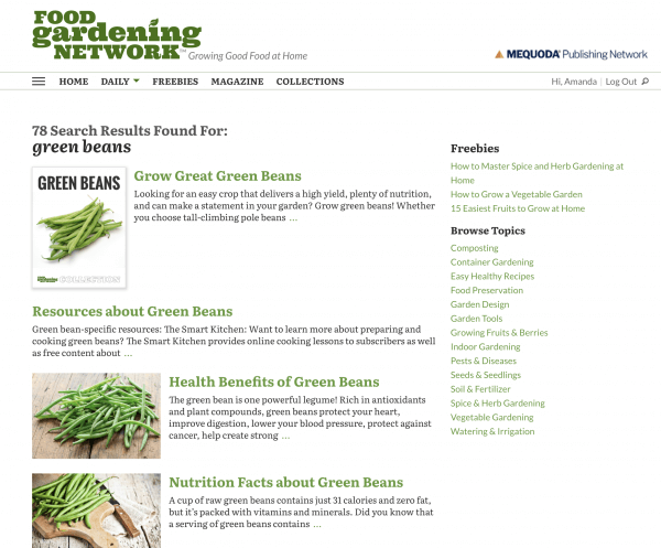
Magazine subscription website feature #9: Curated collections
There are two types of collections a publisher can use to develop from their web magazine.
Dynamic collections are made possible by identifying topics that commonly accrue a large collection of content drawn from many issues. Whenever a new issue is released, articles are added to these dynamic collections based on topic or category.
Special collections are a variation on the above where editors hand-pick a much more limited number of articles from past issues and curate them into a special issue or special collection. These special collections can be tied to events, holidays, content sources or any number of other appropriate themes.
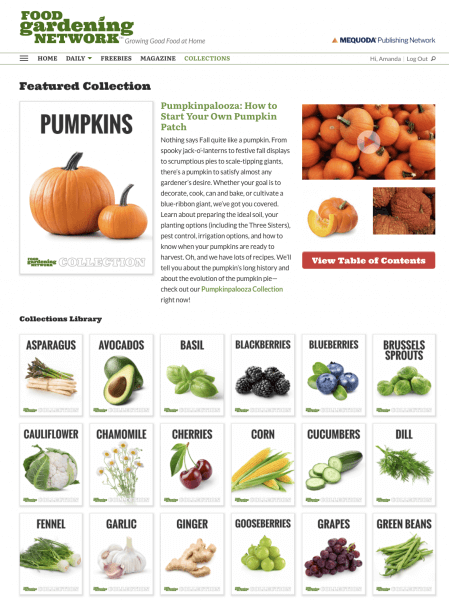
Food Gardening creates collections based on specific vegetables, herbs, and fruits. As a new magazine, they developed these from scratch to create in-depth guides for each plant, but they have made these collections more in-depth by curating additional articles into the collections that are related to each plant.
Magazine subscription website feature #10: Premium content previews
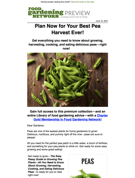
Premium content previews are content marketing efforts feature snippets of premium content and are designed to engage premium members by encouraging them to use their premium membership. They’re also meant to engage free subscribers encouraging them to upgrade to the premium membership.
For example, both free and premium members might receive three previews per week which get open rates that are consistently north of 60% for premium members, and 30% for free subscribers. These derivative minimum information units are aligned with special collections, and individual magazine issues to which free subscribers have limited access, and premium subscribers have unlimited access. They are delivered by email, but some publishers also publish them for free on their magazine subscription websites to increase engagement from non-subscribers.
In this example from Food Gardening, the preview focuses on the premium Pea collection. See the full preview.
And it all begins with a dynamic issue homepage
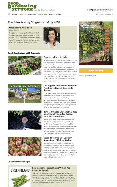
When you arrive to the latest Food Gardening magazine issue, you’re met with a letter from the editor, videos, collection close-ups, and featured collections. The user is invited with a big button to “start reading” which leads them to the Gardener’s Notebook, which is a monthly letter from the editor, and the table of contents appears on the right-hand side at that point as well so that the user can begin to “page through” the issue.
When designing your magazine subscription website, keep the goal in mind that your magazine website should not act the same way as your free portal or blog. Users want to know the difference between what content is free, and what they’re paying for, and when they are in an issue, they want reassurance of where they are in the magazine and in the archive.
At this point, we’d like your feedback. What else have you included in your own magazine subscription websites, or, as a user, what would you like to see included?


Highly informative with demonstrative steps for starters of magazines and publishers.
Thanks a lot for the advice.Will refer to any one in need.
Bye
Satheesh Nair