Readability, Aesthetics and Labeling Help Fundcraft.com’s Users Feel Right at Home, but Navigation and Affordance in Fundcraft.com’s Website Design are Confusing to Users, and Could be Losing Potential Sales
Fundcraft Publishing provides turn-key printing services to create customized fundraising cookbooks for their customers, bringing in sales of $40 million in 2004. Fundcraft Publishing is an example of a successful, family-owned printing company that has jumped to the Web to build on their existing business. Along the way, they have made huge website design and usability mistakes. Fundcraft owns a network of sites, and using the Mequoda Website Scorecard on the hub of the network—Fundcraft.com—we can learn how to cook that Christmas turkey just right, and how to watch out for those underdone pink areas. Fundcraft.com’s website design efforts earned As in strategy and readability and fell into some unnecessary mistakes in navigation and affordance.
- Fundcraft.com’s site strategy and product offer is clear to the user from every page
- Readability, aesthetics and labeling help Fundcraft.com’s users feel right at home
- Navigation and affordance on Fundcraft.com are confusing to users, and could be losing potential sales
- Fundcraft.com clearly supports the brand on almost every page, however they occasionally hijack visitors to another Fundcraft site in their network that does not promote or even mention the Fundcraft brand
- While there are many website design problems on Fundcraft.com, the company is successful and the site gets enough right to be a value-add to their marketing, customer service and distribution efforts

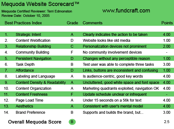
Fundcraft.com’s Mequoda Scorecard
1. Strategic Intent – A
Fundcraft is the largest cookbook printing company in the US. The company was founded as a family-owned printing company in the 1900s. Since the 1950s they’ve operated in a unique market niche, publishing fundraising cookbooks for organizations. With $40 million in 2004 sales, Fundcraft’s strategy is paying off. Their group of websites attract over 100,000 visitors a week.
[text_ad]
Their Sites:
- Parent Company:
- Marketing and Services:
Fundcraft’s product/service offer is easy to understand for the first time visitor. On the homepage we read: “Publish your own cookbook with Fundcraft.” This is repeated in the logo image (albeit hard to read) “Personalized Community Cookbooks” and next to the logo image along the top “Personalized Fundraising Cookbooks.”
The customer base includes church, club or civic organizations who want to create a cookbook for their fundraising program. Fundcraft is providing a specialized printing and distribution service to make this an easy process for small organizations with limited resources. The customer base is defined, the customer need is specific and the process is clearly described on the website. Fundcraft manages customer needs through a network of sites, with Fundcraft.com as the hub of the network.
2. Content Webification – D
Fundcraft.com is old media simply posted online—static content and downloadable PDFs. I was hopeful for some interactive content webification when I saw a page entitled “Web features.” Listed here are several features that would definitely add value to the Fundcraft site, but each feature is actually a separate website—with a different brand name. Short/Cut is a content management system for customers and Cookbooks.com is a marketing site allowing customers to sell their books online. For a second my heart started beating when I saw “Get instant reprint prices online.” I thought, “Cool, they do instant online pricing.”
Um, no. They ask you to print out the reprint price page, and sign and mail it to them. You can’t even email it! The same went for their regular pricing page—a long PDF form—again requiring snail mail.

3. Relationship Building – C
As a customer, if I login, I will be able to see my own cookbook and information regarding my order. This is on the level of personalization of a commerce site, such as Amazon.com. With the amount of content (pure information) that this company has at their fingertips, this category could be greatly expanded and would improve the user experience. For example, users could be offered a free registration in exchange for being able to create a “favorites” or “wish list.” The bottom line? While content personalization is present, it is not exploited to improve the user experience, or prominently promoted to new users.
4. Community Building – F
Church groups, non-profit organizations, clubs, civic groups… yeah, not really a very community-oriented group. I’m sure they would have no interest in participating in a community chat room, or using a forum to discuss fundraising strategies. Sigh.
Sorry for the sarcasm. But honestly, it makes me sad to see this missed opportunity to provide such a nice and easy added value to the customer, which would help customers in their good-hearted fundraising efforts and also increase search engine visibility and word-of-mouth new business for Fundcraft.
5. Persistent Navigation – D
Fundcraft.com is a small site with a specific purpose, and the navigation should not be a big issue. However, there are two glaring errors that the site makes in navigation.
- Thinking from the company viewpoint, not the user’s. The site is attempting to serve two purposes at once, and switched right hand navigation to serve these purposes—without clear messaging to the user.
- Thoughtless mistakes in link importance levels. There is a link in the right hand navigation bar that takes the user off-site, without warning and against the expectations set up by the other links in the same area.
First, the right hand navigation switcheroo! As long as you are asking the first level of questions—what is this, how does it work, etc, you have right hand navigation bar A. The minute you graduate into a deeper level as a sales prospect, you want to look at the options for book covers for example, you are thrown to right hand navigation B. This might be a clear delineation for the company, but it isn’t for the customer. They are going to jump back and forth between asking the first set of questions and asking the second, perhaps as they show others in their organization and decide on contacting the company to start a sales process. And as they do so, they are going to get tangled in the confusing, changing navigation. “Hey—I can’t figure out how to get back to that page!” Is something you never want a user to think.
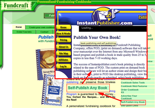
Second, the thoughtless mistake. The right hand side navigation has a list of links which lead to pages within the site. Great. The trouble is the link “Self-Publish Any Book.” This simple text link is sandwiched between “Advertise your Cookbook” and “Site Quick Links” Both the former and latter take you to pages within the main navigation template, the user is still on the site and doesn’t have to learn anything new as they click to the new pages. But click on the the “Self-Publish” link and boom! You’re on another site within the network—InstantPublisher.com. This inconsistent use of links and navigation is very confusing and jarring, and many users won’t get the connection.
The top navigation bar stayed consistent, so we aren’t getting an F here. But a little cleaning of the kitchen is in order.

6. Task Depth – B
Fundcraft wants to bring in new orders for cookbooks, as well as serve the existing customer. How well can a typical user solve these tasks?
- What can I do here?
- How much does it cost?
- How do I order?
- Can I check my current cookbook account status?
What can I do here?
The first task is answered on the first page—”Publish your own cookbook.” Great start. I also particularly like the clip-art style graphics step-by-step under “Create your own cookbook.” Very visual and fun.
How much does it cost?
The second task has a top navigation button “pricing” so I get there right away. Now I see that this is a hard question to answer, it depends on a lot of variables in my cookbook selection. It would be more user-friendly to give me a couple of sample packages, for example, “100 hardcover, 50-recipe cookbooks will cost approximately $100.00.” Or, more marketing friendly, in the form of case studies or testimonials: “Grace Church spent $1,000 to print their cookbooks, and they raised $10,000 in cookbook sales.” Instead I get a complicated PDF price list to download. I don’t like downloads and I don’t like doing math. This is not user friendly and discourages me from ordering.
How do I order?
Um, I thought this would be easy. But I’ve been clicking around for a few minutes here… why is there no “order now” link? I see an “Order Free Info” link. This gives me a form, and I’m not sure that it’s actually what I want. It says something about getting information and a Web ID and password—as a user, I think I want to order, and not just more information. I just read a bunch of information. I want to get started already!
Can I check my current cookbook account status?
The login box is below the fold. This means that at least half the users won’t find it. Your customers expect to be able to login on your homepage, but that doesn’t mean they will start scrolling for the first time in their Web-lives, just for you. Instead, a certain percent of them will email or call you before they change their behavior and scroll down the page.
7. Affordance – D
The Affordance on Fundcraft.com, unfortunately, is inconsistent and confusing.
Some issues:
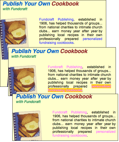
- Links within text blocks are not underlined. Users don’t always need the underline, for example on navigation bars. But when a link is within a text block, just changing the text color to indicate a link is not enough.
- Visited links are a pink shade. I checked this on two different monitors—and the color is just plain hard to see. Better to stick to the standard magenta than lose visibility.
- Link labels are not clear. Users should have a reasonably good idea of where the link will take them before they even click on it. Ideally the headline on the landing page will be the exact same words as they clicked on to get there. In four paragraphs Fundcraft uses seven links, duplicating two of them with different text. Only two of the links had the same headline on the landing page as the word that led to the page.
- Hard to see color combinations. On the top navigation we have dark green text on green buttons. The contrast isn’t good, and some people will have trouble reading it.

8. Labeling and Language – A
Everything on Fundcraft.com is in plain English, no jargon. Simple and easy-to-understand labels such as “Create Your Own Cookbook” and “Coupons” and “Customer Books.” “Site Map” was probably the most technical sounding term on there. This site uses language that will be easy to understand to their customers, and assists users in finding what they want.
9. Readability (Content Density) – A
Fundcraft.com is an uncluttered, well-balanced, easy-to-read site. There are consistent graphic elements at the top of the page, giving a visual anchor, and usually one additional graphic within the content portion to prevent becoming a text-heavy site. The column width is in the 10-15 word range, with good contrast between the text and the background (expect in visited links—see Affordance). The sans serif font and minimal use of bold makes reading easy on the eye.
10. Organization – A
Primary task links on Fundcraft.com were sprinkled over all four quadrants on every page. This leaves me with a quandary, as our scorecard says this earns an A. But, the links feel so randomly placed, often showing up within a text block or image as a roll-over, that they can be very easy to miss. However, I will keep true to the Mequoda Website Scorecard —and those issues are covered in the navigation category. On Fundcraft.com, primary links are indeed found in all quadrants, page real estate is not wasted.
11. Content Freshness – F
I could find no evidence of updated content, no clear schedule, no dates of any kind on Fundcraft.com. This is a missed opportunity. Customers probably come once a year for their fundraiser, but keeping the brand top-of-mind by giving users a reason to visit regularly would be a clear bonus to users and a relatively low-cost marketing strategy. I can think of easy ways to do this right off the top of my head. For example, how about a “Recipe of the Day?” Or a “Hot off the Press” spot for recently published client books? Or, since marketing is a main purpose of the site—a specials section, with seasonal discounts or coupons? Or a “Cover Page Design of the Week”… should I go on?
12. Load Time – A
Fundcraft.com has a load time of 10 seconds on a 56k. This is great! This is the first “A” I’ve given in this category. I’m guessing a lot of those church groups are probably still slugging it out on dial-up.
13. Aesthetics – A
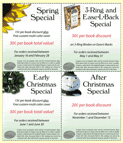
Fundcraft.com’s design is perfect for the site’s customer base and strategy. It feels homey, local, like the company-next-door. The clip art images and actual cut-and-paste coupons exemplify the do-it-yourself attitude that a cookbook creating customer will want to feel more comfortable with the endeavor. I love the different shades of green which allow for some texture to the page without being distracting.
The site could use some streamlining, both in terms of improving affordance, readability and navigation, and simple cleanliness, such as removing some useless items like the ticker at the top of the page. In Mequoda terms, though, we simply want the aesthetics to match the user mental model and to support the purpose of the site, which this design does perfectly.

14. Brand Preference – B
Fundcraft.com clearly supports the brand on almost every page with the consistent logo and use of the company name in the marketing text. The reason the site has earned a B, is because of the occasional hijacking of a visitor to another Fundcraft site in their network that does not promote or even mention the Fundcraft brand. I found myself all of a sudden, plopped onto InstantPublisher.com or Cook-books.com, having had no preparation that I was leaving the site I was on, or who these new sites were. These are of course part of the Fundcraft network, and should be linked from the hub site Fundcraft.com.
However, while the network strategy will change page elements such as having a new URL, new navigation, even new colors, it must be done in a user-friendly way. In other words, let the user know before they click they are going to another site, and make sure they know that you OWN that site. But instead, these satellite sites have completely foregone the Fundcraft brand, and therefore lost any trust that I had built up while on Fundcraft.com. This unnecessary confusion could be fixed with a little thought into strategic design elements throughout the network of Fundcraft sites.
Conclusion
You don’t need to get everything right to be making money on the Web. While there are many problems on Fundcraft.com, the company is successful and the site gets enough right to be a value-add to their marketing, customer service and distribution efforts. Fundcraft simply needs to put a little dash of strategic attention to the structure, design and usability of the site. A little careful preparation and the Christmas dinner will come together nicely, creating a happy family of customers loyal to the site and ready to spread the word.


very useful information! thanks for sharing!