eBay started a decade ago as a small online auction site with a short, four-letter URL and a quirky name. Then it took off like a rocket.
Of all the dot-com companies that were launched in the 1990s, it can be argued that eBay.com is the most successful. Twenty-four percent of all e-commerce in the United States in 2004 took place on eBay.com, up from 16 percent in 2000, according to IDC, a global market intelligence and advisory firm in the information technology and telecommunications industries.
eBay’s slogan is “The World’s Online Marketplace®” and, while it has imitators, no other online auction is nearly as large or as feature-laden.
Founded in 1995, eBay says its community now includes more than 100 million registered members from around the world and that “people spend more time on eBay than any other online site, making it the most popular shopping destination on the Internet.”
Clearly, these eBay people are doing something right!
So it is a somewhat daunting task to critique a site that has made its founders multi-millionaires and created full-time online businesses for hundreds of eBay power sellers.
[text_ad]
Nevertheless, I forge ahead, with humility in my heart and the Mequoda Website Scorecard at my side. Even the giants like eBay can learn a thing or two from a list of proven best practices.
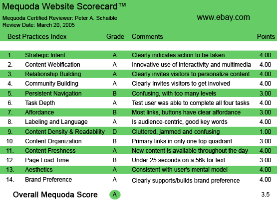
Using the Mequoda Website Scorecard, eBay scores high in implementing effective design practices. However, against the criteria of the Mequoda Best Practices, there is some room for improvement. (But who can argue with eBay’s success?)

eBay.com’s Mequoda Scorecard
1. Strategic Intent – A
eBay’s stated mission is “to provide a global trading platform where practically anyone can trade practically anything.”
It’s abundantly clear when you first visit this site that the objective is online commerce. Search for something to buy. Or sell your item—be it a Beanie Baby doll or a Lexus.
If you win the auction, pay for your purchase using PayPal, a wholly-owned eBay online payment company. PayPal now has 64 million user accounts, more than many major banks and credit card companies. Nine percent of all consumer e-commerce in the United States, and five percent globally, went through PayPal in 2004, according to Forrester Research, Shop.org and IDC studies.
You arrange delivery by contacting the other eBay member via email. eBay provides helpful tools to expedite all this. Everything is straightforward.
There are numerous rules to learn, and you want to follow them religiously so you don’t run afoul of the eBay authorities, and don’t risk getting a bad reputation with your fellow eBay members (negative feedback).
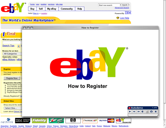
But the expected procedures and behaviors are made crystal clear, beginning with eBay’s excellent online “How to Register” Flash video. 
eBay has an excellent “How to Register’ Flash video right on the homepage.
2. Content Webification – A
Talk about your unique selling proposition?! Nobody else comes close.
eBay enables its members to interact in a way that wasn’t possible from traditional classified advertising or auctioneering. It was the first online commerce site to offer live auctions and, despite the recent emergence of a few niche competitors, it occupies and dominates this position like no other Web business.
3. Relationship Building – A
Anyone can search eBay for innumerable items offered for sale. But you must register to bid or buy. Registration enables the member to create personalized shopping pages, save favorite searches, request notification when most-desired items are offered for sale, and other benefits.
Once you list an item for sale, or place a bid on an offered item, you can expect daily email messages that inform you of the status of your auction. The computer programming mechanics behind the huge eBay machine must be enormous. The site automates nearly everything, yet places its customers foremost in the process with outstanding and ongoing communications.
4. Community Building – A
eBay is the ultimate “reach out and touch someone” website. If you’re a buyer, you can ask the seller questions about the offering. When an auction closes and a deal is struck, payment is made and the sale item changes hands. Now both buyer and seller have an opportunity to rate each other as ethical and honorable business people by leaving “feedback” for all other eBay members to read.
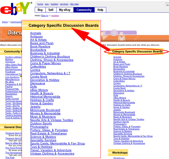
Additionally, eBay provides its members with more than 60 discussion forums and chat rooms. Yeah, eBay gets the community building factor right. 
eBay provides its members with more than 60 discussion forums and chat rooms.
5. Persistent Navigation – B
How could eBay not be a bit confusing?! How could anyone design a site of this magnitude without having too many levels?!
It’s like criticizing the world’s largest ocean liner for having too many decks. It’s unavoidable.
Navigation is fairly consistent throughout the eBay site. With such a myriad of offerings in countless categories, eBay, owing to its enormous size, must be a bit cumbersome to navigate.
To compensate and minimize confusion, the designers have done a reasonable job of adding a search engine box to nearly every page, and including consistent hypertext links to the homepage and various help topics.
And yes, it is intuitive. Newbies become eBay veterans after only a few hours of experience.
6. User Task Depth – A
If you’re preparing to sell an item on eBay, you’ll want to compose your item description offline, in a word processing program, proofread it, and then cut and paste it onto the eBay site. It’s simply easier and provides you with more control.
The essential tasks for the fully functioning eBay member are (1) sell an item, (2) bid on an auction, (3) pay for a purchase, and (4) leave feedback for the buyer or seller. None of these is brain surgery, and eBay has made it as foolproof as possible.
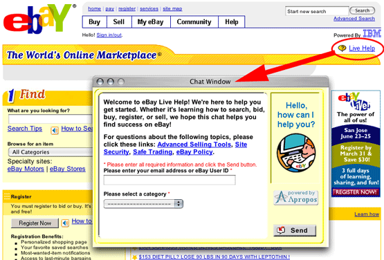
Additionally, help is only a click away. Just click the Live Help button at the eBay homepage, enter your User ID or email address, select a category, and then click Send. You’ll be connected with the next available eBay representative. 
Additionally, help is only a click away. Just click the Live Help button at the eBay homepage, enter your User ID or email address, select a category, and then click Send.
7. Affordance – B
Most hypertext links are blue and change to maroon when clicked. But some are maroon and don’t change color at all. In a few instances, graphic symbols that double as hypertext links are sprinkled into the mix of directions and actions. This is inconsistent and annoying, but not a major distraction.
8. Labeling and Language – A
The eBay directions and descriptions are written in Earthpeople talk. I found no 25-cent words on the eBay site until I got into the legalese of the User Agreement, and even that wasn’t unintelligible.
9. Content Density and Readability – D
Here, finally, is eBay’s Achilles’ heel. The site’s pages are simply too crowded.
In an attempt to derive additional income for special “featured” auction items, the designers have crowded everything possible onto nearly every page. You might argue that clutter is unavoidable on a site presenting this much content, but I disagree. eBay is dizzying.
Perhaps the MTV generation, with their short attention spans and epidemic attention deficit disorder, can cope with all the activity. But I find it very distracting. I would rather have clearer pages with more white space and be required to drill down for additional information, than be bombarded with so much clutter and so many hypertext options at every turn.
10. Content Organization – B
Quadrants, smodrants! You come to eBay to buy, sell, or browse. The site throws everything at you at once: search, sign in, register, check out these specials, jump to this category, etc., etc.
eBay is a very busy place!
The eBay homepage displays more than 50 hypertext links and the eBay site map includes links to nearly 200 page choices. So the new visitor has many options competing for his attention, but the site designers have done a reasonable job of organizing the material to help you through the maze.
There is always room for improvement, of course, but a site of this magnitude presents a daunting task to even the most experienced graphic designer or usability expert. Presumably, eBay’s management team has studied the interface or information and process flows.
At least we can say that primary task links on the eBay homepage are visible above the fold, as recommended.
11. Content Freshness – A
On any given day, there are millions of items across thousands of categories for sale on eBay. Hundreds if not thousands of new items are added each hour.
Additionally, the eBay management team continuously adds new tools and features to enhance user participation.
12. Page Load Time – B
It doesn’t seem to matter what speed your connection is, or how many graphics appear on the page, the eBay webmasters have found a way to make the site’s longest and most complex pages appear quickly. At least, that’s the impression I always get when visiting this site.
The actual clock speed, as determined by the Web Page Analyzer, is 22.52 seconds at 56K, but it seems much faster. In any event, I don’t imagine eBay’s enthusiastic users mind waiting much. Whether waiting to see if you’ve won an auction, or anticipating the final price you’ll receive for the item you’re selling, I doubt many people abandon eBay owing to slow download times.
13. Aesthetics – A
This is the most subjective of all the judgments we can make about a website. Consistent with whose mental model? It really depends on the demographic and psychographic profile of the user. And eBay members are so numerous, they include people of all ages and incomes, etc.
eBay.com, Amazon.com and Yahoo.com (among others) set the early standards for using the colors blue and ochre on commercial websites, and many have followed their lead. So these are the colors we have come to accept and expect. In the pre-Internet days of the 1960s and 1970s, these colors were embraced by such bricks-and-mortar companies as Visa (nee BankAmericard) and AT&T (pre-divestiture), so they are well imbedded in our consciousness (or sub-conscience).
eBay’s typefaces and graphic identifiers are attractive and functional, and there is an attempt to use them consistently throughout this massive site.
For whatever reasons, the graphics are different on the eBay motors site, a fully functional sub-site exclusively for selling motor vehicles. But the change in appearance is only momentarily startling and the navigation is intuitive if not entirely consistent.
Similarly, another sub-site, eBay Stores, employs a different layout, but does not distract or slow down the experienced eBay user.
Even so, the site’s pages are crowded and busy. See No. 9, above. 
For whatever reasons, the graphics are different on the eBay motors site, a fully functional sub-site exclusively for selling motor vehicles.
14. Brand Preference – A
With 10 years of success behind it, eBay has become one of the most recognizable brands on the Internet. The distinctive, colorful, upbeat eBay logotype appears on nearly every page of the site.
With its frequent email messages to sellers and “bidders,” eBay keeps its members informed of the status of their auctions and encourages daily return visits.
“Do you eBay?” is becoming as ubiquitous as “Do you Google?” When your business name enters the lexicon (and consumer consciousness) as a verb, you’ve got an undeniably powerful brand!
Conclusion
eBay continues to grow and prosper. Regardless of whether it follows all the Mequoda best practices, you can’t argue with its success.
This month (March 2005) eBay announced its launch of online classifieds websites in select international markets. Under the brand Kijiji, which means “village” in Swahili, these sites give people living and working in the same city a convenient, free way to meet, share ideas, trade goods, and find information or things they want locally.
Earlier this year (February 2005) eBay completed its previously announced acquisition of Rent.com, a leading Internet listing website in the apartment and rental housing industry.
“eBay’s potential for growth is greater today than it has ever been,” said Meg Whitman, President and CEO of eBay. “We believe our businesses will continue to grow ahead of e-commerce and we are extremely confident in the future.”
Not bad for a business with a short, four-letter URL and a quirky name.


Hello there, just turned into alert to your weblog through Google, and located that it is really informative. I am going to be careful for brussels. I will be grateful if you continue this in future. Many people might be benefited out of your writing. Cheers!
I’m glad I found your blog, there are some really useful tools here.
Thanks