Every part of your site has a purpose: to make money
 Website taxonomy is one of the most widely misunderstood – and carelessly executed – areas of subscription website publishing today. Far too many of the big players spend their money making their site graphically stunning, instead of practical and easy to understand.
For starters, your subscription website taxonomy must be clear so users can find the information they seek. If a website forces visitors to use the search function to find what they’re looking for, it’s already failed.
All Mequoda websites are designed to make it easy for anyone to figure out where they’re going … in seconds. But beyond that, your website taxonomy should also work to help you make money.
As you may know, the Mequoda Method is all about attracting visitors, converting them into email subscribers, engaging them with you and your brand, and monetizing those email subscribers by selling products and services to them (yours or other people’s).
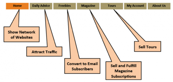
Here’s how our composite subscription website publisher, Green Gardens Network, has its website set up. This Mequoda Best Practice not only makes the site easy to navigate, but works to attract, convert, engage and monetize:

[text_ad]
The home page boosts the brand and shows visitors everything it has to offer, allowing for easy navigation. In addition, this simple organization and straightforward labeling of each section that gets a tab in the navigation bar makes it crystal clear what you’ll find at this site.
The Daily Advice section, such as the spot where you may be reading this post on Mequoda.com, is a portal heavily optimized for search, in order to attract visitors.
The free reports GGN gives away are also optimized for search, but beyond that, those freebies are there to entice visitors to hand over an email address in exchange for a freebie – to convert. The daily email newsletters and posts serve to engage your email subscribers. The Magazine and Tours sections, of course, are pure monetization.
With this tried and tested subscription website taxonomy, GGN visitors should rarely if ever need to use the search function, and as they process their way through the site via that user-friendly navigation, they also go through the funnel that turns them into paying customers.
Drilling down into subscription website taxonomy
Good subscription website taxonomy doesn’t stop at the navigation bar, of course. All that free daily advice and freebies at Green Gardens Network have to be organized, too. And we don’t mean that they’re just organized by date, either. After all, how often do your visitors search the Internet for information in your niche based on its publishing date?
Nope, those users want specific information, and you not only want them to find you when they search for it on the web, you want them to see all that other lovely content you have on the subject they’re researching. And that includes both blog posts and free reports.
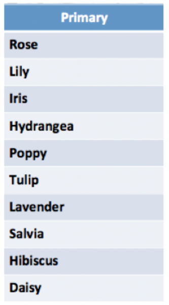
This is where Mequoda’s Best Practice of aligned website taxonomy comes in. All of your content should be neatly categorized in specific topics, which are your primary or uber keywords. Here’s a snapshot of the Green Garden Network website taxonomy, based on the type of plant:

All the GGN content is tagged in its audience development CMS by these primary keywords, plus any related keyword phrases (Knockout Rose, for example, in the Rose category). Anyone searching for content on Knockout Roses will hopefully land on content that’s been optimized for that topic, and presto! You’ve served up content that makes that visitor happy.
Best of all, GGN has also set up its CMS to deliver an Order Form in Editorial (OFIE) at the top of the page and text ads throughout the content, all promoting their free report on roses. GGN will probably convert this visitor into a subscriber, and all because their website taxonomy is set up correctly.
Not only that, but GGN also has its CMS deliver a list of related rose-tagged posts at the bottom of the page where the visitor landed, so he or she can easily explore the site further, admire GGN’s expertise on roses and become even more dedicated to GGN.
None of this is possible without the proper subscription website taxonomy. When it’s done correctly, the functions and benefits your website taxonomy delivers are legion. When it’s done incorrectly, a publisher is leaving money on the table.
If you need more insight into good subscription website taxonomy, you can learn more – lots more – at our quarterly Intensive.
And please don’t hesitate to ask questions in the comments below!


These records can assist one to be knowledgeable employment portal site gain access to is removed Merely speaking, obtaining USPS LiteBlue makes their task
If you have numerous brand names, we’ll personalize each website with its very own shades, navigating bar and also messaging to match the card, provider and also various other program aspects.