Serifs, sizes, and spacing, oh my! Font tips for every effective website design.

A Digiday story on publishers’ more progressive approach to site redesign reveals that in place of the customary massive overhauls every few years, magazines are now outfitting their portals with infrastructure enabling periodic tweaks and tune-ups rather than part-and-parcel transformations. The realization that redesigns are capable of doing more harm than good has fueled this change in thinking.
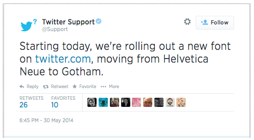
And fonts are at the heart of it, with one foot in traditional redesign theory and the other in this new gradual, evolutionary one. Changing the predominant font of your site is a reasonably simple process with perhaps the single biggest potential impact. Take, for example, the Twitter interface’s shift from Helvetica Neue to Gotham Narrow SSm: While the difference is fairly subtle, there’s certainly a difference. Helvetica’s thicker, fuller, and more etched qualities have given way to a sleeker, wispier, more fluid feel.
[text_ad]
Helvetica is a titan in the world of typefaces, but its grip on the decision processes of graphic designers is slipping a bit. Gotham, on the other hand, is gaining popularity across the web, most famously with its prevalence in President Obama’s stylish campaign content. So, it’s fashionable, but it’s also a practical choice for Twitter, which has struggled to fix some of the “scaffolding” issues of its busy, chock-full interface. Gotham gives all of that information a little more breathing room. At the same time, it doesn’t require the stripping away of features, which would elicit a far more negative response than the font change’s mixed one.
 There’s never going to be a tried-and-true checklist for choosing fonts for your website. We all have different types of readers, and tastes change frequently. If your readers are aged 65-plus you’ll be looking for a more bold, readable, and large font. If your crowd is the techie type, you might use smaller, cleaner fonts.
But even that rule of thumb is becoming more and more malleable. Sites across the web are implementing larger fonts with dominant, outsized art and more white space as a matter of cosmetic preference, in addition to current thinking on how readers consume information.
Ev Williams’ publishing platform Medium, for instance, has taken content design in a new direction, all the way down to its radical disavowing of comment forums.
In the end, the fonts you choose will need to be readable and serve the purpose you’re aiming for. Here are a few tips to help decide which styles may work the best for you:
Font tips for landing pages
In our testing, Arial works best for fonts above size 12, sometimes for 11. Verdana for fonts 11 and under. On marketing items for OFIE’s, salesletters, etc., we will use Arial but sometimes for short, large headlines and for a more elegant look, we might use a Serif, something in the Times family, not bold and with some good line spacing. If the headline is long, we’ll stick with a Sans Serif.
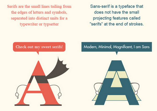
Not sure the difference between a Serif and Sans Serif font?
As mentioned above, some publishers have been experimenting with large-sized fonts with lots of white space.
For blogs, Medium, a pioneer in the big font, white space movement, is currently using Freight Text Pro, a derivation of Georgia.

Fonts that are easier to read
A sans serif font is easier to read online, while a serif font is easier to read in hard-copy print and in headlines. If you’re worried about readability, also pay attention to your white space. The judicious use of white space, even on the most content-rich pages, can keep text areas clean and contained. Below is where Reader’s Digest tested different version of their logo.

Serif vs. Sans Serif
The logo they ended up with was a serif font.

[text_ad]
Spacing your letters out
Simply spacing out your letters and paragraphs correctly can make a huge difference in readability. According to UXBooth.com, some studies will tell you to cap your line lengths at 45-75 characters. Other studies will tell you that users can read faster when there are more characters on a line. See what works for you.
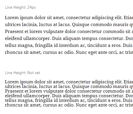
In terms of line height, take a look at this example from UXBooth, which will show you the difference in legibility when you add more space between lines of text:

Choosing font colors
The W3C, which all designers and developers turn to for current web standards, states “a contrast ratio of 3:1 is the minimum level recommended by [ISO-9241-3] and [ANSI-HFES-100-1988] for standard text and vision.” Have no idea how to find a color to fit those requirements? Try this online tool.
UXBooth.com notes that, “while these rules imply that higher contrast ratios are ultimately better, some people suggest that too high of contrast actually hurts to read, and use of off-white backgrounds, or off-black text instead of 100% black on white. There is however not much quantitative data in this regard. A few sources claim too much contrast can be difficult for dyslexic readers to view. With these considerations in mind, some designers opt to use off-blacks in attempt to make reading more pleasant.”
Let us know if you’ve gotten any specific feedback from you readers. I know that in the past, we’ve added buttons to increase font sizes for our older readers, but there are many out there that get complaints about fonts being too big. What are some decisions you’ve made? Let us know in the comments.
This post was originally published in 2013 and is updated continually.


Hi. You forgot to include that large fonts take up too much page space. I love reddit for its simplicity. This new sites are coming up with so little wording but such large titles that it takes forever to load. I personally get put off with such sites.
I agree. While designing a website, one must choose the right fonts that can be read easily. I hope the tips you have shared in this post will guide the web designers to choose the right font and font color for their website.
Wow, great tips! I really liked learning about the importance of spacing, especially in paragraphs. Thanks for sharing!