Form over function does not apply on the web as it often does in print
Magazine content can be the basis of a successful magazine subscription website, as long as it follows the basic rules of subscription website design and content management.
The trouble some publishers have when designing their site is figuring out where the magazine stops and the website begins. Considering the very different publishing schedule that magazine publishers have online, there are a few popular bad website design mistakes to avoid:
- Bad Website Design Mistake #1: Burying your frequency
- Bad Website Design Mistake #2: Hiding your content
- Bad Website Design Mistake #3: Neglecting keyword phrases
- Bad Website Design Mistake #4: Hiding social media buttons
- Bad Website Design Mistake #5: Using intuition over testing
[text_ad]
Bad Website Design Mistake #1: Burying your frequency
When magazine publishers first launched their websites in the early to mid 2000’s, they were updating their lead story once a week or once a month, treating the homepage like a magazine cover. This design, which buries your lead, shows users that you update your entire website at that frequency. It also sends the message that there is no reason to visit more often.
Websites that include their most current posts in a list from newest to oldest are using the homepage properly by showing users what’s new at the website, or new in a given topical section of the site.
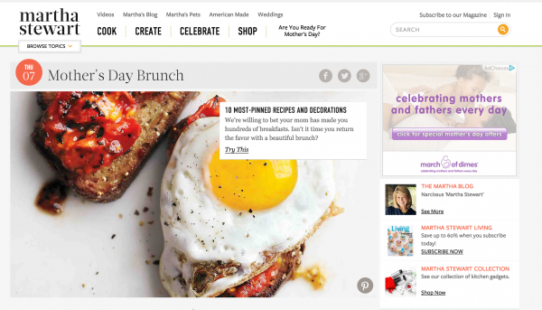
MarthaStewart.com: Good – the dates are big and bold.

Slate.com: Bad – not a single date except on the right-hand side in the “most recent” column.

Bad Website Design Mistake #2: Hiding your content
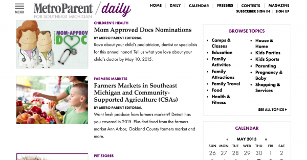
Websites that force users to find content via internal search discourages users from browsing. It also stops external search engines like Google, Yahoo! and Bing from giving the permalink topic page URLs they need in order to index and show your content by keyword cluster. On MetroParent, you can easily find topics on the right-hand side of the page in order to better navigate the site.

Don’t hide content from search engines, either. Use topic pages, tag pages and author pages, and use appropriate permalink structure. Example: Your website may have dozens of listings for seafood restaurants in the Back Bay area of Boston, but unless you have a permalink topic page with a URL that ends with “.com/boston-restaurants/back-bay/seafood,” you force the search engines to choose between the posts for your individual listings (MIUs).
Bad Website Design Mistake #3: Neglecting keyword phrases
Some publishers use the cleverest headline and navigation terms that make their content hard to find.
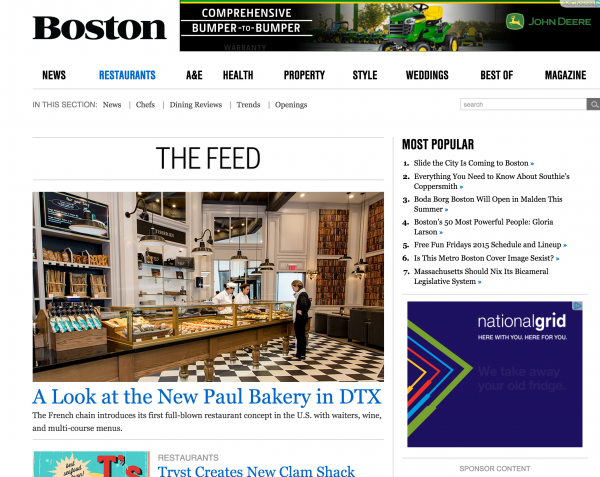
If you have a section of your website dedicated to restaurants, don’t label it “Dining Out” or “Places to Eat,” because that’s not how users search for restaurants. Filing a restaurant review post in a topical section called “Places to Eat” is like storing soap in the refrigerator… only you will know where to find it. On Boston Magazine‘s site, their section dedicated to restaurants is named exactly how you’d expect: “Restaurants”.
Use the free Google AdWords Keyword Planner to research how users actually search for the content on your website and use the most popular keyword phrases in your taxonomy, tags, headlines and body copy.
Bad Website Design Mistake #4: Hiding social media buttons
Many publishers are still under the impression that their email list is their only list. Not true! Don’t hide your social media buttons as if you hope people won’t click on them. Your social media followers not only click and read your content (when they see it), but they share it too, which makes those lists even more valuable.
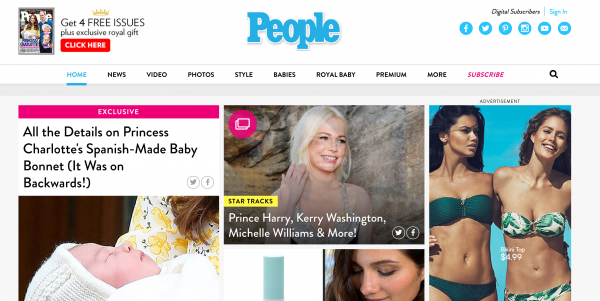
Is it any wonder that People.com is a social media darling? Not only do they place their social media links on the top of their site, but they also have links to share content right in the images.
Bad Website Design Mistake #5: Using intuition over testing
The first versions of most websites often end up being a bust because they’re launched without any usability tests. Designing based on a popular theory won’t always work. Just ask one publisher who recently redesigned their site to look more Pinterest-like and failed miserably as page views and engagement plummeted.
Have anything to add that we haven’t listed? What’s your biggest website annoyance?
Editor’s note: This article was originally written in 2014 and has been updated.


