I’ve had spinal meningitis, cancer, diabetes and attention deficit disorder. OK, not really. But I think I might qualify as a hypochondriac, along with a certain percent of the WebMD readership. (An issue that they write about, calling it “Cyberchondria”.) So, it was with joyful anticipation of all the new diseases I could self-diagnose, that I picked the task of reviewing the WebMD Health content site.
There is no shortage of health information online, from governmental to non-profit consumer groups, pharmaceutical-funded and alternative medicine sites, to the verifiable quacks. Everyone wants to make the best decisions about our healthcare, and determining what information is reliable, and what isn’t, can be a daunting task. This is something WebMD clearly knows—as seen on the homepage title tag “WebMD—Trustworthy, Credible, and Timely Health Information.” Therefore, earning your visitor’s trust is a key goal for a health information content site. I’m adding a “inspires trust” lens onto the Mequoda Scorecard for today’s website review.
My first impression of the site sets expectations of a lightweight consumer health magazine on the order of Self or Prevention. WebMD last month launched a print magazine available free to patients in doctor’s offices. However, I have upped my expectations for the quality of the health information provided, based on the depth of the physician and industry services from the parent company. One of the key players in the Internet Health field:
- “WebMD® Corporation provides a range of information, transaction and technology solutions that help consumers, physicians, providers and health plans navigate the complexity of the healthcare system.”
After doing my best to find indications of illness, I’m happy to say WebMD is a healthy site indeed, passing the Mequoda Scorecard with a well earned A. Let’s examine the site and study the successful practices.

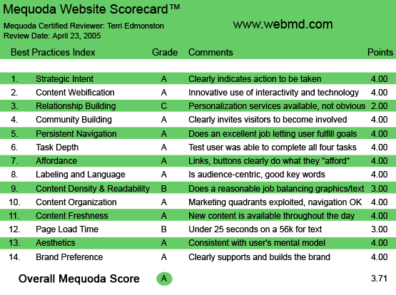
WebMD.com’s Mequoda Scorecard
[text_ad]
1. Strategic Intent – A
WebMD Health follows the Mequoda Editorial hub model, a free content site in the middle of an online network. WebMD Health, the Editorial Hub, is a search-friendly advertising-based site whose sole goal is to draw in a large volume of visitors. Visitors are then gently directed to the Editorial Hub’s satellite sites, where the fee-for–services model begins. The model works. WebMD Health draws in more than 20 million visitors every month, and had revenues of $131 million in 2004.
How do they get such healthy looking revenues?
- Selling online content and services directly to consumers
- Selling advertising
User based revenues:
The WebMD content network includes: WebMD Health Manager ($29.95 per year), WebMD Weight Loss Clinic ($4.99 a week or $21.62 monthly) and WebMD Fertility Clinic ($59.95 first three months, 19.95 thereafter). With excellent use of subscription marketing tactics—free trials and involvement devices (surveys)—free WebMD Health visitors are drawn into these paid subscription sites.
Sponsor based revenues: In addition to the standard banner and text link advertising, WebMD offers sponsored content pages to advertisers. For example, the WebMD University, where a single advertiser sponsors an entire university “course”—four weeks of interested eyeballs. In addition, WebMD is above board with their readers about what is sponsored, even dedicating a FAQ page to help users understand the difference between editorial and sponsored content.
The only rough spot was finding the adverting contact information or media kit. Finally, from the site map, I found the generic email address for the advertising department. This makes me do all the work, and as a media buyer, I would put WebMD on the bottom of the pile.
2. Content Webification – A
WebMD is webified and fun. Innovative interactive features were present, promoted, and for the most part, well executed.
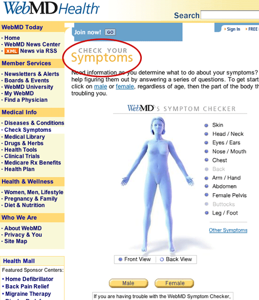
The first, and my favorite, is the symptoms check. This is an attractive and simple 3D rotating image of the male and female body at the top of the page. Visitors who have a problem, but don’t know where to start searching, can use this tool to find the right content. For example: “This pain in my left side isn’t going away, I wonder if I should go see a doctor?” The keyword phrase “Pain left side” isn’t going to get very relevant or useful results from a search engine. This tool allows you to simply point to where it hurts, just like you would at the doctor’s office. After choosing a body part, I am offered simply worded questions that lead me to the information that is most relevant to my problem. Simple, useful, fun and Webified.

This tool allows you to simply point to where it hurts, just like you would at the doctor’s office. You are then offered simply worded questions that lead to the most relevant solution to the problem.
The search features are well developed. I can search by keyword (the form is always at the top of the page), or through a directory system with alphabetical anchors, or I can search the category list in a drop down menu. The duplication of navigation methods might seem redundant, but some will respond to the drop down and others to keyword search. These duplicate methods can help a site to serve the variety of user navigation preferences.
From the Left Nav I surfed to Health Tools, which are also integrated throughout the site. I used quite a few of these tools, mostly the quizzes as I searched for a new disease to self-diagnose. Unfortunately, I’m healthier than I thought.
While the site webification was quite good, I would have enjoyed more audio and video options. For example, they could use their partnership with CBS HealthWatch to bring in some short video spots. As I will discuss in the next section, WebMD has instead directed their development energy towards relationship-building technologies.
3. Relationship Building – C
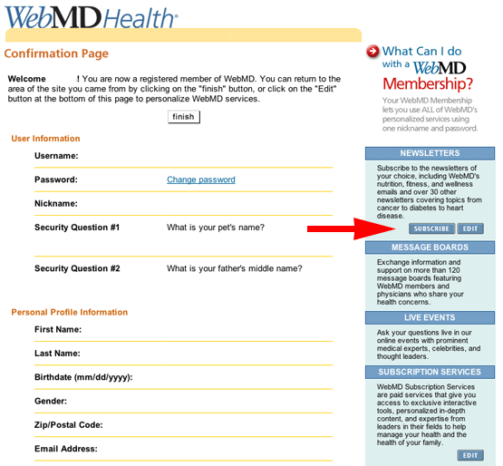
I wasn’t online long before I found myself entering my email and setting myself up with a profile. This is the first task of an editorial hub. Get my info, get a reason to contact me, and get me back. However, they have missed the boat in the newsletter opt-in. There was no check box within the form; instead I had to click on the blue box on the side right before hitting the “finish” button. I didn’t notice it, didn’t read it, and certainly didn’t click on it.
The next major boo-boo, is the lack of site personalization. As I’ve become accustomed to doing on Yahoo and many other content sites, I want to pick the health topics that are most important to me, and see them when I’m logged in. When I see content that’s important to me the minute I land, I feel more connected to the site as a whole.

They missed the boat in the newsletter opt-in. There was no check box within the form.
4. Community Building – A
As I mentioned in the first paragraph—I’m a hypochondriac. So I have a long list of problems that I was eager to discuss. As I found on WebMD’s chat rooms and community board, I’m not alone in my need to talk and share.
I went right to the chat rooms, and immediately found myself in a conversation about a health issue that is affecting me now (back pain). I found someone who had the same problem, and who was actually suffering more than I. The experience helped me to feel compassionate instead of self-pitying, and to have hope—a pretty intense result from just a few minutes on a website. This is the sort of experience that increases a consumer’s connection to a site, and it’s the ultimate goal of community-building programs.
The Boards (Forums) were well attended, although threads tended to be short. Comments were incredibly supportive, mostly people wrote something sympathetic and kind, or suggested solutions that had worked for them. I noticed in one of the sponsored forums that almost every answer seemed to point to the sponsor’s website. While as a marketer I approve of the revenue-generating program, as a consumer I felt a little skeptical. This was getting a little close to crossing the “trust” line, and blemishing the brand. Finally—the least robust execution is found in WebMD’s Live Events. An Event has a featured speaker, a doctor or an author, and is run at a specific time as a moderated chat room. The attendance was low and so was the interactivity. I felt like I was reading a list of sound bites from the featured author. This feature could be enhanced by audio or video, and better promotion to increase the audience size.
5. Persistent Navigation – A
The Navigation was excellent. The site uses Left Hand Navigation for most content and interactive site areas, and a top navigation for Search, and other site tasks (discussed in “Organization”). Everything was in the right place, and I had no trouble finding any feature or information page that I wanted.
6. Task Depth – A
Why would I go to an online health site? I’m either feeling sick and haven’t yet gone to a doctor, or I’ve been diagnosed and want more information. These are both information-seeking tasks, and are easy to accomplish on WebMD.
I’ve already discussed the general search tools. Excellently done. WebMD also offers audience-specific search. These filtered searches include finding a physician, drug lists by medical condition, lists and information about Clinical Trials and Medicare information by state. This focused-search functionality is not what I expected to find on WebMD, but it makes perfect sense. It adds much appreciated depth to the health-related information queries of typical visitors.
7. Affordance – A
Using as many navigational methods as the site does, including drop downs, search, inline links and of course Nav bars, WebMD has done an excellent job with Affordance. Clicking around this site is clear and easy.
8. Labeling and Language – A
I once worked on a search optimization project at a medical journal. We spent weeks discussing the correct labeling and language for our audience. For example, physicians will search for “Angina” or “Melanoma,” and consumers will typically type in “Chest pain” or “Skin cancer.” So, I was very curious to see what linguistic decisions were made on this consumer-oriented site.
Answer: They get an A. WebMD knows their audience. Categories and drop downs used layperson terminology. But today’s consumer is smart, and often a patient will become very educated on their particular disease, speaking in medical terminology like a physician. So I checked. When I searched using the medical lingo, the site’s search engine recognized what I was looking for and brought me to the right place. Good job.
9. Readability (Content Density) – B
I don’t think that the optometrists were involved in the design focus groups. These are cluttered pages. It’s a tough line to draw, the balance between navigation, advertising and content in such a small space. While WebMD has excelled at the first two, they have slightly sacrificed content readability. The text column width was either too narrow at 7 words or too wide at 16. I found myself taking the extra clicks to the printer-friendly version—even though I continued to read online.
10. Organization – A
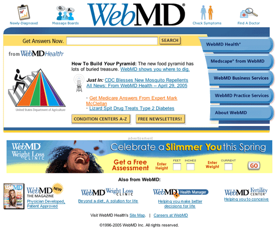
WebMD has efficient, and effectively organized, pages. The primary links in all four quadrants were easy to find, easy to understand, and even drew me in. In addition, the tasks each page is required to fulfill for both visitor and business needs are prioritized well. In the basic WebMD Health template we see the primary user task—reading content—in the middle. The primary site tasks, such as printing/emailing an article, and signing in/up, are found in the upper right quadrant. Finally revenue-earning space is placed across the top quadrants, and across the right side quadrant for image ads and text ad space in the upper right.
When you drop down below the fold the content continues, and I find links to more content and links to the “Health mall,” which are sponsor-featured sales pages. Important, but given slightly less priority to the tasks listed above.
11. Content Freshness – A
WebMD Health is more of a research and community site than a news site. The news and editorial content is updated daily, but visiting several times in a day won’t net the visitor any new information. However, because of the chat rooms and bulletin boards, there is always something new on the site, always a reason to check in whenever I get a chance. As seen in the Mequoda Scorecard, “Research has shown that websites with a high update frequency generate more repeat visits per month per unique user.” Thanks to their high volume of users and work in the community-building field, WebMD has made the grade in “Content Freshness.”
12. Load Time – B
At 27 seconds on a 56K modem, they are well above the 8 second limit. Thankfully, some of the interior pages clocked a little faster. However, even on my fast connection I often found that I was waiting longer than I’m used to, and caught myself starting to click away before the page fully loaded.
13. Aesthetics – A
Colorful and yet easy on the eyes, the light blue/mustard yellow combination fits a general consumer audience well. The site comes across as serious, but not boring. A few photos per page and careful use of graphic headlines add to the friendly feeling of this site. 
A few photos per page and careful use of graphic headlines add to the friendly feeling of this site.
14. Brand Preference – A
From button-down, peer-reviewed medical journals to colorful consumer magazines to drug company marketing sites to herbal remedy advocates, online medical information sources are endless. The publishers of these sites have a wide range of goals, and a savvy consumer knows that trusting the source is imperative when your health is on the line. That’s why “Brand” is perhaps the most important criteria for this particular review.
I trusted WebMD. While not all the content on the site is written by the site staff, for example postings on Boards or Sponsor pages or information from disease-specific non-profits, the source of every bit of information on the site was clearly marked. Also, I never felt like I was being told there was only one answer, one drug or one diagnosis. I was encouraged at every turn to talk to my doctor myself, or to seek a second opinion. WebMD the brand held up in my mind, even through all the voices I found on their pages.
Conclusion
WebMD has been one of the best sites I have analyzed. I have very little to complain about. Looking back, we see an A in almost every category. The special strengths are the community building and interactive tools. The criteria where we see some room for improvement include relationship building and content readability. WebMD will be my first stop in my next hypochondriac crisis.


I’m sure Google is sure of which well-known CMS all webbased software can connect to and perhaps watches them all thoroughly.
I’ve learn some excellent stuff here. Definitely value bookmarking for revisiting. I wonder how so much effort you place to make this kind of great informative website.
Good post. I learn something totally new and challenging on blogs
I stumbleupon every day. It’s always interesting to read articles from other writers and use a little something from their websites.
Hello There. I found your blog using msn. This is an extremely well written article.
I will make sure to bookmark it and come back to read more of
your useful information. Thanks for the post. I will definitely comeback.
regards Propolis