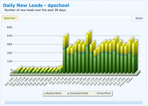
Popular blogger Darren Rowse shows how floaters increased the number of subscribers to his newsletter from 40 to over 350 per day.
A hot tactic for increasing conversion rates on your website is called a Floater. While it may look like a pop-up, it’s not. Floaters do not open in separate windows and therefore cannot be blocked or banned. Website publishers we’ve talked with report a two to three times increase in conversion rates when pop-ups are replaced with Floaters.
Although a Floater looks like a separate document floating on top of a website page, it is really just a layer in the HTML code. To the user, it looks a lot like a magazine blow-in card. While printing blow-in cards and inserting them into print products is cheap, Floaters, like their Pop-Up predecessors, are virtually cost-less. Like blow-ins and Pop-Ups, Floaters can irritate users if over used or used to promote offers that seem out of context to website users.
While floaters are incredibly successful in terms of collecting email addresses, it’s still a hard sell to get some publishers to put them on their sites. That’s why we just had to share when we heard what Darren Rowse (ProBlogger.net) did to his conversion rates on Digital-Photography-School.com with Floaters:
“Before using this technique I was averaging around 40 new (and verified) subscribers a day to my email newsletter,” Rowse said in his blog. “To be honest I was pretty happy with that. 40 a day is over 14,000 per year—who would complain about that!”
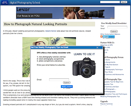
“However last week I decided to experiment with a feature that Aweber offers its publishers that I’d resisted using previously—the ability to collect subscribers using a ‘Pop Over’ subscription form.” Here is the Floater (or Pop Over as Aweber calls them) that Rowse is using:
“These Pop Over subscription forms are of course much more intrusive to readers than a sidebar form—this is the reason I resisted using them for so long. My fear was that they’d annoy readers, page views per visit would drop and that I’d end up with a lot of angry emails from readers,” Rowse admitted.
So what’s the result of Rowse’s test? “Average confirmed subscribers have risen to over 350 per day (over a year this would translate to over 125,000) so at least on that front it has been successful,” he says.
At 192,152 unique visitors a month (according to Compete.com)—approximately 6198.45 visitors per day—that’s almost an 18% conversion rate. Not too shabby!
[text_ad]
As for those worries about how the users would percieve his new marketing tactic, Rowse says he’s only gotten two negative responses. “To this point I’ve had two readers email me to complain about the Pop Overs. One saw them multiple times (I suspect because the cookies associated with them seem to be associated with different versions of the Pop Overs). The other complaint came from an iPhone user who said that the Pop Over took up the whole screen and was impossible to close (something Aweber might want to do some testing on).”
Rowse shows that reader engagement has even increased a bit. “Considering page views per visitor didn’t go down and I’m adding 350 or so new potential weekly readers to my blog each day I’d say reader engagement has actually significantly been increasing!”
Rowse admits that he’s not ready to use Floaters on his main blog ProBlogger.net because he doesn’t think his audience is ready for it—yet. “To this point I’ve resisted using Pop Over subscription forms here on ProBlogger as I think the audience here will be more annoyed by them than on my photography blog as ProBlogger readers tend to be a bit more skeptical of intrusive marketing.” He hopes to be be able to test Floaters on different types of visitors soon to— those coming from RSS, search engines and inbound links—which we’d love to see.


