One take-away from this in-depth session on landing pages and website conversion architecture, were all the different types of ads and placements that publishers can place on their site
“Email Conversion Rate (ECR) is a direct driver of email circulation,” said Don Nicholas, explaining the importance of collecting email addresses from multiple places on your website. “The better your conversion rate, and the more contextual opportunities you offer them to give you their email address, the larger your email list will become.”
Nicholas suggests building out as many Rapid Conversion Landing Pages as possible that offer free special reports. The more products you can give away in exchange for an email address, the broader of an audience you can attract.
Nicholas showed the audience different “conversion” ads you can use on your site:
OFIE (Order form in editorial): An OFIE is an embedded subscription form that appears on web pages either to order a product or service, or more likely to sign up for an email newsletter. This order form appears within editorial content on a website, most often found on Article Landing Pages. This is because it’s easier for a publisher to get more subscribers or sales by placing OFIE’s on a page that is most indexed by a search engine.
Example:
OFIN (Order form in navigation): These online order forms appear in the navigation panels of a website. The customer/end user fills them out to order a product or service or to sign up for an email newsletter. While they are usually smaller in size than OFIEs, an OFIN’s strategic intent is the same: to quickly capture your visitor’s name and email address in order to grant access to a free special report or a free copy of a magazine or newsletter. Some publishers may also simply offer a list of all their free reports, which is what we at Mequoda do.
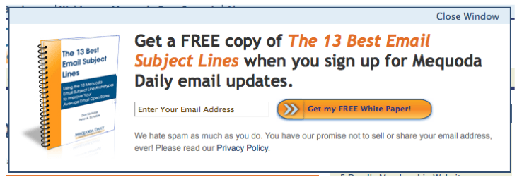
FLOATERS: Named a floater because it appears to float onto a webpage. This was a method created in order to fight back against pop-up blockers. While it may look like a pop-up, a floater does not open in a separate window and therefore cannot be blocked or banned.
The floater order form is a tactic for increasing landing page conversion rates and may be used at nearly every entry point on a website, though it’s usually better to set a cookie to let the floater appear to the user only once upon entry to the site. Floaters on average have about an 8% conversion rate.
Example:
TEXT AD: An online advertisement block that uses text links, or text-based hyperlinks, without graphics. These are found within editorial content to sell a product or to point directly to a Rapid Conversion Landing Page that collects an email address.
Example:
[text_ad]
Nicholas noted that “known users” shouldn’t receive these types of ads once they are logged in. You might substitute them for ads that promote paid products, or you might leave them out all together.


