Providing news and information on how to comply with Federal laws and international banking regulations is the niche addressed by this subscription website
Whether obtained from theft, smuggling, white collar fraud or drug dealing, crimes that generate a profit create a problem for criminals—how to process the proceeds to disguise their illegal origins.
The process is commonly called money laundering. Its purpose is to convert money gained from illegal activities into money that appears to have been earned legally.
Money laundering is an enormous criminal activity.
The International Monetary Fund estimates that the aggregate size of money laundering worldwide could be somewhere between two and five percent of the world’s gross domestic product.
Using 1996 statistics (apparently the latest available), these percentages would indicate that money laundering ranged between US $590 billion and $1.5 trillion. The lower figure is roughly equivalent to the value of the total output of an economy the size of Spain. (Source: Financial Action Task Force on Moneylaundering.)
Money laundering is a problem for non-criminals, as well. Financial transactions involving tainted money are typically conducted with legitimate businesses, which can be unwitting dupes in the process. In 1986, the United States became the first country to make money laundering a crime.
Since 1989, Moneylaundering Alert, a print newsletter, has been an authoritative source for information on money laundering in the United States and around the world. Each month, Moneylaundering Alert reports the latest news, developments and guidance in the money laundering field worldwide, including legislative, regulatory and enforcement action, money laundering schemes, money laundering control initiatives, and guidance on money laundering compliance for financial institutions and professionals. An annual subscription is US $445.
Moneylaundering.com Premium is produced by the editors of Moneylaundering Alert. It provides access to more than 2,000 articles from the last 14 years of Moneylaundering Alert, all of which can be searched by keyword. An annual subscription is US $695 for a single user license. A sister site, Lavadodinero.com, has much of the same content available in Spanish. The price: US $495 annually.
Moneylaundering.com Premium calls itself the world’s leading authority on money laundering news, guidance and analysis: your around the clock, around the globe anti-money laundering analyst-assistant.
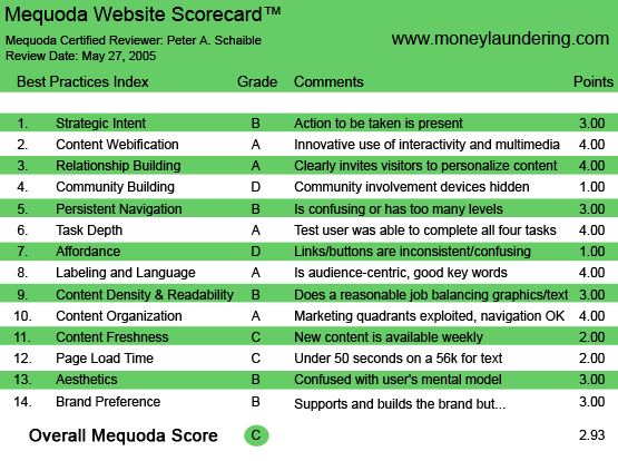
Using the Mequoda Website Scorecard, Moneylaundering.com Premium earned a rating of C.

Moneylaundering.com’s Mequoda Scorecard
[text_ad]
1. Strategic Intent – B
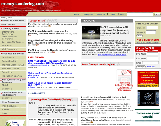
Links in the Moneylaundering.com homepage left navigation panel to About and Subscribe are above the fold, but strategically could be a little higher. Even so, there is no mistaking that this is a subscription website.
The visitor can either log in, join or browse the latest news. If the choice is news, he can’t get very far past the headline and a couple of teaser paragraphs before being prompted to subscribe in order to read the full story.
Short of that, he can sign up for a free weekly email alert. (See Relationship Building.)
Unfortunately, the homepage also uses some of its real estate to sell other products, even displaying a couple of ads that take the visitor away to other websites, which is seldom a smart practice. Too many distractions dilute what should be the primary intent, which is to get the visitor to subscribe. Ads for additional products might better be moved to other “inside” pages.
2. Content Webification – A
Moneylaundering.com excels in using the medium of the Internet to enhance the value of its content. First, it offers a downloadable PDF file of a recent sample issue of Moneylaundering Alert, the print newsletter.
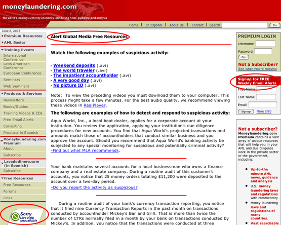
Second, it offers five free online videos that exemplify suspicious customer activity at banks.
Third, there is sometimes “live help” available from the homepage in the way of an interactive exchange of messages between the visitors and a moderator.

The site offers five free online videos that exemplify suspicious customer activity at banks.
3. Relationship Building – A
Very prominent on the homepage is an invitation to sign up for Moneylaundering.com’s free weekly email alerts, in order to receive the latest breaking money laundering news and analysis in your inbox every Thursday.

This free weekly email alert sign-up is very prominent on the homepage.
4. Community Building – D
Moneylaundering.com has a homepage link to forums, but when we visited, it was not working and the page could not be found.
5. Persistent Navigation – B
Navigation at Moneylaundering.com seems clear and intuitive, but includes some links that take the visitor completely off the site without opening a new window. This is amateurish. The addition of a few keystrokes of HTML code can preclude this deficiency and the lost visitors that it causes.
6. User Task Depth – A
Users can log on, join, sign up for a free ezine, order CD-ROMs and books, subscribe to the Moneylaundering Alert print newsletter (or download a PDF file of a sample recent issue) and register for Web seminars and all-day seminars. All quite straightforward and uncomplicated.
7. Affordance – D
This site suffers from inconsistent identification of hypertext links. Especially egregious is the inconsistent use of underscoring for links. Additionally, the links do not change color after having been visited. The designer has made the links change color when moused over, but the color is the same red that is used for other text on the site—not a good choice.
8. Labeling and Language – A
No surprises. No buzz words. The labels here are all friendly and consistent with my mental model for the content.
9. Readability – B
This site is busy and crowded. I would prefer more white space and different colors. I would expect a topic on how to comply with the law to use blue as a primary color, not tan and red.
Sadly, very few website designers choose to use a narrower fixed, newspaper width, opting instead for a flexible width that automatically adjusts to the page. The narrower width is so much easier to read, but because it diminishes homepage real estate, we don’t see it very often. This may be a false economy.
Moneylaundering.com would benefit from a narrower column width and more white space.
10. Organization – A
Critical marketing and contextual links are above the fold. A couple of display ads that take the visitor off the homepage without opening a new window are shown.
11. Content Freshness – C
It appears that Moneylaundering.com is updated with new content as it becomes available —usually several times a week. If I were an anti-money laundering compliance officer and a subscriber to this site, I would return frequently if not daily for news and industry alerts.
12. Load Time – C
According to the Web Page Analyzer, Moneylaundering.com downloads in 37.75 seconds at 56K. There are 25 images on the page for a total of 58,058 bytes. Replacing graphic rollovers with CSS rollovers would speed display.
13. Aesthetics – B
This is always the most subjective evaluation of a website. In my opinion, the graphic design of Moneylaundering.com works well enough, but would benefit from a different selection of colors and a more open layout, employing a lot more white space. Your mileage may vary.

In my opinion, and I realize it’s subjective, the design of the site works well enough, but would benefit from a different selection of colors and a more open layout, employing a lot more white space.
14. Brand Preference – B
Display ad links from the homepage to the Association of Certified Anti-Moneylaundering Specialists, Inc. and IntegraScreen Reports dilute the Moneylaundering brand. Additionally, the publisher could have helped build a brand by integrating the site’s graphics with the design of the Moneylaundering Alert print newsletter. That is a missed opportunity and a disappointment.
Conclusion
Moneylaundering.com is a serviceable website that is doing a lot of things right. It dominates its market niche and charges a substantial subscription price, so it is doubtless succeeding. With a little tweaking, Moneylaundering.com could be much more attractive and effective.


