Three publishers who pay attention to content freshness in their website homepage designs
When searching for something in a search engine, we’re typically searching for the most up-to-date information, or the most relevant information. Especially in circles like finance and business, we are looking for breaking-news type items.
Looking at stock predictions from three years ago won’t help us invest for the future, just like reading about how to set up a Facebook page from three years ago will be confusing and inaccurate today.
That’s why it’s incredibly important that, as publishers, we are true about when our content is published. Less frequently updated websites may actually do better with no dates on their content, while publishers with evergreen content may not even need them. However, if you cover topics of any kind that may be considered timely, then a date stamp is important.
For example, I often attach a year to many of my search queries. If I’m looking into how to hack my new Verizon Fios cable box, I’m probably going to attach 2011 to my search query, because I’m looking for the most recently updated article on the topic.
Now, not every Internet searcher is so savvy, but Google is. Google will post an article that has a date attached to it before they’ll post a static page. Even more, they’ll show the date in the description of the content in many cases, so not only is it visible to Google, but the people searching for your content can see how old your article is.
Does this do you a disservice if an article pops up that is years old? Not entirely, because at least you’re still popping up instead of being thrown by the wayside. The more Google (and readers) know about how recent your content is, the better.
Besides, if you have an “old” article that keeps popping up, who says you can’t update the article and change the date?
[text_ad]
Beyond that, using a date on your content also helps readers on your website make informed decisions. Seeing that you update regularly may encourage them to subscribe to your email, RSS feed or Twitter feed. Believe it or not, there are still websites out there who leave their entire homepage to featured content that offers no easy way to tell how old it is.
Here’s how we decide between good and bad design, in terms of frequency in our free Website Homepage Design Basics white paper:
Bad Website Design:
The upper left quadrant of your website homepage and topic pages are dominated by a feature story or stories that update at a much lower frequency than the rest of your periodical website. Many of the websites we’ve reviewed were updating their lead story once a week or once a month, treating the homepage like a magazine cover. This design shows users that you update your entire website at that frequency. It also sends the message that there is no reason to visit more often.
Good Website Design:
Websites that include their most current posts in a list from newest to oldest in the upper left website homepage quadrant are using the homepage properly by showing users what is new at the website, or new in a given topical section of the site.
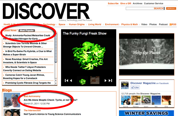
Check out the upper left quadrant of the Discover Magazine periodical website for a great example of how to let users know what’s new and thus encourage them to visit often.

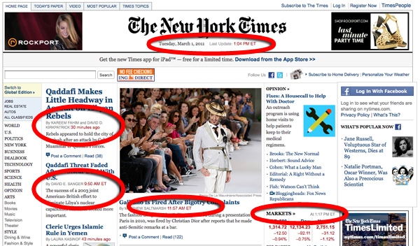
Obviously a site like NYTimes.com is even more rigorous, citing the exact times that the content is posted. Even the top of the website says when the site was last updated.

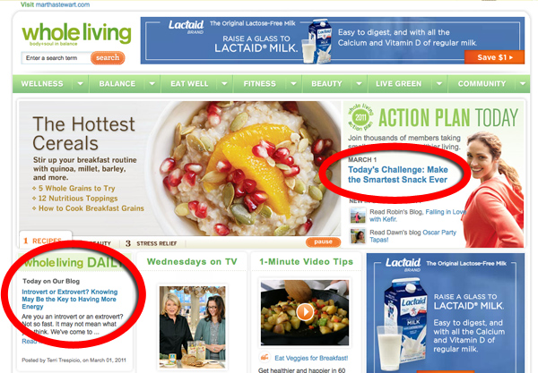
Even Martha Stewart knows that evergreen content—like the articles published on Whole Living—need to take priority on the homepage. Look how they’re telling folks (above the fold) about their daily content:

Website credibility plummets if the homepage promotes an event that occurred two months ago. Websites should be considered “works in progress” that are constantly updated if only so that they don’t bore repeat visitors.
Research has shown that websites with a high update frequency generate more repeat visits per month per unique user. With the average number of websites per user going down and the average time spent on the Web going up, it is imperative that the content on your website be as fresh as possible.


Great examples of different home pages that all place a premium on recency…
Good website design is about so much more than look and feel.
Don