Investors.com is an Excellent Example of a Publisher Taking Advantage of the Synergies Between Audience Information Needs and Technology’s Ability to Facilitate the Satisfaction of Those Needs
Investors.com, an online edition of Investor’s Business Daily, is the sort of site that the core audience loves with a fierce loyalty. With a focus on the signature stock analysis methodology, deep data diving and just the need-to-know news, the website doesn’t have a lot of splashy design and is exceptionally un-exciting for non-investors. Investors.com is a deep site that succeeds well in providing a plethora of ways for getting and displaying data crucial for the avid trader. Investment junkies love it; IBD knows how to speak to their core audience.
IBD was launched by an energetic, successful young investor named William J. O’Neil in 1984. Creating a competitor to the WSJ originally earned him a lot of derision, but he has built a publication that commands respect in the investment world. With a paid circulation of 215,000 and 50,000 digital edition subscribers, IBD is a player in financial publishing.
The parent company William O’Neil + Co. Inc created IBD by focusing on improvements in an underdeveloped niche in business publications. By “identifying the common characteristics of stocks that historically have performed well,” O’Neil made his own fortune, and through his books and lectures promises to help others do the same. In other words, he’s targeting those who love playing the market, active investors who are as addicted to data as gamblers.
- The strategic intent of the advertising/subscription hybrid site is immediately clear.
- Readers are encouraged to create community through online forums and real-world Meetups.
- Content webification gives the reader many options for slicing, displaying and downloading data.
- The language used for navigation, site icons and titles of IBD specific tools and features, are consistently explained and defined in a clear and polite manner.
- The links look like links and underlining and colors are used according to website design standards.
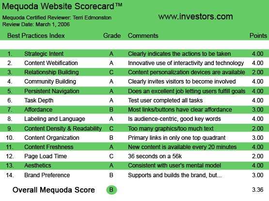
Investors.com‘s Mequoda Scorecard
1. Strategic Intent – A
Don’t you hate finding out a few pages in to a site that some of the content you thought you could read requires payment? IBD makes it clear from the homepage that I can’t expect a free lunch here. Additionally, I appreciate the free trial so that I can browse the content as if I were at a newsstand, before deciding to buy. IBD makes the value proposition visually obvious and easy to start with bright red buttons at the top—”Subscribe” or “Free Trial.” They have also put the IBD Store on the top navigation, so I know there is more to buy than just a single subscription. The key icon also visually reminds me that I will need to pay for some of the content on display. I know what they want from me, what I want from them and how to go about the transaction.
[text_ad]
2. Content Webification – A
In their early days IBD took market share from WSJ by improving product features for the investor segment. The David and Goliath story is trumpeted in their press kits, therefore I expected some truly innovative stuff on the website. I give the site an A for innovative use of interactivity, because on the major points they are right in front of the curve.
- Interactive stock screens and data selectors allowing the user to dig into the database.
- Personal portfolio “My Stock Lists.”
- Data downloads and export ability, into either Excel or text formats for continued research.
- An early adopter of Olive Software’s Active Paper for the eIBD digital edition of the paper, which allows for more personalization and saving articles to a library.
- Mobile data to your cell phone.
- Seven categories of RSS feeds.
- Workshops and Learning Center.
- Rates and Calculators.
- Community building with forums and Meetups.
I have to mention, the experience of trying to use all of the above methods of content webification wasn’t the best. It took a while to find things and to understand them, and some were provided by third party partners. This wasn’t about slick layout and splashy design. However, just by sheer volume of functions, IBD has shown that content webification is an important part of their strategy.

3. Relationship Building – C
Well-functioning relationship tools increase loyalty, and create switching costs for the user so that they are discouraged from leaving you when something better comes along. By creating a My Stock Lists, where the user puts in some effort to list their own stocks to be able to see personalized information at any time, IBD has done exactly that. Many sites have this function (many do it better too), but the point is to have the option for your readers, to create one more reason that switching to the next guy will be more work.
The trouble is, that’s the only thing in this column. It’s not innovative (anymore), it isn’t particularly well presented and it’s just not enough.
The eIBD, (the digital edition of the print publication, see Branding) includes more personalization features, for example “My Collection,” a library of user’s saved articles. The functionality here is part of Olive Software’s ActivePaper, the technology behind eIBD. However this is a separate product from Investors.com.
4. Community Building – A
Community building is a section of the Mequoda Scorecard where financial sites often fall flat. IBD has surprised me in this regard. Not only does the site explicitly recognize the value of community with a link in the navigation “IBD Community,” and a page devoted to helping users “seek advice or share experience with your fellow investors,” but they also make use of a community building tool that I wouldn’t expect to see on an investment site—a real-world Meetup option. There are 162 IBD groups worldwide, with 24,552 members. Some comments:
- “I have an avid interest in investing and I’m always looking for new ideas to research.”—Patty, Grand Blan, MI
- “There is power in numbers! Support is the greatest feeling one can have on individual investing.”—John, Tonawanda, NY
- “I know learning how to invest is more important than learning a job. Let’s get our money to make our money.”— JayJ, Wichita, KS
These are pretty passionate comments—they have tapped into something here. Since meetups are often used for local business networking, I shouldn’t have been surprised. Some of these groups were over 200 members, some were under 10. It is in the hands of the individuals in the group to make it work. Still, the return on publisher resources here is a good bang for the buck. This low-cost marketing tactic provides a way to use your brand-loyal readers to expand your brand reach. Just create the engine and your readers will bring the gas.
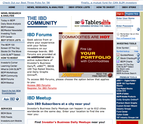
5. Persistent Navigation – A
IBD has the navigation basics down. The top, left and right navigation bars were well designed, well labeled and consistent. The key icon to indicate paid content was especially nice, but I wish it had been used more often as there were times I clicked on links and was surprised to find myself looking at a login blocker page.
6. Task Depth – A
A website isn’t worth supporting if users can’t easily do what they want to do—they’ll just leave. So this important Mequoda website scorecard criteria looks at some basic tasks for a typical IBD reader:
- Subscribe to premium access.
- Create a personal stock list, add and remove stocks that I read about and see up-to-date news on those stocks.
- Print an article.
- Increase my own investing skill and knowledge.
All of these tasks were a snap to complete. I want to give particular kudos to the IBD Learning Center which is a rich, online how-to book on investing. One of my favorite things about online publishing is the ability for a single site to provide news and the background to understand it. Learning tools are not useful to 80 percent of the savvy investors who read the publication, but for the newbies, those who will become IBD‘s future loyal readers, learning the basics is an essential need. IBD is presenting the core brand value (a “resource to help ambitious individuals… make better investment decisions”) to both customer segments, long-term loyal readers and new recruits.
7. Affordance – B
Basic conventions have been followed here. The links look like links and underlining and colors are used according to website design standards. Icons are used liberally, but they are well designed and explained, helping and not hindering the user. Some problems come from the use of partners (for example Bankrate and Meetup) to deliver some functions. When using a partner, usability often suffers. This is because when integrating the partner’s functionality into the publisher’s site, design is often ignored. This creates a visual dissonance for the user. In other words, they have a “Hey—which site am I on?” moment, which is not a good experience.
8. Labeling and Language – A
I confess, not being an active trader, I didn’t get a lot of the lingo I read in the articles. The editorial content is absolutely written for knowledgeable readers. The reason the site still gets an A (after I got over my personal insecurities) is because of the glossary, the definitions and explanations. For example, I clicked on “Daily Stock Analysis” and unobtrusively next to the section head is a link “What is daily Stock Analysis?”… there’s my answer.
The language used for navigation, site icons and titles of IBD specific tools and features, are consistently explained and defined in a clear and polite manner throughout the site. They have balanced basic language to facilitate site usage with high-level, audience-specific lingo within the editorial content.
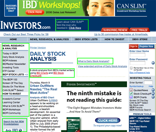
9. Readability (Content Density) – C
I hated reading content on IBD. The articles often had only 10 words in two shmushed lines above the fold, after the headlines, navigation, advertising, bylines, dates etc…. had taken up most of the screen. The balance of advertising to content was simply disturbing. I wanted some white space, some relaxation for my eyes. The exceptions here are features—such as the IBD Stock checkup or the IBD Charts—which are given plenty of space as advertising is pushed to the side on these pages. This betrays the prejudice of the publishers—the sacred cow here is the data, not the editorial.
There are other ways to read the content. You can read the exact replica of the print publication either online using ActivePaper (by Olive Software), or download the PDF by date. ActivePaper takes some of the benefits of HTML, hyperlinking, speed and interactive management, and pairs it with the design flexibility and readability benefits of PDF files. I thought eIBD was cool, but still clumsier for online browsing than the HTML version. Everything was a trade-off, and none of the options provided a good reading experience.
10. Organization – B
The organization of the IBD pages varied greatly, depending on where on the site you found yourself. Some pages were almost all marketing, badly divided between external advertisers and internal house ads. Other pages, such as the IBD charts or Stock Checkup, threw out most of the navigation to give more space to content/data and external advertisers. None of the pages managed a pleasant balance between the groups vying for space: editorial content, internal marketing and external advertisers. IBD still earns a B, however, as primary links and marketing links were always available and visible, even inconsistently balanced.
11. Content Freshness – A
Stocks are ideal for content freshness. The IBD stock price and volume data is updated continuously throughout the day on a standard, 20-minute delay basis.
12. Load Time – C
Investors.com takes 36 seconds to load on a 56k modem, earning the site a C.
13. Aesthetics – A
For investing and financial sites, it seems that monochromatic color schemes heavily reliant on careful shading are as de rigueur as short hair and a cell phone. The strong grid layout, dark/light/grey blue palette (with the occasional red button accent), dryly present the information without overshadowing it. The aesthetics of the site fit the typical 50+ wealthy male user like a well-tailored suit.
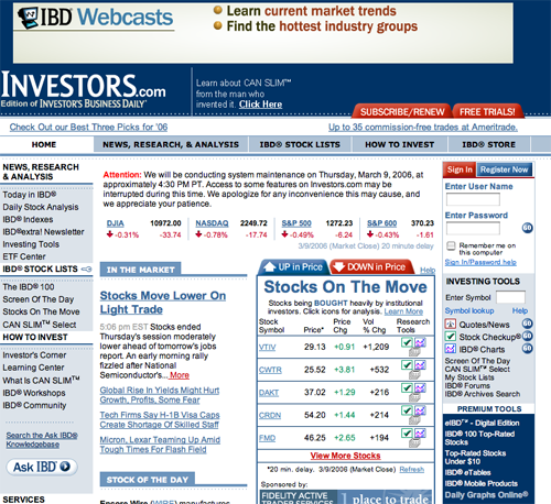
14. Brand Preference – B
The main brand name Investor’s Business Daily is the print publication, and goes by the acronym IBD. We’re reviewing the website, which like many print brands has varied the Web name to “Investors.com” and in a smaller font “Edition of Investor’s Business Daily“. There is still another iteration “eIBD”, which is the digital edition of the print publication. So far, the count is four separate names appearing on the website for what is essentially variations of the same product.
In addition, we have further complications of the situation as the brand IBD is part of a larger group owned by William O’Neil + Co., including CAN SLIM™ and Daily Graphs Online, both of which are separate products. (CAN SLIM™ is still under the Investors.com URL, with a new navigation in the sub-site design. DailyGraphs.com is a completely different URL). Yet, they both appear integrated in the navigation of IBD as if they were part of Investors.com.
That being said, the brand is basically supported and built upon throughout Investors.com, as it often refers to the print publication, and frequently uses the acronym IBD on the site to identify features (The IBD 100©), tools (IBD Community) and charts (IBD eTables).
It’s good business sense for a publisher to slice and dice the content to provide different bundles of features and benefits to different audience segments. That common business tactic leads to the common business problem of over-naming, overlapping names and confusing hierarchies. Consumers don’t want to work too hard, they don’t want to memorize 10 names and figure out what the subtle differences are. It’s the onus of the publisher to choose names carefully and present differences to the consumer clearly. In other words—I understand where IBD is coming from, but they haven’t handled it very well. A little cleaning up is in order.
Conclusion
Investors.com is unusual in publishing in that it started as a print newspaper, but in reality it was never about news. At the core it was always a research tool. The source information and a target audience create a situation that is almost made for the Web. In other words, people who like to play the market like lots of data, there is a lot of data to be had and the Web is good at distributing lots and lots and lots of data.
Therefore it is no surprise at the successful way IBD has created many product options for their customers, the way IBD uses interactive functionality to manage data online and to create custom data screens and downloads. This is a great advantage the Web has over print. There are only so many pages a paper will put out, but there are as many ways to view the data as there are investors reading it.
Investors.com is an excellent example of a publisher taking advantage of the synergies between specific audience information needs and technology’s ability to facilitate the satisfaction of those needs.


