The Incredible Website Usability of Craigslist.org is a Key Component in the Success of this Community Phenomenon.
Craigslist.org (CL) was a simple online community classified site started in 1995 by Craig Newmark (yes, Virginia, there is a Craig). The originally-non-profit site was incorporated in 1999. There are 190 versions of the website—localized by city—throughout the world, featuring free classified advertisements (jobs, housing, for sale, services, personals, gigs and community) and forums.
Although Jim Buckmaster was brought in as CEO in 2000, Craig has kept the titles of Founder, Chairman and Customer Service Representative. Having the company founder list “Customer Service Representative” among his titles would seem like a cheesy bit of PR, but in this case there is enough evidence to support the truth of the intent. Craig has kept his “service mission and non-corporate culture” values central to how he runs the company. For example:
- The site has a peace symbol favicon, and keeps a dot-org level domain as well as a dot-com.
- Craig’s Blog talks about his personal views on Internet (and other) issues, not an excuse for CL PR.
- Users can comment on corporate decisions, and negative comments are not removed.
- Although as a private company CL could keep a lot quieter, the recent Fair Housing lawsuit (in Chicago) is publicly discussed on the site.
- CL accepts no banner advertising.
- CL runs a non-profit foundation.
- The About pages include words like: inclusive, giving a voice to the disenfranchised and humane, non-commercial environment.
This touchy-feely community site has had some serious business success. Craigslist has more than 10 million users and eight million classified ads each month. While there are no public revenue numbers, given the simple business model, we can make a reasonable estimate. The site accepts paid listings for job postings from NY and LA ($25), and SF ($75). With about 1000 listings per workday, multiplying out for 260 workdays per year, revenues for 2006 should be at least $33 million.
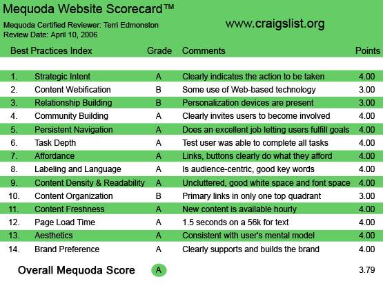
Craigslist.org’s Mequoda Scorecard
Craigslist Estimated Annual Revenues
| City | Price | Listings per Day | Revenue per Day | Revenue per Year |
| NY | $25 | 1000 | $25,000 | $6,500,000 |
| LA | $25 | 900 | $22,500 | $5,850,000 |
| SF | $75 | 1100 | $82,500 | $21,450,000 |
| TOTAL | $33,800,000 |
Notes:
Listing per Day = average volume on a weekday. Listings on weekends average ~100.
Revenue per year multiplies Revenue per Day x 260 weekdays a year.
The $10 real estate broker fee in NY is not included, as it was postponed as of this writing.
The Market: Forrester predicts the online classifieds market will be $4.7 billion by 2010. In 2004, eBay bought 25 percent of CL shares from an ex-employee—resulting in loud screams from many users. While no changes have been made yet, the stakes are getting higher. Microsoft has just launched some direct competition—Windows Live Expo, with a lot more bells and whistles, while Google Base is in beta, and other big players are also expected to be playing in the classifieds space soon.
The above paints a picture of a very interesting website design stand-off coming in the next few years. CL has a no-nonsense, bare-bones design that matches their non-corporate values. The new entrants will undoubtedly throw in all the Web jangles that bloat development and marketing budgets. Which design model will win out with the users is still up for grabs, but there is no mistaking the current success of Craigslist with their extremely basic website design.
1. Strategic Intent – A
CL started as a community site, not planning on making a profit. The strategic intent was to simply make an easy-to-use space for people to list local events and to post personals and stuff they wanted to sell/swap/find. The users are trying to connect and the site is trying to help them connect.
What is available on the site is clear from the plethora of links on the homepage. The basic point of the site for the new user is obvious. If the user participates and digs deeper, they will find even more than they bargained for with the active forums and “best-of-Craigslist” posts-of-fame page. The site goes from a shallow level of selling stuff to a deeper level of sharing selves. Connections.
2. Content Webification – B
CL has publicly stated that they see the future development of the site in languages and cities, more than in “bells and whistles.” While Microsoft is disagreeing with this theory (by including IM, blogging and mapping options on their competitive site), CL has stuck to their guns. CL is bare-bones Web content—pictures, text and hyperlinks. This has been a key component of the site’s success, but what is a bell-and-whistle today could become tomorrow’s must-have functionality. The lack of innovation in interactivity and multimedia technology here could hurt in the future, as other sites draw away users with more extensive options.
3. Relationship Building – B
Relationship building is about making a user feel like there is a personal connection between what they see on the screen and their own actions. A user should feel as if they have helped create what they see, as if they belong. Creating a post does achieve that end—once I’ve posted something on the site I have a relationship with what happens here—to that part of me online. However, while I am clearly invited to start the relationship, CL sort of drops the ball on the next step. The next time I come there’s very little to indicate I was ever here—even though I’ve posted and subscribed, the site doesn’t clearly welcome me back, and all future connections happen via my email. Improving the (hard-to-find) personalized homepage and putting name/login on every page would help.
4. Community Building – A
CL is one of the defining websites for Internet community building with the entire purpose of the site being to facilitate online community. The documentary movie, “24 Hours on Craigslist,” interviews CL users and vividly illustrates CL’s community building achievement. In one very intriguing example of the power of the CL community (and perhaps it could only happen in San Francisco), people used CL to create Flash Mobs where users would all read a post, and then follow the directions to appear in a specified place and time and take a group nap or play “duck duck goose” with complete strangers.
While Flash Mobs are an extreme example, in the movie we get to meet a whole spectrum of CL users. We meet usual people: a man selling a boat, a couple selling extra strollers. We meet unusual people: a single woman looking for sperm or a co-parent. We meet people who some might even find offensive as they tell us how Craigslist helps them in their quest for kinky sex. But the key is that this diverse group all found their own community on this site. They all belong.
More to the point, how does CL do this? Answer: respect the wisdom of the masses. Don’t control them, don’t forbid them, don’t require them. Just put the architecture up and get out of the way.
In practice: CL has a public forum where users post about site issues like design, spam control and charging fees. Much like Wikipedia, CL has essentially been built by the masses. What “control” is required is provided by the users themselves. The self-moderated flagging system prevents the abuse of the site and creates a space that is useful to the greatest number of people. The users want a successful site too, and CL lets them create it.
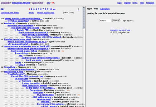
The Craiglists forums.
5. Persistent Navigation – A
The ultra-simple navigation scheme uses the most basic of Web standards: breadcrumbs. These nifty little links at the top of the page require a lot of back and forth to get about, but also require no path or process-learning on the part of the user.
6. Task Depth – A
Classified sites rely on one thing—users talking to each other. This includes:
- Finding and reading listings either by search or by navigational categories
- Replying to the listing immediately, via email
- Posting a new listing in the correct category
These are the ingredients of the site’s success. With the search form, the well-organized navigation, a “post” link at the top of every page and the poster’s reply email (encrypted for privacy protection) on every post, the site is fantastic at helping users accomplish their tasks.
7. Affordance – A
With the exception of Jakob Nielsen’s Useit.com, there might be no other site on the Web that follows affordance rules so strictly. All links are blue, change color and underline on mouseover. There is no variation in linking behavior. Other visual indicators such as bold, color text or yellow backgrounds are used appropriately (bold for headlines, color to alert the user to an important message). Added bonus: tricks such as small numbers next to a category link to indicate the number of posts in the category.
8. Labeling and Language – A
The language of classifieds has not always been a simple one. Remember the first time you read a newspaper classified and was completely confused by some of the abbreviations that were necessary to keep wordcount (and price) down? Luckily, space is not a problem on this site, and the language benefits. The navigation labels are extremely simple with words like “housing,” “jobs” and “for sale.” Even when abbreviations are used, we see only those that are standard usage such as “admin” for administrative, or “biz dev” for business development. The user never has to guess what something means.
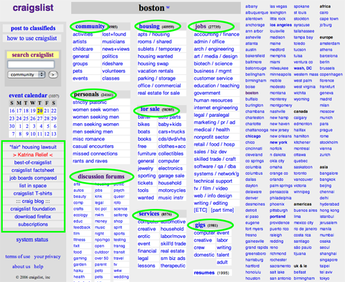
The navigation labels are extremely simple with words like “housing,” “jobs” and “for sale.”
9. Readability (Content Density) – A
Because of the basic design, CL is incredibly readable. Posts are given a page unto themselves, otherwise the site presents easy navigation with link lists or boxes of links. Perhaps not only the free, online nature of the listings, but also the readability of the pages, has helped Craigslist trump traditional newspaper classifieds so thoroughly.
10. Organization – B
With breadcrumb navigation and search boxes at the top, and the rest of the page given to either content or links to content, almost 100 percent of the site is devoted to primary tasks. Marketing, as you would expect on a site with these values, is shoved to the very edges. An example of marketing tasks for CL would be the “post” and “subscribe” links at the top, or the “RSS” and “Add to MyYahoo!” links that appear on the very bottom. While this makes for a very content-friendly site, allowing the marketing tasks to be a little more visible in all four quadrants would help users not have to scan and scroll to find them.
11. Content Freshness – A
With millions of people using the site, posting in every time zone in the world, I think we can safely say that this site has new content throughout the day. The breakdown here would be by city. S.F. might have thousands of new posts a day, while Zurich only has a few a week. The strategy still works, as large-volume cities like S.F. can support low-volume cities as they build up their own local users.
12. Load Time – A
Zoom! At 1.4 seconds on a 56K modem, Craigslist will prevent the most ADD-prone-multi-tasker-in-existence from browsing away.
Some users have volunteered to bring CL up to modern-day coding standards, removing the nested tables and re-coding the site in CSS, which is a great tribute to the site, but apparently a little unnecessary. The simplicity of the design leaves even old code super-speedy and functional.
13. Aesthetics – A
Classifieds were always the ugliest part of the newspaper, yet those same ugly classified pages were also the largest segment of newspaper advertising revenues (automotive, real estate and employment). My point? Ugly works.
This site is so ugly that users have volunteered to redesign it. A programmer’s version of anti-design, we see shades of grey boxes delineate sections, plain black text (or blue for links) with bold for headlines and no images except what a user puts up in their postings. Even the logo is simple text, not a graphic.
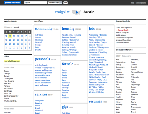
What the redesign might look like…
The site absolutely deserves an A in Aesthetics because the boring, simple and plain layout perfectly matches the user mental model. CL is about the posts, the stuff, the connections. The users of Craigslist would be skeptical of a spiffy-looking logo and a snazzy graphic-y layout. The design supports the purpose of the site, the purpose of the users. In other words, Craigslist is about non-commercial, user-driven community and the site design declares that.
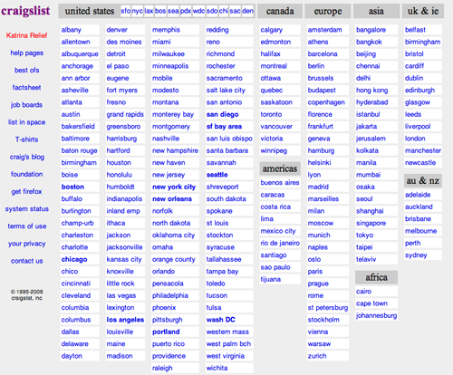
What Craigslist.org actually looks like.
14. Brand Preference – A
Without a logo, without a tagline and without a corporate branding campaign, Craigslist has built a worldwide brand almost by accident. The values of the company are a part of every decision, and visible on every page. This is branding from the bottom up, and it works.
Conclusion
Craigslist has scored an A in almost every category of the Mequoda Website Design Review Scorecard. Without a corporate board or shareholders to be answerable to, Craig was able to make decisions solely on the basis of user needs and requests. This site has emphasized user needs from the beginning and it shows. The incredible usability of the site is a key component in the success of this community phenomenon.


This is really attention-grabbing, You are an overly professional blogger. I have joined your feed and look ahead to in quest of more of your excellent post. Also, I’ve shared your website in my social networks
I’m now not positive where you are getting your information, but great topic. I needs to spend some time studying more or working out more. Thank you for great information I used to be searching for this information for my mission.
Where can I locate a web designer who can
create a small craig’s list like website
3 pages
Home page
Consignment page
Contact us page
Ability for users to post product for sale like on craig’s list
privacy email for users
search bar and product listed window
How much?