Devoting Too Much Homepage Real Estate to Website Navigation and Graphic Images Demonstrates a Compromise in the Selling Power of Text—a Major Mistake for a Lead Generation Site like CareerCoach.com
We have often heard prospects say, “Executives don’t want to read,” or “Your site has to really stand out to be taken seriously.” We suspect this perspective guided the development of Jerry Stein’s CEO Perspectives: Executives and Leadership site at CareerCoach.com. The site is graphics heavy to a fault, with elaborate transitions between “executive art” that accompany each page change. Unfortunately, the design relegates text set in a small type size way down on the screen—often, below the fold. Each time you choose a different website navigation link, a new visual appears, often accompanied by a left-to-right fade. The majority of the screen real estate on each page is devoted to the website navigation and the graphic images that accompany the link. Regardless of the actual success of this site, it is more an “image” site than an aggressive, lead-generating site
- The newsletter description is a restatement of the firm’s description and mission, rather than a benefit-oriented description of why visitors should sign-up for the newsletter
- The site does not feature any community involvement options: forums for exchanging ideas or commenting on matters of joint concern
- A short video of the firm’s founder, Jerry Stein, could have personalized the site—short audio testimonials from satisfied clients could add impact to the testimonials
- The site lacks a “marketing funnel” that would allow visitors to gradually build a relationship with the firm before making a commitment to go all the way
- Even if I were an executive, I doubt that I would return to the site, because—without content, only brochure-like “descriptions”—why bother?
Introduction
As I spent time preparing my CareerCoach lead generation website design review, I was reminded how often I’ve heard prospects say, “Executives don’t want to read,” or “Your site has to really stand out to be taken seriously.”
I suspect this perspective guided the development of Jerry Stein’s CEO Perspectives: Executives and Leadership site at CareerCoach.com. The site is graphics heavy to a fault, with elaborate transitions between “executive art” that accompany each page change. Unfortunately, the design relegates text set in a small type size way down on the screen—often, below the fold.
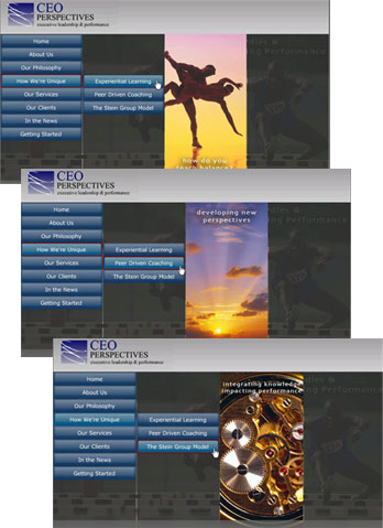
Each time you choose a different navigation link, a different visual appears, often accompanied by a left-to-right fade.
The Career Coach site features minimal text. The majority of the screen real estate on each page is devoted to the navigation and the graphic images that accompany the link.
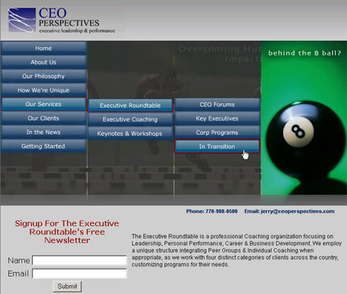
A full page view showing the typical spatial relationship between text and graphics at CareerCoach.com.
Regardless of the actual success of this site, it is more an “image” site than an aggressive lead-generating site.
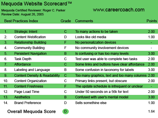
CareerCoach.com’s Mequoda Scorecard
[text_ad]
1. Strategic Intent – C
The default homepage focuses attention on one of the two call-to-action options on the site: the newsletter sign-in.
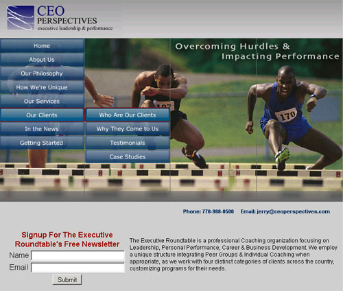
The homepage reveals the numerous nested navigation links, each with its own graphic image, and the newsletter sign-up.
There are numerous links to choose from, but there is little by way of structure to guide the first-time visitor through the site. “Which link should I choose first?” is likely to be the visitor’s first—and permanently unanswered—question.
Notice the preponderance of “We’s” and “ours” in the links. Most messages are written from the firm’s, not the visitor’s, point of view.
Note that the newsletter description is a restatement of the firm’s description and mission, rather than a benefit-oriented description of why visitors should sign-up for the newsletter.
2. Content Webification – D
With the exception of the changing visuals and the gray fade-out transitions that accompany each click of a navigation link, there is no use of audio or video on the site.
A short video of the firm’s founder, Jerry Stein, could have personalized the site. Short audio testimonials from satisfied clients could add impact to the testimonials many have contributed.
3. Relationship Building – F
Since there is no “content,” in the sense of articles or special reports describing recent challenges or trends in executive coaching, executive leadership or other contemporary topics, there is no opportunity for visitors to fine tune the site’s information offerings to their needs.
An RSS feed from the firm’s blog offers an easy way for the firm to frequently update the site, if they don’t want to prepare articles, special reports or compile survey results.
4. Community Building – F
The site does not feature any community involvement options: forums for exchanging ideas or commenting on matters of joint concern, etc. Part of this might be because no executive would want to admit they need coaching or are looking for a better position. Nevertheless, the tone of the site indicates a wall between CareerCoach and its market by not fostering some sort of joint project—perhaps an innovative type of intra-market communication.
5. Persistent Navigation – B
The navigation is persistent, if unrewarding. No engaging “story” or “understanding” emerges after reading the brief paragraphs that accompany each navigation link. Worse, in almost all cases, a slight repositioning of the screen is necessary to reveal the text at the bottom of the screen—which often doesn’t really provide convincing or substantive information.
6. Task Depth – C
The two tasks—the only ones possible on the site—consisted of signing up for the newsletter and filling out the “Getting Started” pre-qualification form for coaching.
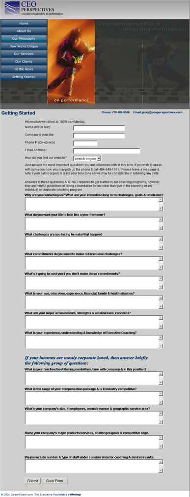
CareerCoach’s Getting Started assessment is logical and easy to fill out, yet it assumes that you are ready to jump right into a serious relationship.
The CareerCoach.com site does not offer a “midpoint” between signing up for a free newsletter or beginning a coaching relationship with one of the firm’s associates. In other words, the sites lacks a “marketing funnel” that would allow visitors to gradually build a relationship with the firm before making a commitment to go all the way.
7. Affordance – C
Most of the links and buttons were clearly marked. The question is “did they live up to their promise?”
The bulleted list on the “Experiential Learning” page, for example, contained underlined text that looked like hyperlinks, but were not.
8. Labeling and Language – B
I don’t know when the site went live, but several links were not active. These included the “News” and “Case studies” links, both of which loaded a new page that contained the disappointing phrase, “Coming soon.”
9. Readability (Content Density) – C
It is always interesting to compare sales letter websites, which are trackable and must depend on results to justify their continued existence, with sites that lack specific goals and measurability.
Salesletter, or direct-response, sites fill the screen with headlines, subheads and text. Untracked sites, however, tend to make the graphics large, and the message light.
This is definitely not a site for serious reading. The small type size and the relatively long line length would combine to discourage extended reading—even if the site was filled with persuasive copy and multiple calls-to-action.
10. Organization – C
If the goal of the site is to secure registration for the free email newsletter, or to receive completed assessments from prospects ready to begin a coaching program, the two calls-to-action are relatively obvious.
However, are these the correct two primary tasks? In the absence of knowing the defined role for the site in the firm’s marketing plan, it is impossible to define the site’s meaning or purpose.
11. Content Freshness – F
Freshness is not an issue, as there is no “content,” other than brochure-like paragraphs describing various facets of the firm’s offerings to executives and their firms. There are no background stories, credibility-building articles or press stories on the site. There are no archives of newsletter back issues.
12. Load Time – C
The issue is not particularly how fast the website reformatted itself each time a different navigation link was clicked, but how quickly or slowly it appeared to reformat and update.
I found the constant left-to-right, fade-to-grey and switch to a new graphic, to be very frustrating. I don’t know how much time it took, but I found it always stressful when parts of the screen briefly switched to black, often resuming with the same graphic image that had been on the screen before the transition!
13. Aesthetics – B
The graphics support the purpose of the site, from the “image” point of view. The site looks expensive and professional. It is definitely a “corporate” site, not an entrepreneurial one, and definitely not a consumer site.
The site projects a solid image, of a firm that’s going to be around. But again, what is the purpose of the site? Is the image appropriate for executives who need to survive in an Internet-dominated world?
14. Brand Preference – D
Even if I were an executive, I doubt that I would return to the site. Because, without content, only brochure-like “descriptions”—why bother? Updated content provides compelling reasons to revisit, but the absence of content leaves only a vacuum.
Conclusion
If website “looks” alone can persuade executives to hire CareerCoach, great! However, I suspect the website plays a relatively cloistered and symbolic role in the firm’s marketing. Most sales probably originate through networking, referrals, and cold calls. After making contact with a prospect, it’s relatively easy to say: “Check us out on the Web!”
But, as far as creating meaningful business opportunities with new visitors to the website, the site plays a far more background role.


My brother recommended I may like this website. He was once totally right. This submit truly made my day. You can not imagine just how a lot time I had spent for this info! Thank you!