Bottom Line Secrets: America’s best source of inside information is also a lesson on how to sell newsletters online.
Martin Edelston and Boardroom Reports are legendary in the direct marketing and newsletter publishing world.
The company was born about 28 years ago in Mr. Edelston’s home basement “with $5,000 and a dream,” as he describes it.
The dream was to present answers to issues confronting most Americans—how to be more effective at work… how to manage your money… how to save for your children’s educations… which foods are healthy and which aren’t—without being long-winded or confusing.
Mr. Edelston recognized that Americans share many of the same questions and don’t have time to wade through volumes of publications in search of the answers. He wanted to present information in a publication that is accurate, concise, clearly written and quickly read.
Today, Boardroom Reports publishes four periodicals and dozens of books “dedicated to the quest for the best, most useful and easy-to-read answers to the challenges of today’s fast-paced life.”
How does he do that? Mr. Edelston’s strategy was to create a network of thousands of experts who are top in their fields, ask them the tough questions and publish their insider perspectives.
One of the company’s publications, Bottom Line/Personal, is among the most widely read newsletters ever published, with over a million readers monthly. It covers hot topics ranging from investment advice to raising children to buying and selling a home and building a career.
Boardroom Reports is obviously very successful in the realm of print publications, so we were eager to see how well the company has used the Internet to market its flagship product.
Using the Mequoda Website Scorecard, BottomLineSecrets.com earns a solid B.
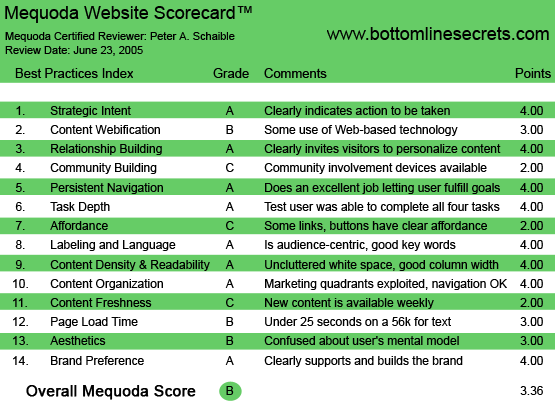
BottomLineSecrets.com’s Mequoda Scorecard
[text_ad]
1. Strategic Intent – A
BottomLineSecrets.com is a B-to-C website. The strategic intent is to get you to 1) order a subscription using your credit card on a secure page, 2) sign up for six free trial issues or 3) sign up for Bottom Line’s free email letter. Alternatively you can 4) do a search of the 21,000 online documents reprinted from Boardroom Reports print publications or 5) buy a hard copy book (or a watch, a fleece jacket or a baseball cap).
All this is straightforward.
2. Content Webification – B
The site search engine enables the user to search a treasure trove of free information from previous issues. Plus, the user has a choice of reading half a dozen current articles (“This Week’s Secrets”) by leading experts in the fields of health, real estate, relationships, time management and nutrition.
The product here is short, pointed articles. Don’t expect a lot of interactive tools that demonstrate webification. The generous sampling of content fills the bill.
However, there is a convenient button for sending a BottomLineSecrets.com article to a friend via email. This is smart viral marketing.
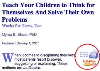
There is a convenient button for sending an article to a friend. This is smart viral marketing.
3. Relationship Building – A
Users can sign up for two different email newsletters (Useful Secrets or Daily Health News) and choose to receive them in either text or HTML format. Both are interesting and valuable, and both demonstrate the value of a Bottom Line Secrets subscription, where, presumably, similar content arrives via snail mail in great abundance.
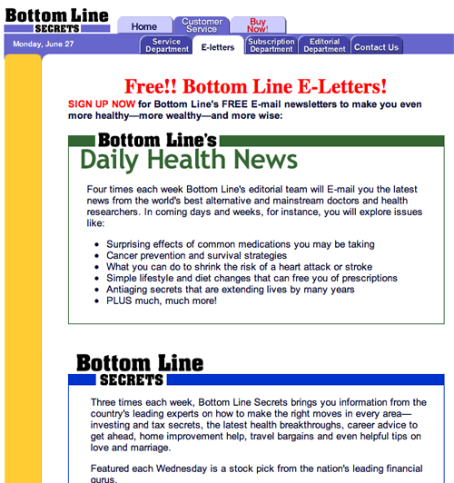
Users can sign up for two different email newsletters (Useful Secrets or Daily Health News) and choose to receive them in either text or HTML format.
4. Community Building – C
Bottom Line Publications print the opinions of leading authorities in many fields. Clearly the intent is to get readers to interact primarily with the information itself and occasionally with the authors—my own physician of more than 25 years writes for one of these publications.
But, there is no attempt to create an online community of subscribers. However, the site’s FAQs section explains how to make story suggestions, order reprints, contact authors, share comments with the editors and the publisher via snail mail, and submit a product or service to be considered for one of the consumer columns.
BottomLineSecrets.com could encourage greater community involvement by providing an online user comment section where one could offer a compliment or ask a question. It wouldn’t need to be public; although, with a moderator and some judicious editing to keep out vandals, it could be a public feature. The site might receive some flattering testimonials this way. I would certain provide one.
5. Persistent Navigation – A
Navigation on this site is clear, simple and intuitive—even elegant. There is a large top button for access to customer service and a clear hypertext link for updating email preferences. The user always knows where they are and how to get back. Even the order form for the Bottom Line Store enables you to return to Home, Customer Service, Privacy Policy, etc. I have no suggestions for improvement.
6. User Task Depth – A
This site makes it easy for the user to browse the sample content, buy a subscription or book, start a free trial or contact customer service. I only wish that every commercial website were as straightforward and simple to use. The Customer Service section is particularly useful and well organized, with excellent FAQs and answers.
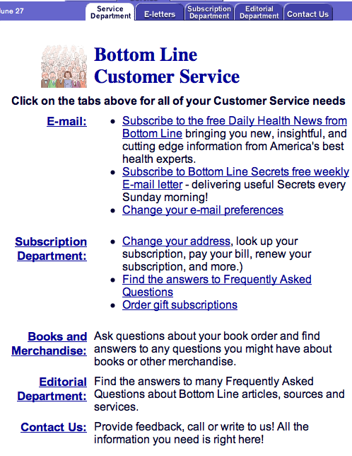
The Customer Service section is particularly useful and well organized, with excellent FAQs and answers.
7. Affordance – C
Links and buttons generally do what they are supposed to do. However, the colors for many of the hypertext links is red when it should be blue. And type should almost always be black. Using blue type confuses the user about what is a hypertext link and what isn’t. Not smart.
8. Labeling and Language – A
Clear, precise and audience-centric. No room for improvement that I can detect.
9. Readability – A
This site is uncluttered. It uses adequate white space and employs good column widths, type sizes and typeface. Some of the headlines are in all caps, which I don’t recommend.
Curiously, BottomLineSecrets.com is built on a narrow table measuring only 160 pixels wide. This makes it exceptionally easy to read, even though it creates an unusually wide right border. You get used to it quickly, however, and it doesn’t distract from the site.
10. Organization – A
This is not a content-heavy website, at least so far as its page layout and organization is concerned. There’s a ton of useful information here, and you use the search engine to find it, or browse using the “Best of the Bottom Line: Yearly Indexes.”
Critical marketing information and contextual navigation is all above the fold. Overall, this is a well-designed site.
11. Content Freshness – C
New content is available weekly in the form of “This Week’s Secrets.” More frequent updating would probably bring undecided users back more often, with the expectation that many would convert to paid subscribers.
12. Load Time – B
BottomLineSecrets.com is lightning fast, clocking in at 16.5 seconds on a 56K connection, according to the Web Page Analyzer. That’s a very respectable download speed. Could it be tweaked? Sure, but at what cost to content and graphics? I don’t recommend a change.
13. Aesthetics – B
The colors and graphics seem appropriate for the brand. Not my personal style, but there are no surprises here.
Personally, I would prefer a graphic or headline with an offer and a big promise, but that’s the marketer in me. (The name of your product or business is not a sufficient headline.) The site is consistent with the user’s mental model, especially the colors—red, white, black, two shades of blue and ochre.
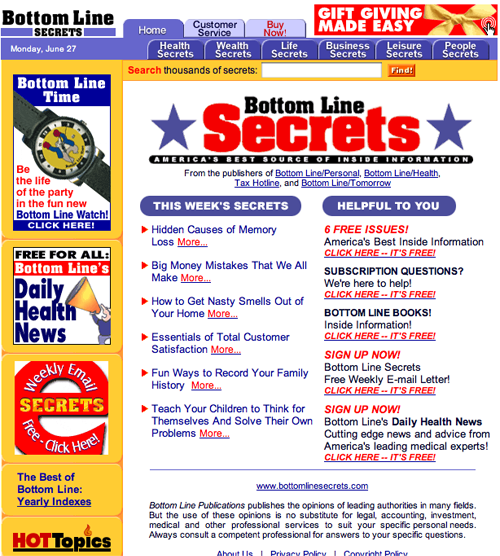
Personally, I would prefer a graphic or headline with an offer and a big promise, but that’s the marketer in me.
14. Brand Preference – A
The site clearly supports and builds brand preference and encourages return visits. Use of the print newsletter’s distinctive logotype/nameplate helps support the brand, even though those elements are not consistently used for branding Boardroom’s other print products, which is curious.
Conclusion
Americans are generally impatient. The Boardroom Reports publications have always appealed to our urge to get to the nitty-gritty of the matter in a hurry. Don’t bother me with details. Net it out. What’s the bottom line?
BottomLineSecrets.com nets it out too. It’s designed for speed.
I think that the Boardroom Reports publications, regardless of quality content, wouldn’t have succeeded nearly as well if they had different titles. The choice of words like “Bottom Line” and “Secrets” are just so, so, um, juicy!
And they combine so well with other mouth-watering words that copywriters can spin creatively. Words such as “inside information” and “unfair advantage” and “knowledgeable experts” make the reader believe the content is truly special and that they are privileged. The appeal is to our sense of self worth and ego. We all want to be part of that special group who are “in-the-know.”
That reminds me of the slogan for Hallmark greeting cards: “When you care enough to send the very best!” Who wants to be on the outside of that equation?
Not me! I want to be an information insider, too! Where do I sign up?
BottomLineSecrets.com (and its nearly identical website, Boardroom.com) succeeds by giving us a healthy taste of fascinating content, but not quite satisfying our appetite for even more.


I am trying to find out why I recieved new calender but no monthly issue. I know I sent infees for myself and my son.where is my normal copy?