The difference between $1.8M and $438K in new revenue is your conversion rate and architecture

At Mequoda, we do a lot of work with clients who are starting from scratch with online publishing and subscription website marketing. They get the full benefit of the Mequoda Method because we build their website to take best advantage of SEO and optimize it for conversion of visitors to email subscribers and, ultimately, buyers.
We also have clients come to us who put up a website years ago when the Internet first blossomed, and without any research or data to guide them, those websites were built, well, badly. Those early websites were an exercise in slapping the magazine on the Web, and organizing the site exactly like the magazine.
Unfortunately, Internet success is achieved in wholly different ways from the print era, and we now know that websites are not magazines … and magazines are not websites. Instead, your website is the place where you drive traffic and sell stuff. And as I said, its primary purpose is to convert visitors to engaged followers to whom you can market via email, and who will be eager for that stuff you sell.
In Mequoda land, conversion architecture is the backbone of a subscription website. Even if you’re generating modest revenues without it … if you could make more money, why wouldn’t you?
[text_ad]
The ruler of revenue generation: Conversion rate
The first clue that your website isn’t performing up to par is if your conversion rate is anything less than 4%. Honestly, some publishers we talk to have a rate of about 1% or less, so we know that conversion science isn’t common knowledge.
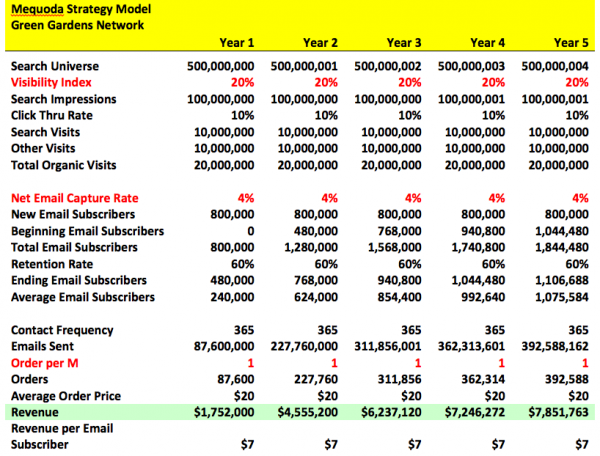
But it should be. Here’s why. As you’ll see below in a spreadsheet for our fictitious company, Green Gardens Network, we’ve assumed 20 million website visitors per year. A 4% conversion rate means 800,000 new email addresses, and based on our research, about 30%, or 240,000 of them, will be opted in to regular GGN newsletters and promotions. GGN will send emails to those subscribers 365 days a year, for a total of 87.6 million emails.
Again, our research shows an average of 1 order per thousand, so GGN winds up with 87,600 orders. Suppose those are magazine subscriptions or books at $20 each, and GGN is generating $1.752 million a year from that email list. And in five years? GGN will have earned $7.852 million by harvesting email addresses and marketing to those subscribers. And it all comes from that 4% conversion rate. Isn’t subscription website marketing grand?

[text_ad]
How to get there from here
But what does the 1% conversion publisher earn? That publisher only garners 200,000 new email subscribers per year, and sends emails to 30% of those, or 60,000. With only 21.9 million emails sent, the publisher gets 21,900 orders at $20 each … for a mere $438,000 in revenue that year.
I’m willing to bet most publishers would rather have $1.752 million.
So if you’re a 1% publisher with an established website, what do you do? If you were to rebuild your entire site, you’d do what Mequoda’s new website clients do: Set up your site in conversion zones, which are based on popular categories of your content and are created with SEO in mind.
As Mequoda preaches, those sites readily attract visitors and convert them to new audience members. Your ability to capture traffic from search – not your magazine departments – should be a top priority. Structurally, sites that are true content marketing machines use keyword research to anchor their website architecture. Primary keywords become categories and topic pages, and secondary keywords become tags and tag pages. Keywords are targeted carefully and are used on a daily basis in headlines, subheads, body copy, URLs, meta data fields, free report titles and internal links.
And herein lies the key to the 4% conversion rate: Every Web surfer who searches on your targeted keywords arrives at a landing page for a special report related to that search, which is free in exchange for an email address. And to do that, you must have all your content set up in discreet categories, or conversion zones.
Additionally, anyone who arrives via any page that’s assigned to that particular conversion zone will see a floater also offering the free report.
Without those zones, landing pages, floaters and free reports, your chances of converting that visitor are, oh, about 1%. That’s more like sheer good luck than marketing strategy.
So for long-established websites, we usually tell the publisher to pick one of his existing categories, create a free report based on promising keyword phrases, “sell” it on a well-optimized rapid conversion landing page to harvest email addresses, and then send out those promotional emails that will generate revenue. Those publishers may not get to 4%, but they’ll certainly break that sad 1% conversion rate.
Unfortunately for many publishers, who built their sites in the early days with exactly the same architecture as their magazine, their categories are often completely unusable as conversion engines.
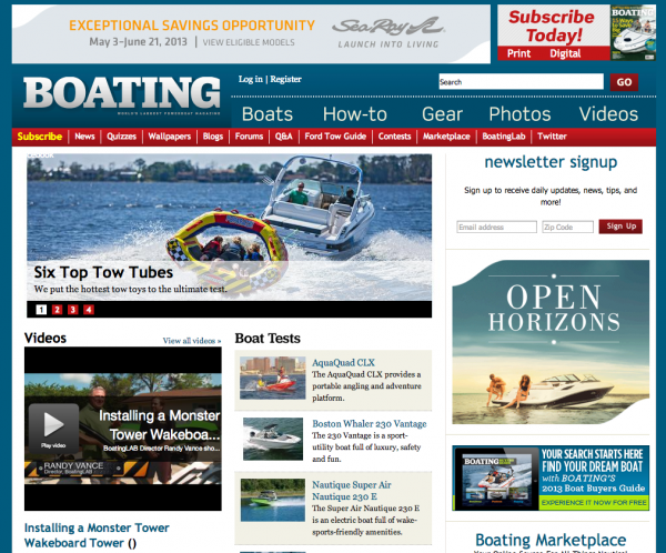
For the purposes of this post, I randomly chose a large publisher with a respected magazine and an established website to retrofit in my imagination: Boating magazine and Boatingmag.com. Boating bills itself as “The World’s Largest Powerboat Magazine,” and with total circulation of 161,794, it’s doing something right.
But at Mequoda we always want publishers to make even more money, so here’s what I’d do if Boating were our client. Of course, because Boating is not a client, I don’t know what their keywords or categories are, so I’m going to try to figure them out by digging into the site.
[text_ad]
Case study: Boating

First, a look at their navigation tabs.
![]()
This is a perfect example of a website set up exactly like a magazine would be: by department, as if a reader wants to use the website the way they read magazines from front to back. Nope, website users expect to go straight to the information they need, just as they can at other non-magazine websites. But at Boatingmag,com, these departments each have a tab in the prime real estate of the nav bar for some reason.
These tabs are an important part of your navigation and should help readers find what they’re looking for quickly. And we know that readers of magazines that cover pastimes and popular consumer items, like boats, cars and cooking/food, are not, trust me, looking for quizzes or contests.
What they do look for are things like “outboards,” which we know because that keyword has 12,000 annual searches. But the home page visitor certainly wouldn’t know how to find information on outboards from the nav bar – and any time you force a visitor to use your search tool, you risk sending them away. But more on the navigation later.
After taking a look at these nav tabs, I browsed through some “channels,” which were delivered as filters for a search I performed:
- Boats
- Boat tests
- Cruise
- Sport
- How-to
- Photos
- Boat ownership
- Engines
- Gear
Some of these might make powerful conversion zones to drive traffic to, each with an aligned free report.
Next I drilled down to find other categories of content. A look through their tags delivered some other types of content:
- High Performance
- Mercury Marine
- Outboards
- Sport
- News
- Monohull
- Boat Tests
- Seamanship
- Nor-Tech Boats
- Donzi
- Photos
- Concept
- Cruise
- Cabo Yachts
- Express
- Fishing
- Fishing Boats
- Tiara
- Express Cruisers
- Formula
Now I have a pretty good idea of what kind of content they deliver:
- News, reviews and tests of boats, by manufacturer (Mercury Marine), style (Monuhull) and the activity the boat is designed for (Cruise)
- Content about the activities themselves (Fishing)
Keeping in mind how people search – “how to [activity],” “[manufacturer] boats,” “[style of] boats”, or “[activity] boats” – I would reorganize the website by the following categories, along with related free reports. In real life, my categories would be listed by each manufacturer, style and activity, but that’s a lot of bandwidth for a blog post, so I’m summing them up:
- [Manufacturer] Boats
- Aligned free reports: Best [Manufacturer] Boats of All Time
- [Style] Boats
- Aligned free reports: Best [Style] Boats of All Time
- [Activity] Boats
- Aligned free reports: Best [Activity] Boats of All Time
- Boat tests
- Aligned free report: Boating’s 10 Best Tips for Boat Buying
- Engines
- Aligned free report: Boating’s 10 Best Tips for Engine Maintenance
- Gear
- Aligned free report: Boating’s Must-Have Gear for [year]
You’ll notice I didn’t include “News” as a category. Niche media consumers aren’t Googling for “Mercury Marine news” (192 searches annually is statistically 0). So why would you dedicate a conversion zone and align a free report to it?
News can be posted in your blog or on one news page, but each article should be optimized for, and assigned to, the appropriate zone. That way, someone arriving at the site after searching for something that does have decent search volume, say, “best outboards,” will land on the latest blog post/press release about new outboard motors from Mercury Marine, and see a floater for the free report, Boating’s 10 Best Tips for Engine Maintenance.
The same goes for photos and quizzes – assign them to a category based on what style, manufacturer or activity the boat is related to, not a category of “Quizzes.”
Of course, some readers might do things differently that the above. Feel free to challenge me in the comments below!
While I’m at it, I’m going to rework the navigation tabs, even though they’re not the same as categories for search purposes … simply because Boating’s tabs bug me. Nav tabs are, you know, navigation tools. Remember, Internet surfers are not looking for quizzes or photos. They want something based on the activity, style, or manufacturer of the boat. Some of Boating’s tabs get to stay, some have to go. My proposed new tabs would be:
- Home
- Blogs
- Forums
- Boats (with dropdown menus for Boats by Manufacturer, Boats by Style, and Boats by Activity)
- Boating Activities (more dropdown menus)
- Engines
- Gear
- How-To
- Marketplace
- Ford Tow Guide
I don’t know how much traffic “Q&A” gets at Boating, but my bet is that “How-To” is a more informational name for it. You already know how I feel about “News,” “Photos” and “Quizzes.” If you must, put them in the right rail. That’s also where I’d put “Boat Tests.” At first I assumed that this would be much sought-after on the website, but tests get almost no search love, so I decided to move this off the main nav bar.
(Side note to Boating: BoatLab may be the brand name, and I’d bet it’s valuable to regular subscribers, but it gets even fewer searches than “boat tests.” It might be time to beef up promotional efforts outside your website and then use it as an enticement to subscribe.)
(PSS: Dump the “Twitter” nav tab and replace it with the icon elsewhere on your home page. Oh, and get thee to Pinterest and Facebook also.)
[text_ad]
The bottom line
All of this is strictly fantasy, of course, as Boating is a publication from a big publishing house (Bonnier) which has its own in-house marketers. But clients normally pay us well for this kind of advice I just gave for free, and I hope it serves a purpose for others who wonder why they aren’t getting a 4% conversion rate and raking in additional millions every year.
And even if you can’t completely rebuild your website right now, at least take the categories you have – the ones that aren’t “News” or “Photos,” that is – create a free report, set up your RCLP, floaters and other promos, and start harvesting at least some email addresses.
If the day comes when you really can rebuild your site, you’ll also have some solid data on what categories you should be using. In the end, it all comes down to driving organic traffic and having free, related content delivered up to the right visitors – and that depends entirely on your website architecture.
So start looking closely at your Google Analytics to see how well your “News” page is doing, and begin thinking about those all-important categories/conversion zones. Soon you’ll be dreaming of dollar signs leaping over fences! In the meantime, let me know what you think of my Boating suggestions, and share your own experiences with improving conversion rates.


