This subscription website model is effective on its own or paired with a reference site
An application premium subscription website archetype offers specialized online software that allows users to input information, use calculators and/or search a proprietary database, and access results.
When we first started documenting our subscription website archetypes, there was no such thing as an iPad or iPhone, and therefore, no “apps” as we currently understand them. So to be perfectly clear now, think of “application website” in our context as an “interactive tool” website.
For the most complicated research, or research that’s done sitting at a desk during the workday, the application subscription website is a robust business model. Applications can also be a part of other archetype websites, including consumer-oriented websites, as I’ll discuss below.
Application subscription websites deliver their own data, or combine it with user data, to provide added value for the subscriber. The minimum information unit (MIU) is a record or datum that users access with the application provided on the site.
As we always note, this paid website model can be paired with a free or affinity model, such as a blog, portal or community, to allow nonsubscribers to interact and get a feel for the product.
Here are all nine subscription website models that Mequoda has identified, including the ones I’ve already blogged about.
Premium (paid) subscription website models
- Membership
- Newsletter
- Reference
- Periodical
- Magazine
- Application
Affinity (free) subscription website models
- Community
- Portal
- Blog
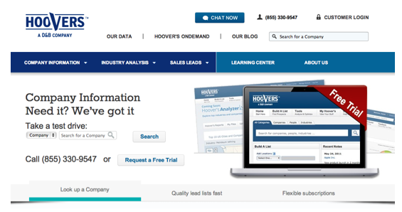
Hoovers.com is a benchmark site for the application subscription website archetype. It requires registration and payment for full access to the site. It involves a massive B2B database of businesses that subscribers can search in depth and print out the profiles, if they wish.
Other examples would be tax preparation websites such as TurboTax.com, where users can prepare their taxes and, for a fee, print out and submit tax forms. And there are many application service provider websites that allow subscribers to manage their stock portfolios, keep track of inventory, track and manage credit scores, or other activities that not only require the user to provide content but require the provider to interact with that content and provide added value.
Hoovers, like other pure application sites, offers nothing but a blog as free content. Every tab in the navigation bar leads to content you can only access as a paid member. Everything else you see no matter what you click on is a sales pitch for their content.

As I said earlier, there are also hybrid variations out there. These include Morningstar.com, one of the early stars among the multitude of online investment information sites and an early Mequoda-built site, and WineSpectator.com. Both are reference websites, organized by subject. WineSpectator.com, like ConsumerReports.org, began life as a print magazine, which lives on today and is sold at the associated reference website.
Both Morningstar.com and WineSpectator.com have free content and forums, so their navigation bars lead the user to all that information, organized by category. They each have a slightly different way of leading premium members to their paid content, however.
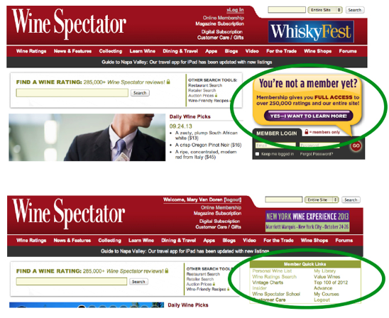
At WineSpectator.com, a banner ad for subscribing in the right rail (top screenshot) is replaced by a box with members-only links (bottom screenshot) once you log in. The navigation bar includes no links to premium content.

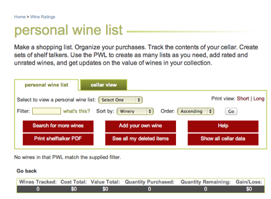
Premium applications include Personal Wine List, Wine Ratings Search and Vintage Charts, all aimed at helping the serious collector buy, sell and organize his wines.

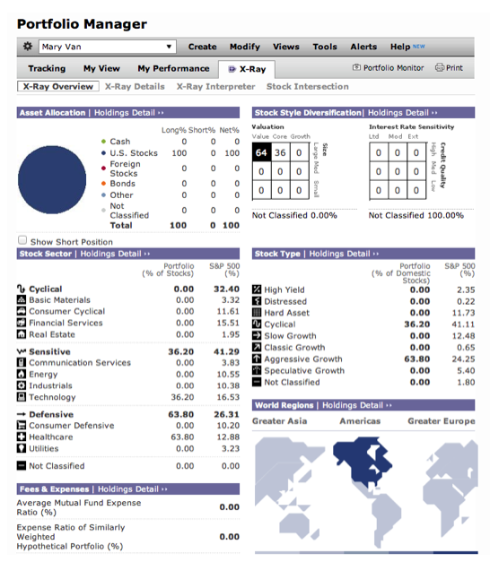
At Morningstar.com, the applications are accessed via a tab in the navigation bar. Applications listed when you click on the tab include those available to both free registered members and those available only to paid members.

Interactive tools (applications) and alerts that are available only to Morningstar paid members include Portfolio X-Ray, Portfolio Monitor, Stock Intersection, and Analyst Trade Analyzer.

Application subscription website characteristics
| Who Pays | MIU | Frequency | % UGC | Authors | Taxonomy | Homepage | |
| PAID | |||||||
| Magazine | User | Article | Low | Low | Many | Issue | What’s New |
| Newsletter | User | Article | Low | Low | Few | Issue | What’s New |
| Application | User | Record | NA | Low | Few | Search | What’s Popular |
| Club | User | Profile | NA | High | Many | Search | What’s Popular |
| Periodical | Varies | Article | High | Moderate | Many | Subject | What’s New |
| Reference | Varies | Record | NA | Low | Many | Subject | What’s Popular |
| FREE | |||||||
| Portal | Sponsor | Post | High | Moderate | Many | Subject | What’s New |
| Community | Sponsor | Post | High | High | Many | Subject | What’s Popular |
| Blog | Sponsor | Post | Moderate | Moderate | Few | Subject | What’s New |
The application website bears some resemblance to a reference website. Neither is updated with any noticeable frequency, and when they are, it’s behind the scenes, in the data. Other comparisons are:
Who pays: On an application website, the user pays to subscribe to the application and some content. On a reference subscription website, the payer might be the subscriber, as at Consumerreports.org, or it might be a sponsor/advertiser.
MIU: The minimum information unit on both an application website and a reference website is a record embedded in the application. For example, MIUs at Morningstar.com might be experts’ stock reports or a fund analyst report. At WineSpectator.com, it can be an auction price or an expert’s wine rating.
User-generated content: Neither of these types of website have much, if any, user-generated content. The publisher provides entries and records. Websites with a lot of user-generated information content are membership websites, such as Lending Tree, where the users, not the publisher, provide the information being delivered.
Authors: There are very few authors providing the records at an application website. A reference website is typically the opposite, with many authors.
Taxonomy: Application subscription websites, such as Morningstar.com, are search-based, while a reference subscription website like Consumerreports.org is organized by subject. At Consumerreports.org, the user primarily browses through the subject categories he came to learn about: cars, electronics, appliances, etc. At Morningstar.com, a user either searches for information on a specific stock, or uses the application to search out specific stocks that meet the user’s requirements.
Homepage: Both websites focus on what’s popular with users on their homepages, unlike homepages at periodical and newsletter sites, where emphasis is on the latest information. Users at application and reference sites are looking for information that is not necessarily brand new, but which answers their questions and is of interest to other users like them.

Application websites are complex to set up and maintain. While they’re most often found in the B2B space or in personal finance/investing (which share many B2B characteristics), a publisher could also set up a pure consumer site like WineSpectator.com.
Do you have any experience running an application website? What are the advantages and disadvantages of using it as a business model?


