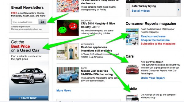
With 11 calls-to-action on the homepage alone, it’s no wonder why Consumer Reports has no trouble getting subscribers
With thousands of probable Turkey fryer accidents happening yesterday, I thought it would be an appropriate day to talk about ConsumerReports.com. We’ve mentioned Consumer Reports before in our FREE Subscription Website Design White Paper, but as the web changes, so do the websites we report on.
Today I wanted to talk about a few other layout and design elements that the Consumer Reports homepage is doing right. The site strategy is clear to a visitor: Consumer Reports is a reputable non-profit offering a lot of valuable content. The business makes money through direct sales and subscriptions alone, and there are several content products offered. Their main product is their subscription website.
Holy Calls to Action, Batman!
In the top 250 pixels of ConsumerReports.com their are a whopping five calls to actions to subscribe. These are calls-to-action for signup of both the web and print versions of Consumer Reports. What they’ve done a great job of is blending them into the design while still calling them out. I have them highlighted in the image below but if you visit their website you’ll see that your attention is drawn to them but you aren’t distracted.

The calls-to-action also continue throughout the page. Below is an image of a CTA that is placed right below the fold.

There are another 5 calls-to-action in the lower half of the page for a grand total of 11 opportunities for someone to subscribe to the website or buy a product.

Layout is Perfectly Spaced
ConsumerReports.com fits a lot of information on the page without overloading the user. They really understand the fine balance it requires to sell a product while still being as informational as possible. If you’re offering any type of informational subscription service like Consumer Reports, pay close attention to their strategy.
Take Aways
– The hierarchy of page elements and information is well structured. Flow and layout are very important to the user experience.
– You can get away with a lot of calls-to-action but you better be good at it. Consumer Reports has done a superb job of giving away free content but still hammering home every CTA.


Consumer reports touches lightly on their calls to action. They’re not terribly distracting, and if you’re not trying to get someone to subscribe or create a more significant relationship than reading a blog, then you’re not going to survive online. They have an excellent balance. Without the green arrows, would you have even noticed them all?
Noting your comments on the “Submit Comment” button. We’re in the midst of a redesign ourselves.