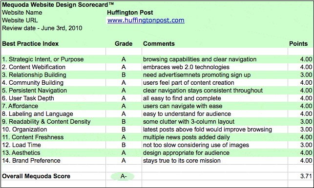
See how this popular news website scored on the Mequoda Website Design Scorecard
This week’s website design review is on the Huffington Post, a popular American politically-progressive online news website and aggregated blog. The HuffPo, as it is often referred, was started approximately 5 years ago. It is currently the most linked-to blog on the Internet and recently landed in the top 10 news sites.
Using Mequoda’s own Website Design Scorecard to evaluate this popular website, we’ll see how it fares in key website design practices.

1. Strategic Intent – A
The two questions we ask about visitors to the site are “what are the users trying to do when visiting this site?” and “who pays for the site?” The Huffington Post’s strategic intent is very clear, visitors are here looking for content and the revenue model is advertisement driven.
The homepage clearly indicates that the strategic intent is to find varied content available by browsing or using the clear navigation bar. The site contains many sponsor advertisements that are mixed within the content. They scored an “A” for strategic intent.
2. Content Webification – A
Since the site did not evolve from traditional print publishing, it embraces Web 2.0 technologies with over 3,000 bloggers and an integration of social media tools. When reading an article I was given the option of “Quick Read.” This opened a floating window showing the article summary, a link to read more and key data including a number of Facebook links, tweets, and comments. They also included a revenue-generating advertisement zone. This is very creative and useful way of setting the website up.

3. Relationship Building – B
The site includes links to sign up but there was not an advertisement promoting this. They should become more aggressive in the approach to capture visitors’ email addresses. Commenting is not allowed without being logged in as a user. Therefore, in order to comment, a person must register with an email address. The opportunities to connect via social networks are strong throughout the site. This leads to new and repeat visitors.
4. Community Building – A
This site has no problem getting comments as it lets users feel they are a part of the site’s content creation. This site contains a beta version of HuffPost Social News. Registered members can view their activity as well as friends’ activity on the site. This upcoming feature is sure to help build the community involvement feeling.

[text_ad]
5. Persistent Navigation – A
There is a clear navigation bar that stays consistent throughout the site. The Huffington Post has many sub-sites such as Politics, Media, College, Books, and Food. The navigation stays consistent but varies the color in the navigation bar to match the each site’s nameplate.

6. Task Depth – A
The key tasks on the site are “Browse”, “Search”, “Sign up” and “Login”. All of these are easy to find on the homepage and each task is easy to complete. The “Search” uses a standard Google custom search. Most of the homepage lends itself to content browsing which is ultimately the key task of the site.
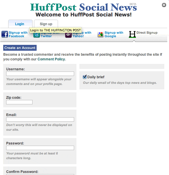
The depth of registration can be seen here on the data collection form:

7. Affordance- A
The site has excellent affordance and users can navigate throughout with ease!
8. Labeling and Language -A
Since this is a news site there is really nothing out of the ordinary so the terminology and labeling are easy to understand for the audience.
9. Readability- B
This site is loaded with images, and advertisements. There is a bit of a cluttered look to the 3-column layout because of the numerous images. An information architect would be able to simplify some of the related articles and popular post listings.
10. Organization – B
The “Login”, “Join” and “Search” buttons are all located in the upper right quadrant of the site. These are small text links that could be more prominent to the new visitors. The homepage headline takes up the rest of the page on the homepage. Moving some of the latest posts above the fold for browsing would likely improve the users’ visit time.
11. Content Freshness -A
This news site is filled with multiple news posts and blogger posts continuously throughout the day.
12. Load Time – B
One would think that with the number of images on the site that the homepage would be slow to load but this was not so. The site loaded in about 4 seconds.
13. Aesthetics – A
The site’s design is appropriate for a news and information site and supports the purpose well.
14. Brand Preference – A
Based on the numbers showing the growth in popularity of this site and the related sites it is launching, it’s clear that the audience understands the brand and that the publisher is staying true to the core mission.
Overall the Huffington Post has a strong showing for a content-based site whose primary goal is to increase unique visitors, repeat visitors and page views for visits. This is why they received an A- overall grade. There are lots of sites competing for advertisers and this growth in popularity shows it’s on the right track and will be able to continue to generate advertising dollars.
One suggestion would be to make some layout adjustments and design enhancements as well increased conversion architecture. These corrections would help bring the site to its full potential.


