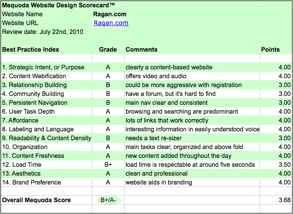
See how Ragan.com holds up to the Mequoda Website Design Review Scorecard
This week we took a look at Ragan.com, a popular site for communicators, and put it to the Mequoda Website Design Review Scorecard.

1. Strategic Intent: A
At first look it’s easy to see that the homepage of this site is about the content. This site is the free entry point for content into the larger Ragan network of sites. There are no third-party paid advertisements on the homepage.
There are links to paid Ragan-branded products like books, training, and consulting as ways to monetize the site, but there is plenty of free information offered to entice repeat visitors. Some articles are for paid members only but there is a good balance of free content.
2. Content Webification: A
This site uses video and podcasts on the homepage as a way to share content beyond the traditional written word. The paid products include Virtual conferences, Training on Demand and Video on Demand. There are lots of webified user benefits in the product area.
Another creative webification is the offering of “Ragan Widgets”. These widgets offer a free headline service for your own website. This is great for in-bound links and PR for the Ragan.com site.

3. Relationship Building: B
There is a traditional newsletter sign-up in the right navigation, but I recommend adding an OFIE or Floater with a free item to entice email registration. The site meets the criteria of clearly inviting visitors to receive content via email, but they could be more aggressive in their approach.

4. Community Building: B
The best way to build a community is to offer a forum where users are motivated to participate and add content to the site. There is a forum, but it was difficult to find. The link “myRagan” took me to a place to register and the sub-navigation included a link to the forum. Site registration is necessary to participate in the forum, but it was not part of the paid membership site.
5. Persistent Navigation: B
The main navigation on the site is consistent and clear as far as topics. Communication areas like Internal, PR, Executive Comm, Web Content, and Government are all highlighted in the main navigation, but there are also topics in the left navigation that were repeated and a higher-level navigation was included above the nameplate. The site could be improved by offering a simpler approach to the navigation. In this case, “more” is not “better”, it’s just confusing.

6. User Task Depth: A
Browsing and Searching are the predominate tasks on the homepage. There is plenty to browse and “Hot Topics” are used to entice visitors to get more details. The shopping cart icon lets users know that the site offers products and the “Become a Member” is there to convert users into members of the paid part of the website.
[text_ad]
7. Affordance: A
The site contains lots of links and everything works as expected.
8. Labeling and Language: A
Even though this site is for all types of communications specialists, it has plenty of interesting information for visitors who are not communications specialists. The site does not get lost in its own jargon so anyone can understand the language and benefit from the content.
9. Readability: B
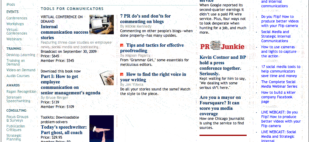
Overall the site could use some improvements on content density. The text and images are balanced, but everything is small and no text re-sizer was found on the site. The site is using a 5 column approach in some places which makes it appear too busy.

10. Organization: A
The key tasks on the site are Browse, Join, Search and Shop. All of these are easily found on the homepage and above the fold. The key marketing quadrants are used correctly.
11. Content Freshness: A
Between the Bloggers and the Editorial content they easily meet the “A” criteria of new content being available throughout the day.
12. Load Time: B+
Ragan’s homepage loaded in a very respectable 5.2 seconds, which tells me they have been careful to optimize images and think about the user experience.
13. Aesthetics: A
This site is information rich, so it naturally has lots of text. The color palette and font choices are clean, professional and support the mental model of a communications professional.
14. Brand Preference: A
The Ragan brand has been in the communications newsletter business for over 30 years. This site is a great example of building on the brand awareness.
Ragan.com scored well on the Mequoda scorecard. With a few slight improvements in the areas of relationship and community building, as well as design elements like persistent navigation and content density, the site could be exceptional.


