GolfVacationInsider.com scores well, but adding video and encouraging user-generated content could bring it to the next level
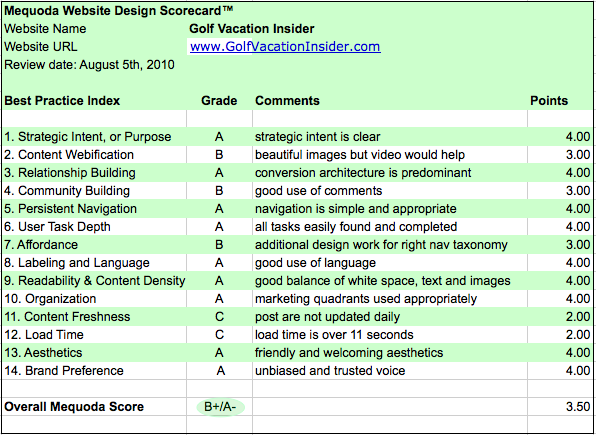
We put Golf Vacation Insider to the Mequoda Website Design Review Scorecard test. This popular website is aimed at those who go on golf vacations or who are interested in places to play golf. In addition to the site, GolfVacationInsider.com publishes a free email newsletter and books on golf travel. Managing Editor and golf travel veteran Craig Better works closely with the editors of Golf Odyssey, a monthly paid newsletter and website, to provide free, concise insider travel tips to subscribers at least three times a week.

1. Strategic Intent: A
This site is a free content website, but it is related to the site Golf Odyssey which is a paid newsletter site.
The site’s intent is very clear from the nameplate and tag line. “Golf Vacation Insider, Where to play, Where to stay, and What to Pay”. It’s also clear that it promotes the paid newsletter “Golf Odyssey”, which has its own tab in the main navigation. Allowing each website to have its own tab in the navigation is a good example of a Mequoda best practice.

2. Content Webification: B
Although the site has beautiful graphics, here is an area that could be improved. My suggestion would be to add some video of golf courses. I can picture a great panoramic view that would give visitors a real feel of the golf course they would like to visit.
3. Relationship Building: A
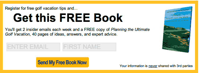
The conversion OFIE is very predominant and the “ask message” is clear. They are following the Mequoda best practice of capturing email addresses and offering an enticing Freemium in return. They are also offering the ability to follow them on Twitter and RSS, which do not capture the email address but allow visitors to build a relationship with the site.

4. Community Building: B
The site allows for comments on the posts which gives visitors a place to share previous golf vacations experiences. Craig Better, the Managing Editor, is a frequent commenter on the posts which adds to the value of the comments. They might consider adding a Forum to encourage repeat visitors.
5. Persistent Navigation: A
Navigation is quite simple but appropriate for the site.
[text_ad]
6. Task Depth: A
There are four key tasks found on the site: Browse, Search, Register, and Join (Paid newsletter). All were easy to find and complete.
7. Affordance: B
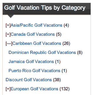
The taxonomy in the right navigation could use some design work. Primary categories that expand could be differentiated somehow, either by a different color or reverse highlighting. Sub-categories could also be displayed in another color. It’s a simple navigation but a few tweaks here would make it easier to use.

8. Labeling and Language: A
The site has some usage of golf terminology, but nothing that is incomprehensible or confusing. Any visitor would be able to understand the basic language used.
9. Readability: A
There is a good balance of whitespace, text and images on the homepage. The 2-column design works well for visitors to get a complete view of the site’s offerings.

10. Organization: A
The homepage makes good use of the critical marketing quadrants and all 4 primary tasks are available above the fold.
11. Content Freshness: C
Posts are not updated daily. A higher frequency of posting would generate more repeat visitors. A suggestion would to be to add bloggers whose posts would help with the content freshness.
12. Load Time: C
Using the Pingdom Tools test, the homepage loaded in over 11 seconds. This could be improved by optimizing images and graphics found on the homepage.
13. Aesthetics: A
Golf Vacation Insider has a “friendly” and “welcoming” feel which is in line with their audience shopping for vacation destinations.
The golf course pictures are gorgeous and add to the feel of a luxurious vacation. I enjoyed viewing the site as it made me wish I played golf so I would have reasons to visit the destinations!
14. Brand Preference: A
Craig Better and David Baum are the brand “celebrities” here. They have built a reputation on providing expert, unbiased, and trusted advice on a site where visitors will not have to worry that what’s promoted is from advertisers or sponsors.
Overall the site scored well, although the areas of content freshness and load time could benefit from some simple changes. In the future they could consider some of the emerging web features such as video and podcasts. These could be incorporated into a user community that allows users to submit videos and podcasts from their golf vacations. Encouraging user participation will lead to repeat visitors.


