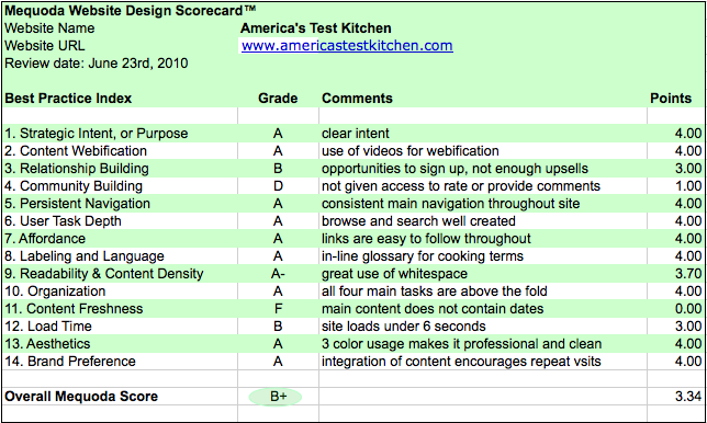
We explored America’s Test Kitchen to see how it held up to the Mequoda Website Design Review Scorecard
America’s Test Kitchen is the “Uber” brand for multiple magazines, a TV show and a number of products. We use the Mequoda Website Design Review Scorecard to evaluate the website component of their overall strategy.

1. Strategic Intent: A
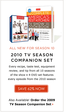
The website is designed to receive incoming traffic from the successful America’s Test Kitchen TV Show. It encourages repeat visits by providing access to episodes on the site after the shows have aired on TV. The site does not contain any paid advertising as it only has Ads for ATK’s own products. There are TV Sponsors who are listed in the footer and throughout the site.

This model contains an unbiased approach in its testing of recipes, equipment and products. The intent is clear as the site aims to provide top-notch cooking information in an unbiased presentation.The intent to convert subscribers to registered or paid members is also clear. A premium membership is a reasonable $24.95 per year and a 14-day trial offer is used as an effective marketing tool. A landing page chart is also helpful in determining the benefits.

2. Content Webification: A
The use of videos throughout the site is a key component of content webification. Watching someone prepare a recipe creates a foolproof visualization that cannot be achieved in a written recipe. Another webification feature is a “shopping list” that is linked to recipes, which give subscribers easy-to-read or printable lists of ingredients needed for each recipe.
3. Relationship Building: B
The user is presented with many opportunities to register on the site in order to gain access to the majority of content. Yet, this is an area they might be able to improve upon by including additional “asks” for joining the premium content access.
4. Community Building: D
As a registered user I was not given access to rate content or provide comments. I’m assuming this is a feature that comes with a premium membership to the site. There was no community forum for users to share their own experiences. Even opening up one area for non-premium members would help them to see this benefit of joining that they might not have realized was part of a paid membership.
[text_ad]
5. Persistent Navigation: A
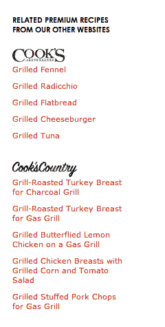
Since America’s Test Kitchen is the “uber” brand to the magazines Cook’s Illustrated and Cook’s Country, they are both included in the brand navigation. There is also a tab for the bookstore and Cook’s Country TV. This navigational bar does not change across any of their related websites, which makes it easy for subscribers to move between the sites.

The navigation bar for ATK included the key components of “Recipes”, “Equipments”, “Taste Test”, “Science”, “Episodes”, and “Current Shows”. These primary categories expand to subcategories for browsing or searching in each area.
6. User Task Depth: A
The main tasks for users are “browse”, “search”, “register” and “join” (for premium content). Browsing and searching are only allowed when registration is completed. Search results did cross among all the related sites, and included clearly labeled snippets for premium content on the related sites.
7. Affordance: A
The site is well designed and links from menus, buttons and text are easy to follow and understand throughout the site. No need for improvements here.
8. Labeling and Language: A
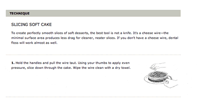
The recipes contain specific context sensitive terms and the site addresses this by including “Technique” boxes that give detailed descriptions and images to accompanying recipes. This is an important feature of the site because it deals with an often overlooked situation that many cooking sites do not address. If someone is following a recipe and doesn’t understand the proper way to complete it, these technique definitions are key to successful completion.
These techniques create an in-line cooking glossary for the site, which is a Mequoda best practice.

9. Readability: A-
The site has a great use of whitespace and the overall layout is clean and easy to read. The only suggested improvement would be to add a Text Sizer for increasing the font size throughout the site.
10. Organization: A
All four key tasks: “browse”, “search”, “register” and “join” are above the fold and easy to find on the homepage. They get an easy A here.
11. Content Freshness: F
The content on the site does have a disclaimer that states recipes and reviews could be newer than the content contained in previous season’s episodes, but the main content does not contain dates. Without dates it hard to know when it’s been updated. I could not determine how often the site gets new content and was forced to provide an F rating here. The labeling of “Season X” does give some perspective but it’s not clear if new content is posted at regular intervals.
12. Load Time: B
The site loads in under 6 seconds, so they have done a good job of addressing a common problem area for many sites.

13. Aesthetics: A
The use of three simple colors (black, red and gray) throughout the site provides a degree of professionalism and cleanliness. I can’t help but jump to the conclusion that the test kitchen would place a high importance on these same values: cleanliness, organization and scientific approach. The site’s design is clearly reinforcing the strategic mission. The connection between the “show” and the website are clearly intertwined.
 14. Brand Preference: A
America’s Test Kitchen Brand is the umbrella brand overseeing other key business areas of TV, books and DVDs. Its integration of content encourages repeat visitors and referrals to the other paid websites under the brand.
This is a top notch site that scored well on the Mequoda Website Design Review Scorecard and with improvements to the content freshness strategy and user interaction components it could be on its way to a perfect A.


