While Persistent Navigation is Now Rather Common, Site Owners Mustn’t Become Complacent. Users Must be Crystal Clear About Where They Are, Where They Can Go and How they Can Get Back to Somewhere They’ve Been.
Usability and design are two key factors in publishing great websites. You may have a clear strategy and great content, but if your site is unusable and unattractive, it will be difficult for users to find what they’re looking for, difficult for you to get users to do what you want them to do and difficult to get users to become loyal customers and revisit again and again.
Creating user-friendly websites begins by following the 14 Mequoda Website Design Guidelines for successful website design. By reviewing a site’s score for each of the 14 items, along with the overall average score, the areas of the site that operate well, and those that need work, become evident.
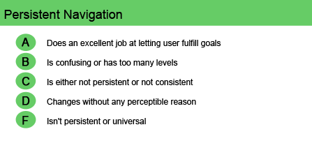
Persistent Navigation
Persistent navigation is the simple concept of ensuring that the navigation to complete an online activity is the same experience each time that the user returns to the site to pursue that activity. Five years ago this was a real problem, as site navigation changed frequently. As a result, the user was constantly lost or having to figure out how the website worked.
[text_ad]
A website is really an interactive piece of software. The navigation facilitates user goals of: 1) easily accessing content, community and commerce and 2) finding any desired feature or information page. The site should be straightforward, relatively simple to use and unchanging—with no surprises or misleading cues, such as design elements that look like links but instead are static graphics.
Site navigation, then, is simply a means to an end. Too many options or too-clever strategies in the navigation hierarchy become confusing rather than helpful and run cross-purposes to the site’s goal. Also, avoid unnecessary or arbitrary variations in the menu system. And if the paradigm changes from visit to visit or from page to page, users will find a site with a better system.
With the exception of certain processes, such as order flows or sign-in processes, users should be able to navigate to all major areas of a website from anywhere within the website. They must never feel lost or unable to return to a location they wish to find again. The navigation, therefore, should be intuitive, with easy-to-understand words. Further, it should reflect the depth and breadth of the content, provide quick and easy access to customer service and be consistent throughout the site. In cases where the navigation for one of the sites in a network or one of the pages on a site must be significantly different, Mequoda research indicates that the best way to treat that is to change the nameplate and the URL of the site or page that requires the different navigation.
So while persistent navigation is now rather common, site owners mustn’t become complacent. Users must always feel crystal clear about where they are, where they can go and how they can get back to somewhere they’ve been.

Website Examples
Best Practice Website

RollCall.com Website Design Review
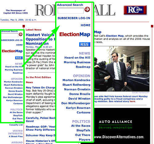
The Roll Call website presents a clear and consistent navigation scheme that is anchored by the global navigation menu in the left hand column. This menu is persistent, remaining unchanged from page to page. When you click on one of the menu items, the page that is served includes articles and stories that are typically the target content sought by the visitor.
Not-So-Good Example

PPSPublishers.com Website Design Review
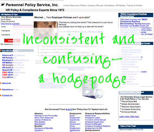
The Personnel Policy Service site leads the user off in too many directions without a clear path back. This configuration is a hodgepodge. Many pages at the Personnel Policy Service site don’t even include a link back to the homepage. Overall, the layout is inconsistent and confusing.


