Website Success Depends Largely on Providing an Incentive—i.e., a Free Email Newsletter—to Encourage Visitor Registration and an Email Address.
Relationship Building
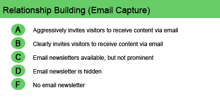
Website success depends largely on providing an incentive—i.e., a free email newsletter—to encourage visitor registration and an email address. Acquiring those email addresses is the first step toward creating lasting relationships with site visitors. If a website does not attempt to capture the visitor’s email address, the individual may never revisit and the relationship is lost.
A detailed description of the free email newsletter, and its benefits, should appear in a “can’t miss” space on the homepage. The description might include a sample page of the current issue, with an offer of a download of the full newsletter in exchange for the email address and permission to receive future issues. And registration should be easy. Just secure that email address—you’ll have opportunities to fill in additional data through further contacts such as email alerts and other relevant messages. The ultimate goal, of course, is to escalate the messages to revenue-producing product offers.
In addition to signing up for the free email newsletter, a site may offer access to blogs, RSS feeds, tools, favorites and other special content if the visitor signs up with a user name and password. That allows personalization of the site each time the user logs in—a cookie that triggers a welcome messages, relevant content based on a personal profile or historical preferences, and automatically filled forms.
[text_ad]
Some site archetypes are more oriented toward relationship building than others. For example, a simple brand-building website, where the purpose of the site is to deliver a message about the company or product, could have some level of success without doing a great job at relationship building. On the other hand, a network hub that doesn’t do a good job of relationship building would be considered an utter failure.
Website Examples
Best Practice Websites
TheBookStandard.com Website Design Review
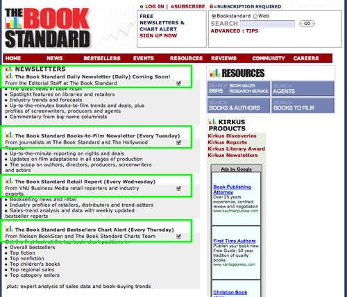
TheBookStandard.com offers three—count ’em—three different free email newsletters, including The Book Standard Bestsellers Chart Alert, a free weekly e-zine with news and sales rankings.
Moneylaundering.com Website Design Review
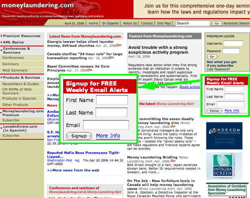
Very prominent on the homepage is an invitation to sign up for Moneylaundering.com’s free weekly email alerts, in order to receive the latest breaking money laundering news and analysis in your inbox every Thursday.
Not-So-Good Examples
eSkyGuide.com Website Design Review
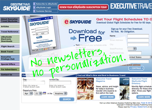
There are no personalization devices on the site.
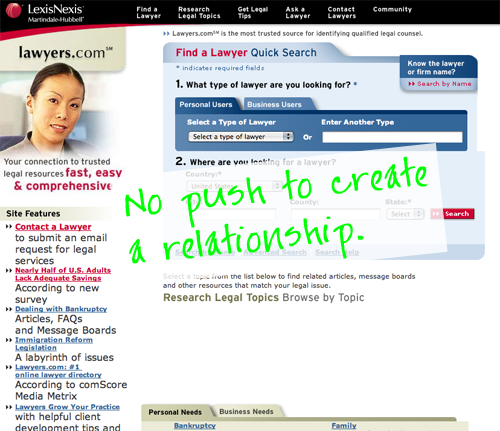
Lawyers.com Website Design Review
The site needs to employ a “push” strategy to create relationships with visitors. It must give visitors an opportunity to register, and in so doing, provide the site operators with valuable insight into the nature and characteristics of site visitors, while offering value in return.


