Usability and design are two key factors in publishing great websites. You may have a clear strategy and great content, but if your site is unusable and unattractive, it will be difficult for users to find what they’re looking for, difficult for you to get users to do what you want them to do and difficult to get users to become loyal customers and revisit again and again.
Creating user-friendly websites begins by following the 14 Mequoda Website Design Guidelines for successful website design. By reviewing a site’s score for each of the 14 items, along with the overall average score, the areas of the site that operate well, and those that need work, become evident.
Websites often have a strong brand with roots in the physical world, but some online marketers say brand doesn’t matter. In a world where search is the most common way to find a site, those marketers are wrong. Brand absolutely does matter.
Why? The paradigm has shifted. Companies no longer push themselves at the online consumer. New customers easily—and often—find a site themselves.
While a website can complement the offline brand with added and dynamic content and images, it’s also important that the website integrate with the offline brand through a single, consistent online branding message. Support the brand in the marketing text and on every page with a consistent use of the company name. And definitely don’t mess around with the logo, coloration, or typeface.
Network sites often run into branding problems, in that they suddenly—without any warning or preparation—transport the unsuspecting user off the hub site to a differently branded satellite or commerce site within the network that has an unfamiliar appearance, different URL, and new navigation. To avoid confusing and annoying the user, use a single interface—user-friendly links—to lace together the hub with the various satellite sites.
[text_ad]
Let the user know that they are going to a new location. Make sure that they know that the same company owns both the hub and the satellite site. And provide a way for them to get back to the original location.
At its most basic level, after all, branding means instilling trust.
Website Examples
Best Practice Websites
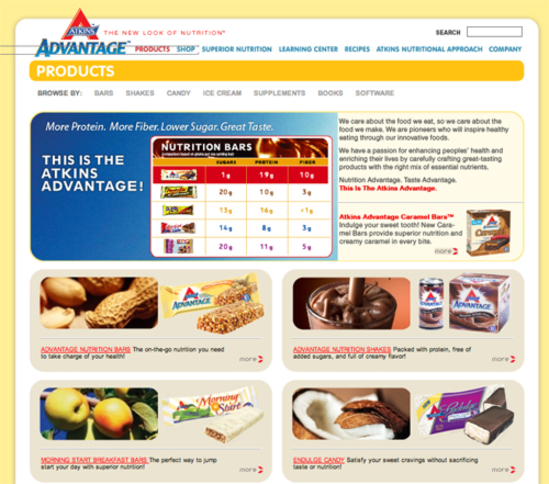
Atkins.com Website Design Review
At no time did we feel like we were confused about the brand.
[text_ad]
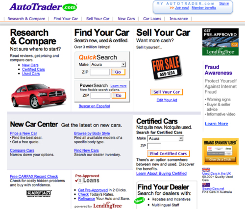
AutoTrader.com Website Design Review
I will probably spend more time with AutoTrader.com
than the site I have been previously using, Cars.com.
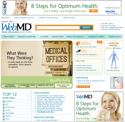
WebMD.com Website Design Review
WebMD the brand held up in my mind,
even through all the voices I found on their pages.
Not-So-Good Example
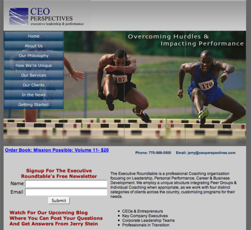
CareerCoach.com Website Design Review
Even if I were an executive, I doubt that I would return to the site.
Because, without content, only brochure-like “descriptions”—why bother


