Usability and design are two key factors in publishing great websites. You may have a clear strategy and great content, but if your site is unusable and unattractive, it will be difficult for users to find what they’re looking for, difficult for you to get users to do what you want them to do and difficult to get users to become loyal customers and revisit again and again.
Creating user-friendly websites begins by following the 14 Mequoda Website Design Guidelines for successful website design. By reviewing a site’s score for each of the 14 items, along with the overall average score, the areas of the site that operate well, and those that need work, become evident.
Content Freshness
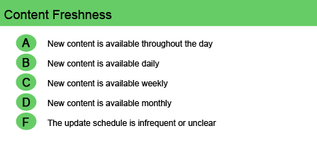
The “Content Freshness” guideline asks the question, “Is there a reason for the user to return frequently to the site?” The Internet is a 24/7 medium, and visitor attention and enthusiasm can be very short-lived. Research indicates that websites with a high update frequency generate more repeat visits per month per unique user. Therefore, websites should be considered “works in progress” that are constantly updated—if only to avoid boring repeat visitors.
Users expect fresh content on a website. Credibility plummets if the homepage promotes an event that occurred two months ago. Even a few out-of-date links can undermine the image of an otherwise up-to-date website. Weekly updates are the absolute bare minimum; daily are better; hourly are the best. With no apparent changes from visit to visit, there’s no reason for a user to feel compelled to return or take any action with any urgency.
[text_ad]
Tell the user when and how often the content has been updated to keep the repeat visitor’s attention. Does the site have, say, a news item, tip, recipe or photo of the day or week? Does it promote something that’s “hot off the press” or a special offer with a sense of urgency? Or perhaps it has an events calendar. If it doesn’t have any of these timely postings, it should. And if so, include the posting date and, in some cases, even the time. For newspaper sites, for example, it’s essential to update the latest headlines several times a day, seven days a week.
It takes a lot of content to refresh your site frequently. If you don’t have, or don’t generate, lots of content, then user-created content can be your secret weapon. For every story you post on a blog, for example, users themselves will post five or ten items and update your website for you. Further, an RSS feed from a blog also serves as a way to update a site. And active chat rooms or discussion boards encourage return visits by providing a reason for users to check in from time to time to read the new content.
Bottom line: Update your website frequently—and make it clear and apparent that you do.
Website Examples
Best Practice Websites
Atkins.com Website Design Review
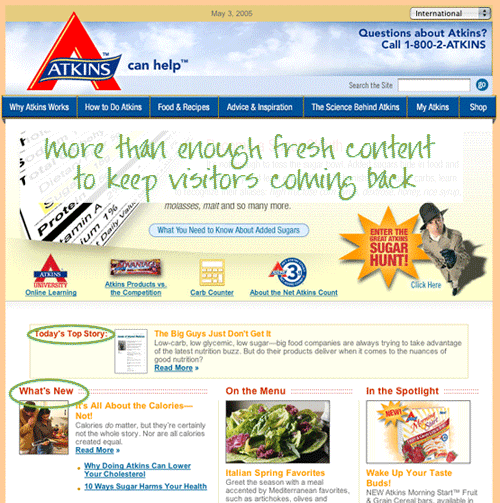
It is member-provided content that keeps folks coming back to this site. However, there are plenty of articles that are constantly being added to the website, as well as events in the Event Calendar, press releases and, of course, the personal stories in the “Advice & Inspiration” section. This is more than enough fresh content to keep visitors coming back.
Computerworld.com Website Design Review
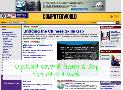
Knowing what’s going on as soon as it happens is important to industry execs. Updating the latest headlines several times a day, five days a week is essential, and here Computerworld gets an A.
Not-So-Good Example
SalaryExpert.com Website Design Review
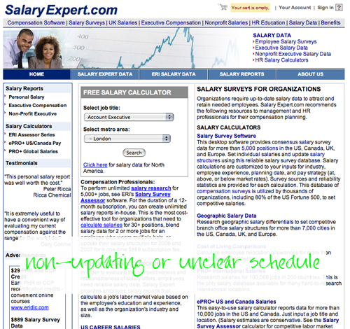
Nowhere on SalaryExpert.com did I see anything telling me how often the content was updated. The salary data here could be 10 years old as far as I know. But that is really more of a product issue. No “News,” “Updates” or “Latest,” nothing at all that either indicates a sense of urgency (a great trick for the sales process) or that I should return to get more information later that day or the next (important for a long sales process or simply keeping the cost of acquiring a customer down). The site has either a non-updating schedule, or an unclear schedule, either one earning an F on this Website Scorecard criteria.
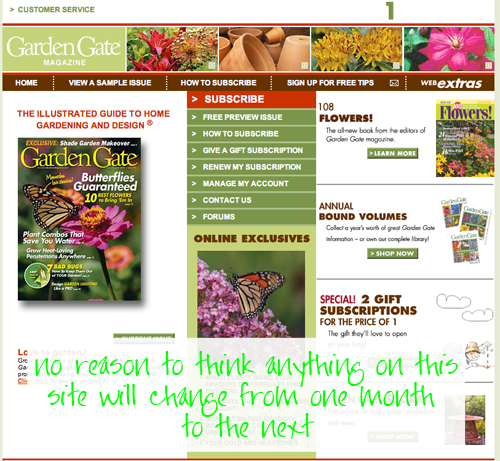
GardenGateMagazine.com Website Design Review
OK—this is where the marketing site has fallen flat. There is no time device, no “Act Now!,” no deadline for me to meet to get in on a great deal. I know the current issue is recent by the date, but other than that, I have no reason to think anything on this site will change from one month to the next.


