Strategic Intent is Perhaps the Most Important of the 14 Guidelines. If Users Can’t Figure Out Your Website, They Not Only Leave Quickly—They Won’t Come Back.
Usability and design are two key factors in publishing great websites. You may have a clear strategy and great content, but if your site is unusable and unattractive, it will be difficult for users to find what they’re looking for, difficult for you to get users to do what you want them to do and difficult to get users to become loyal customers and revisit again and again.
Creating user-friendly websites begins by following the 14 Mequoda Website Design Guidelines for successful website design. By reviewing a site’s score for each of the 14 items, along with the overall average score, the areas of the site that operate well, and those that need work, become evident.
In this chapter of Website Design for Publishers and Authors, we take a close look at Guideline #1: Improving the User Experience with Clear Strategic Intent.
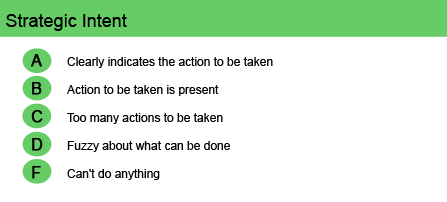
- To communicate strategic intent, you must first know the answers to these questions: What do users want to do at your site? What do you want users to do at your site?
- When a first-time user lands on your homepage—or any webpage, for that matter—it should be immediately obvious to that user, by simply scanning the screen, what can be accomplished, seen or found on that site and/or that page.
- Clearly and prominently focus on the action(s) that you want them to take and that they expect to take: Browse? Buy? Subscribe? Sign up? Join? Sell?
- The content and graphics should be well-presented and prioritized in order to guide the user’s eye to the desired action(s).
- Further, those action(s) should clearly relate to the strategic mission of the company.
To communicate strategic intent, you must first know the answers to these questions:
- What do users want to do at your site?
- What do you want users to do at your site?
When a first-time user lands on your homepage—or any webpage, for that matter—it should be immediately obvious to that user, by simply scanning the screen, what can be accomplished, seen or found on that site and/or that page. Clearly and prominently focus on the action(s) that you want them to take and that they expect to take: Browse? Buy? Subscribe? Sign up? Join? Sell? The content and graphics should be well-presented and prioritized in order to guide the user’s eye to the desired action(s). A jumble of images will cause the eye to jump around and the user will become confused.
[text_ad]
Further, those action(s) should clearly relate to the strategic mission of the company. In order to trust the company and do business with it, site visitors must understand the deal. They must “get,” right away, what the company does, what it expects in return and what the benefits are for signing up, subscribing, joining, buying or otherwise providing information.
The action(s), of course, will differ depending on the website’s particular archetype. The content and design of a Mequoda Product Marketing Website, for example, will focus on product promotions and customer service activities. On the other hand, a Mequoda Membership Website will highlight the member login area and repeatedly pitch membership or subscription offers. And a Mequoda Branding Website will connect the brand to the customer through a useful giveaway or emotional association—which may, of course, be purely an entertainment strategy.
Clear strategic intent is easier to achieve when the website has a theme, very simplified functionality and clear navigation. Complex websites without a clear purpose—and/or are filled with competing links and unrelated text or graphics—are ineffective because they confuse users. Again, users should know from the very first screen why the site is there, what it offers and how it works. That way people who belong there will know what to do. And people who don’t belong there will know right away that they’ve taken a wrong turn on the information highway.
Strategic intent is, perhaps, the most important of the 14 guidelines. If users can’t figure out your website, they not only leave quickly—they won’t come back.

Website Examples
Best Practice Websites

Better Homes & Gardens Website Design Review
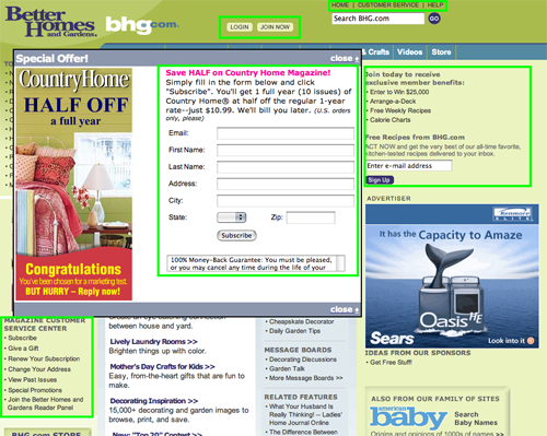
BHG.com does an excellent job of communicating their strategic intent. The three top things we get from this site, in order of importance, are: they want us to get the magazine, they want us to sign up for some newsletters and they want us to save recipes and designs on their website so we will come back.

Computerworld.com Website Design Review
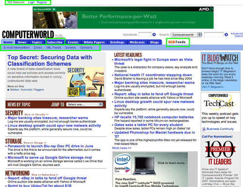
Any reader or advertiser understands the business model from page one
Not-So-Good Example

HCPro.com Website Design Review
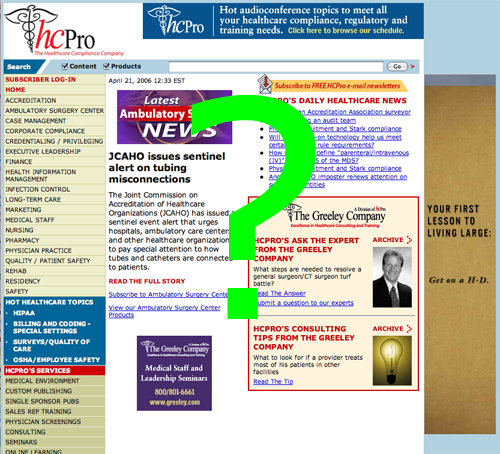
Nowhere on this homepage is it clearly expressed what this site is about, what people can do here and why they should care.


