We reviewed our own site to show you how it ranks
It’s always hard to take a good look at yourself and critique your characteristics. But if we are going to look at others under the microscope then we must take a good hard look at ourselves as well.
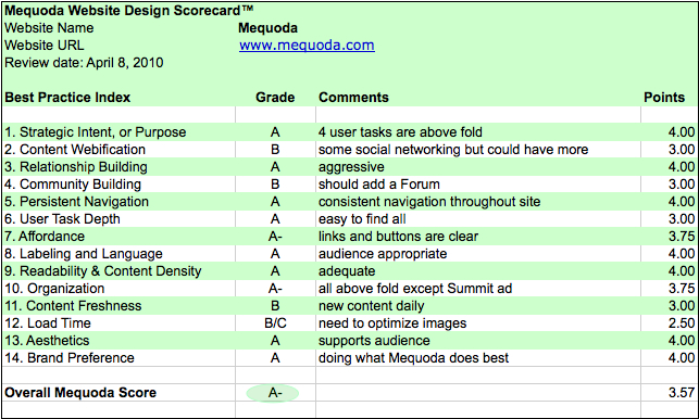
The following grades are based on the Mequoda Website Design Guidelines. Here is what we found:

Mequoda Daily Scorecard
1) Strategic Intent: A
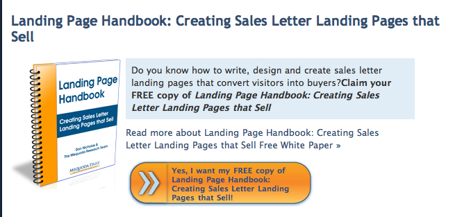
The Mequoda Daily is both a content and commerce site. The key components of the site are easy to find. These aspects include: How to register, the ability to browse, search and buy. The products that are the main focus are the Webinars, Mequoda Pro Memberships and the Summit.
2) Webification – B
Mequoda.com’s Webification includes the Mequoda Pro Q+A section, the presence of paid videos and paid webinars. The Tweet and Retweet options on posts is also included in this category.
Podcasts are new to the Mequoda Daily. More of these would enhance the website. A recommendation would be to move away from static papers and add more audio and video.
3) Relationship Building – A
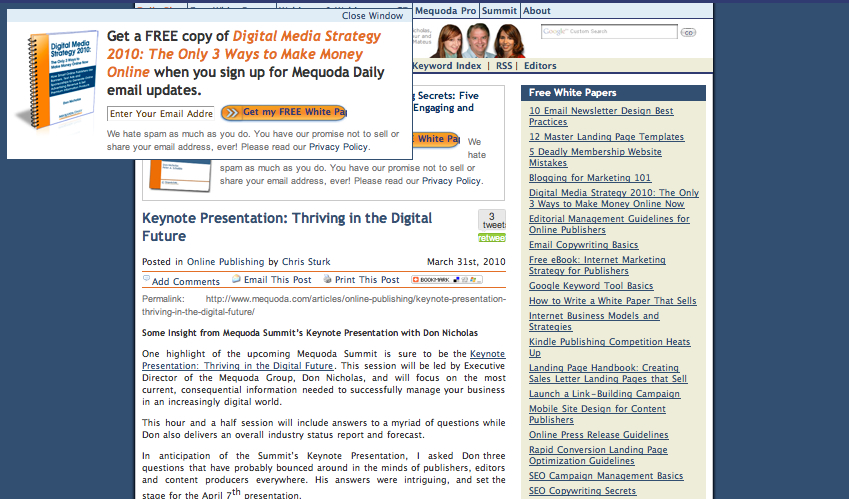
The Mequoda Daily aggressively invites visitors to receive content via email. There are lots of floaters, OFIEs and Text Ads on the pages within the site. Using email to send quality editorial content and promotional offers improves customer relationships.

4) Community Building – B
An interactive forum is a work in progress for the Mequoda Daily and will allow for better community building after it’s complete. In the meantime we do support Twitter, comments on posts and the “forward to a friend” feature.
5) Persistent Navigation – A
The global navigation at the top of the screen is consistent and the sub-navigation, found below our logo, changes depending on the tab a user is currently viewing.
6) User Task Depth – A
The site encourages users to take additional steps. This includes using strategically tied upsells via the OpenX Ad server. For example, if a user downloads our free white paper on Email Copywriting, there is an immediate up-sell to our Email Copywriting Webinar on-demand. There are also Summit ads at the bottom of the pages to help facilitate registrations.
7) Affordance – A-
This section lost a few points due to the images in the OFIEs not being clickable. Only the headlines are.
Additionally, the tag line “Helping Publishers Make Money” in the nameplate looks like a button but isn’t. This may appear confusing to some users, which is why the grade was reduced. Other than these few aspects, the affordance is good.
[text_ad]
8) Labeling & Language – A
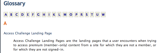
There is a lot of language specific to the Mequoda audience. The Glossary is included on the site to help define terms like RCLP, OFIE, etc. for any new users who may not be fully familiar.

9) Readability – A
The Mequoda Daily has a consistent color scheme and a good use of white space. Both of these features are adequate in creating a strong sense of readability for the audience.
10) Organization – A –
Above the fold we find: Free White Papers, Google Custom Search and Floaters for Registering. These are all very strong qualities to have in a website.
However, there are a few places that need improvement. For one, the Summit advertisement is too far down the page. Also, a rotating ad in the right navigation would be helpful at grabbing more attention from users. This rotating ad would rotate through all paid products including: the Summit, Webinars, Mequoda Pro and Seminars, once we begin promoting for them.
11) Content Freshness – B
The Mequoda Daily is updated daily but not more than once a day. This is appropriate for our audience.
Free Reports are updated with content on a periodic basis, about once every three weeks. Having more content with the same quality would increase the grade for this category.
12) Load Time – B/C
The load time varies based on the daily content that is currently on the homepage. Some posts have more graphics than others which causes the variation.
It is important to optimize graphics for the web and to use tools like Pingdom Tools. I like this specific tool because it identifies the elements that are slow to load.
13) Aesthetics – A
The aesthetics match the B2B audience well.

14) Brand Preference – A
We are consistent in our offerings and services from the standpoints of consulting, training, and website design.
So there you have it, a complete critique of our own website. You may be wondering, “If they can identify which improvements should be made, then why haven’t they done them?”
Well, just like you we have budgets and staffing issues that we must pay attention to. Because of this we must prioritize our website development. However, knowing what needs to be fixed is the first step in the journey. The Mequoda Daily is constantly evolving so stay tuned and visit often, as we change with the times.


I like this. I vote for podcasts! And your glossary is a great idea. Thank you for all the wonderful information. Keep up the good work.