Just be careful which online publishing lesson you learn
| The Economist | |
| Online Magazine Index (OMI): | |
| 3.24 | |
| Total circ: | 1,464,122 |
| UVs / month: | 4,741,244 |
For a publication with roots deep in the Victorian era, founded by a conservative Scottish hatmaker, The Economist is a surprising innovator in the modern publishing era.
Apparently, despite its stodgy beginnings and reputation as a snobbish, upper-crust British media voice – just look at the photos of all the elderly white men running the show in the 2013 annual report – there are some very nimble commercial minds behind it these days.
It was an early player online, has a lovely digital edition, and above all, executes its subscription website beautifully. So beautifully, in fact, that is boasts an Online Magazine Index number of 3.24%, a solid B in Mequoda World.
Remember, the OMI is a measure of a website’s ability to drive traffic, and it assumes that it should be a lot easier to get people to show up for free content than to get them to pay for your subscription.
Meanwhile, paid circulation is stagnant with their circulation reports showing 1,464,122 for the period July-December 2012, down 1.54%. Digital-only circulation is at 100,000.
[text_ad]
The Economist subscription website experience
As Amanda wrote last week, the website delivers plenty of quality content, some freestanding and some from the current issue of the magazine. The visitor can read six articles before being hit with a request to register. Registration gets you another six articles before the paywall shows up with an offer to subscribe.
And, as Amanda noted, registration can also get you regular newsletters that deliver the same articles, so if you read the newsletter articles, you hit that pay wall pretty quickly. Sooner or later, people who stick with The Economist‘s free content long enough will find something that they really, really want to read – enough so that they’ll subscribe.
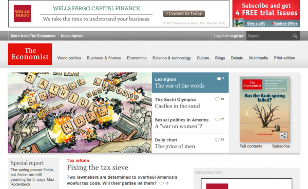
The home page carries banner and display advertising. An ad for subscribing shares a small portion of the banner across the top of the page. Below the navigation bar is a horizontal layout that includes snippets of four articles that are new every day, and next to that is an image of the current issue’s cover, where subscribers can click to access their magazine online, and visitors can click to subscribe.
Below this horizontal area are several columns of older articles, which have been rotated out of the top spot. Only those four main articles are new each day.
One area of content which doesn’t trigger the registration wall or pay wall is a high-level Debate section, where two frighteningly intelligent people discuss a given proposition and readers join in via comments. It’s one or two or 10 steps up from your average subscription website forum, but that’s The Economist for you.
The only other completely commitment-free content is the video section, in which Economist writers discuss issues of the day, but all videos start with a sponsored advertisement.
The navigation bar includes tabs for various categories of content, plus a jobs board and an Economist store. These last two must be what the annual report refers to as “Other” in their revenue sources, which, for the entire Economist group, totaled 12% of their revenue, as compared to 37.5% from sponsorships and advertising, and 50% from subscription sales.
Indeed, The Economist is quite busy monetizing its content into books, archive subscriptions and DVDs. It also monetizes its brand into calendars, prints of its famous cartoons, T-shirts and leather accessories. I think I may have to cave in and get an Economist teddy bear, whose little red shirt proclaims, “Smarter than the Average Bear.”

When I clicked to close the browser window, The Economist had one last shot at me: A popup window with a subscription offer.
[text_ad]
What’s wrong with this picture?
All in all, the Economist subscription website is an incredibly rich (and educational) experience. Their model for driving subscriptions is compelling and reasonably successful, as their fairly stable circulation numbers indicate – and especially so given the relatively high cost of subscribing at $150 per year for print or digital, and $189 for both.
And the monetization of their content and brand, both in the store and in advertising, is also a strong element in their business model. But what’s missing from this picture? Answer: The Mequoda best practices of a free, search-optimized blog to drive traffic, and free reports to convert visitors to registered members.
All that quality content is just that, quality content on the news and issues of the day. There’s not one single piece of content that’s written with SEO in mind; the website experience may be well constructed to build their circulation numbers, but if they’re not driving traffic to the website in the first place, what’s the point?
And while the registration wall that pops up after you’ve read six articles is all very nice, a free report on something fairly evergreen would beef up their conversion rate enormously.
The Economist is overlooking a prime opportunity to build its website traffic (and increase unique visitors, which would boost its OMI to a solid A rating and add to its advertising revenues), and also to build an ever-larger email list, without which no publisher can market its products.
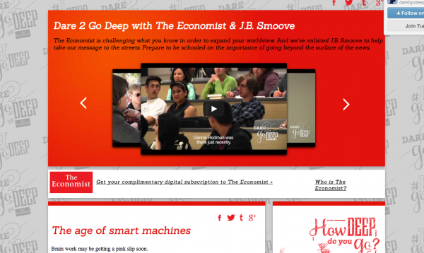
They’ve recently embarked on an incredibly expensive venture to expand into the college student market, with a new Tumblr blog called Dare2GoDeep and a $1 million budget. Each blog post consists of a title, an image and a link back to an article on Economist.com. Trust me, it costs a whole lot less than $1 million to implement an optimized blog, a free report and a promotional email once or twice a week.
In short, The Economist is leaving money on the table. It makes no long-tail attempt to drive traffic to its wonderful website, and when visitors do happen to stumble across it, it relies entirely on the strength and lure of its admittedly compelling news and analysis to convert them to registered members. But, as Amanda pointed out, it fails to promote its products to the email subscribers it does manage to harvest!
Can it succeed in this fashion? Of course. It’s still a B! Could other publishers profit from the Economist pay wall model? Certainly. But if you’re not The Economist, with a huge international presence and a 163-year-old brand, we don’t recommend skipping Mequoda best practices. Pick up that money from the table!


Perhaps its hardest for those doing well to imagine the path to doing even better…