From simple order form to video voiceovers, modern strategies abound
As you may have noticed, Mequoda is a firm believer in the power of email newsletters as a marketing channel – so much so that a Mequoda subscription website is built specifically to give away content and harvest email addresses, rather than sell magazine subscriptions.
This is a far cry from the old print days when you could rent or buy lists of addresses, and the one and only thing you had to do was sell subscriptions via carefully-crafted, elaborate direct mail packages.
But we haven’t forgotten our roots. Of course every publisher’s goal is to sell subscriptions, even if it’s not front and center on subscription websites. And a review of some of Mequoda’s favorite nimble niche publishers shows that there are some clever strategies out there for using the website to sell subs.
The first thing I learned is that long-form copywriting and elaborate design to sell magazine subscriptions have gone the way of fancy direct mail packages. And dinosaurs. While I often write long-form copy for our clients’ free content rapid conversion landing pages, I’m rarely called upon to write promotional copy for the magazines themselves.
Instead, selling subscriptions on subscription websites is more about strategic placement of ads and calls to action. Almost every website I visited has a version of this simple order form from Forbes: no sell copy, just the bare facts.
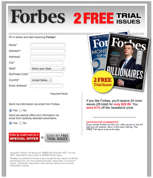
There are a lot of tests you can do on a simple form to increase orders, or course. One that I read about recently involved testing a button that read “Create My Account” vs. one that read “Create Account and Get Started.”
The “Create Account and Get Started” button increased subscriptions by 31%. “My” is a powerful word, but “Get Started” proved more compelling in this instance. For a magazine subscription, you could substitute “Start Reading” as a test against the button text you’re using now.
Content, third-party advertising and subscription pitches, in that order
As they should, the subscription websites I reviewed put content front and center. Most also give prime real estate to third-party advertising. After that comes the puzzle of figuring out how and where to pitch their subscription products.
And when it comes to content, some magazines include their paid content free on the website, and others have none. Premium content, of course, is an excellent place to urge visitors to subscribe, unless, of course, you’re giving away all your most recent content in a neat, curated package like The Atlantic.
Let’s take a look at some different strategies, some traditional (or at least as traditional as anything in the Internet world can be) and some that push the envelope.
[text_ad]
Forbes: Subtle yet prominent
Forbes delivers a dignified gray banner across the top, rather than rotating banner ads that can agitate a visitor. The white font pops out nicely, broadcasting links to its content.
And just below Forbes’ logo in the prominent left position is a link in eye-catching red, delivering an appealing subscription offer of two free issues. I found this small link quite noticeable because of its position just below the Forbes name.
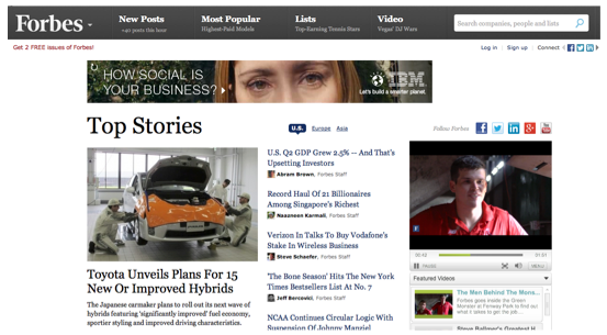
Forbes offers no magazine content anywhere on its site, and not a single ad or link to subscribe. Still, its circulation has seen slight growth recently, so perhaps this low-key approach isn’t entirely bad.
In any case, these links near the top of every page are the most common strategies I’ve seen so far.
Men’s Health: Scattered calls to action
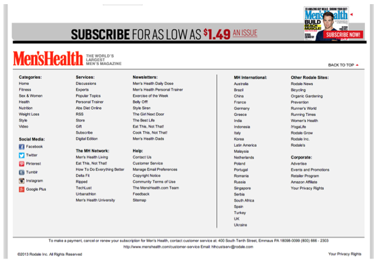
At Men’s Health, “Subscribe” gets similar placement as at Forbes, in this case, the first link in the navigation bar. Interestingly, there’s a link for content next to it, then a link called “iPad” nestled in with more content links. The “iPad” link takes you to a digital subscription landing page.

As expected, there’s the usual top right small banner offering subscriptions, and if you scroll down … no, further … further … there’s an ad in the right rail. I can’t zoom out far enough to give you an image that shows how far down the ad is.
But hey, on almost every page, again at the bottom and just above the usual website fine print, Men’s Health has a full-width banner ad to subscribe. Other calls to action are sprinkled throughout the content, which, interestingly, includes September’s cover article – which has a July dateline..
But I only found this premium content through search (after seeing the cover of the issue), there’s no mention to the reader that this is an example of premium content, and the only calls to subscribe are the same ones that appear on every page in the right rail and at the bottom of the page.
To me this seems a lost opportunity. There are arguments for and against giving away your premium content, but if you do decide to give away some of it, it’s the perfect time to let the visitor know that there’s more like this for just a low, low price …
[text_ad]
The Economist: Multi-tasking floater
The Economist nails the paywall strategy perfectly, as both Amanda and I have noted. You get six articles a month for free – some from the magazine, some not – before a popup delivers a request for you to register for free.
After that, you get six more articles before hitting the paywall. And, of course, since registered users get Economist newsletters featuring articles every day, they’re likely to hit that paywall pretty fast.
But all that happens after your very first call to action: The floater that Mequoda loves so much because it performs so well. Mequoda websites use floaters to promote the beloved free newsletter that’s so important to the Mequoda Method. The Economist takes it a step further to promote both its newsletter and its subscription options.
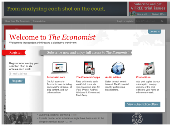
If I were a marketer at The Economist, I’d test splitting off this floater into two separate offers, especially as there are four subscription offers already. As Amanda notes, too many choices make for confused customers. And confused customers hit the “Close” button. Of course it’s possible they have tested the floater and found this works best – sometimes conventional wisdom isn’t the wisest option, but testing always is.
And Subscription Site Insider offers a paywall test that delivered an 8% lift. This marketer changed its call-to-action copy from “To read the full text of this article and millions more, try us out for 7 days, FREE!” to “To read the full text of this article and others like it, try us out for 7 days, FREE!” [emphasis added]
Eating Well: “Best of Eating Well” floater
Eating Well serves up a subscription floater, too, when the visitor clicks on a headline for any article listed under “The Best of Eating Well.”
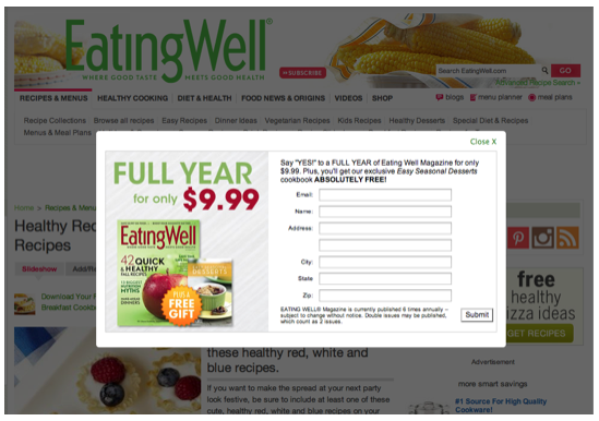
Eating Well, like Forbes, also uses those very tippy-top links above the logo to house links offering subscriptions along with a link to their free newsletters. There’s also a small red button to subscribe immediately to the right of the logo.

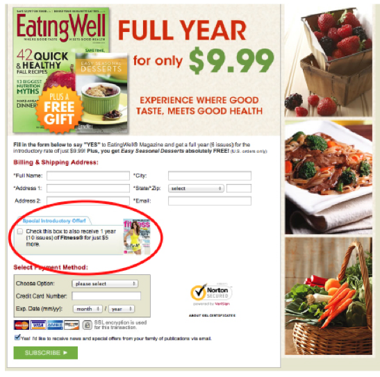
Because Eating Well is a member of the Meredith family, there’s a strategy that all multi-product publishers could employ: an add-on offer for another Meredith publication on its Eating Well order form.
WIRED: Um, we’re not really that into selling subs
At WIRED, which is reputed to be the world’s first digital magazine derived from a legacy publication, the business model appears to be one of selling advertising and ignoring subscriptions. All of the current magazine content is readily available in a nice, neat package – you don’t even have to look for it so there’s no curation benefit to subscribing.
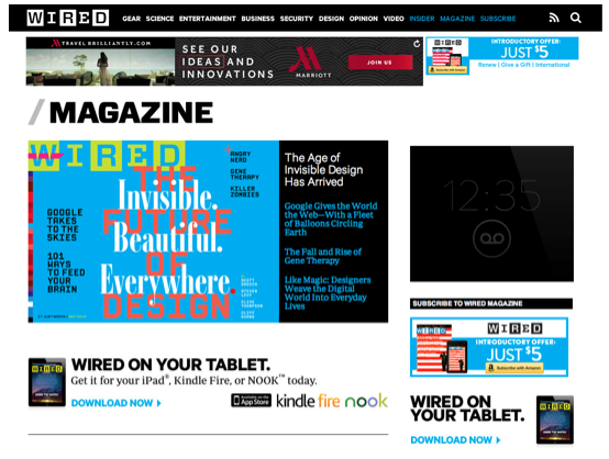
WIRED claims to have increased its paid circulation by 22% over the past five years, and there are the requisite scattered “Subscribe” links on its pages. There are even prominent ads in the right rail on the magazine homepage. But apparently WIRED is building its circulation solely on the convenience factor of not reading the magazine on a desktop computer … otherwise, who would click on a link to subscribe just before diving into the content for free?
[text_ad]
Ceramics Monthly: A digital brochure
Ceramics Monthly, as I recently wrote, is one of two publications promoted at CeramicArtsDaily.org. This is an organization that shines in modern marketing, so it’s no surprise that they have some creative subscription marketing right on their website.
What do they do differently from all others? The homepage is pretty much standard, with the two publications each getting their own link in the navigation bar. It’s what you get when you click on those links that’s unique: actual sell copy.
It’s not long-form copy, but the American Ceramic Society has figured out something that might be even better: A simple paragraph of sales copy next to rotating images, also with brief copy, that describe regular features of the magazine, such as studio visits, glaze recipes and techniques.
Below this digital version of a direct mail brochure is the current issue cover with a snippet of the monthly Letter from the Editor. A Subscribe Today” link is prominently featured with that snippet in Mequoda-recommended orange.
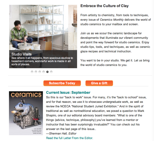
It’s clean it’s simple, and it’s informative, unlike all the other subscription landing pages I visited on this journey. This is certainly something I would encourage niche publishers to test right away against no copy (a simple order form) and even against long copy. Remember, this is a top Mequoda operator with stunning success in all phases of its operation.
Business Management Daily: B2B sticks with traditional techniques
At long last I’ve found traditional long-form copywriting as a subscription marketing technique. You’ll still find this strategy in the newsletter world, particularly B2B. The old adage that the pricier the product, the more copy you need to sell it holds true.
And Business Management Daily, the hub for multiple HR newsletters, services and tools, has the copy in spades. Although there are no other sales efforts anywhere else on the site, a visitor who clicks the “Newsletters” tab in the navigation bar gets the full list of all newsletters.
One more click and you get the full whack: A sales letter that’s like something I would have written. It has a catchy, provocative headline, an informal “straight talk” style, short, punchy paragraphs and “what’s in it for you” themes.
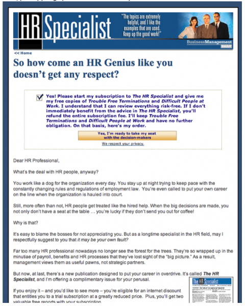
This is repeated for all of BMD’s newsletters. There’s also a training subscription, for which the letter is shorter and features a less personal tone. But those enormous “Sign me up” buttons are impressive!
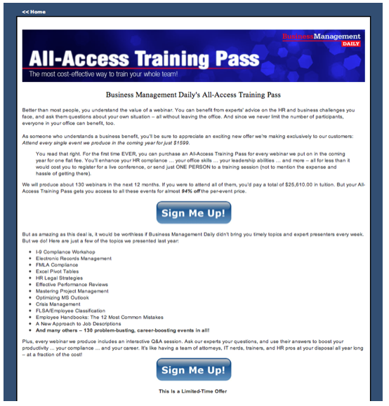
Forecasts & Strategies: Video landing pages making millions
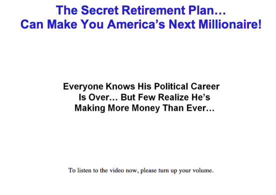
Financial newsletters are among those that have the longest sales letters. But I’m not talking about just any letters here. Eagle Publishing has been having stunning success with something completely counterintuitive: a voiceover reading the text that appears in short bites on your screen.
And remember when I said that long letters work well for pricey publications? According to Subscription Site Insider, some of these videos run for 25 to 60 minutes! (No, I didn’t sit through all of them to confirm it.)
And if you click the “back” button to exit the video, you get an option to stick around but read the letter yourself.
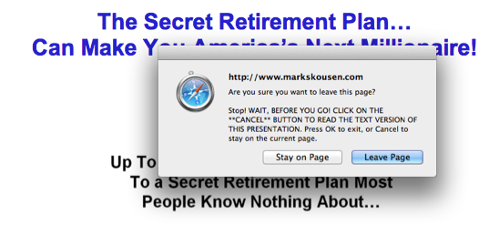
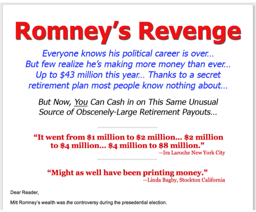
The idea is that getting people to listen and read helps them engage and understand the product better than just one or the other. My guess is that the novelty is certainly a factor, too. Whatever it is, Eagle reports “phenomenal” results to Subscription Site Insider. And Online Marketing Director Michelle Rutkowski told us at last year’s Mequoda Summit that these efforts are fairly inexpensive to produce, so they could certainly be worth trying out if your long-form letters are starting to fatigue.
So do tell me if you have any other favorite strategies for selling subscriptions on your subscription website. Any failures you can share? Dislike any of my picks? Let me know, and in the meantime, think about testing some of these techniques if you haven’t already.


