Look no further than these 11 examples to make your landing pages wildly successful
Whether you’re selling a product or hoping to trade a free report for an email address, your landing page is where you lay it all on the line. Badly written copy, sloppy formatting and lackluster layout lead to death on a page.
But there’s hope for even the newest landing page amateur. Pay scrupulous attention to certain best practices, and you’ll be rolling in dough (or email addresses) in no time.
Landing page inspiration can be hard to find in the Internet wilderness, but I’ve identified several that can serve as guides.
Landing page copywriting and formatting
First, let’s look at the characteristics that make up any great landing page. Everyone approaches their product differently, but some things are mandatory in a great landing page. Ignore these at your peril! There’s a lot of advice out there, but remember that Mequoda tests these practices constantly with its clients, so I’m delivering proven tactics, not theory.
Landing page inspiration tip #1: SEO
No matter what your design team tells you, the first step to creating landing pages is the copy. Landing page copywriting is subtly different from writing for outbound marketing, most importantly because it should always be optimized for search. Mequoda’s tested standard is 3-5% density for your primary keyword phrase, and 1-1.5% for proximity phrases. To calculate density, you can use the Motoricerca tool, which gives you density for dozens of phrases it finds in your copy, or simply use this formula to target just the phrases you want: number of occurrences ÷ number of total words X number of words in the keyword phrase.
Landing page inspiration tip #2: Power words
For some reason unknown to me (but possibly inspired by political speech), a lot of writers these days lapse into passive copy. Never, ever, ever write, “A good time will be had” when you can write “Everyone enjoys the party when you serve these awesome appetizers!” Verbs and adjectives are your friends, friends.
Landing page inspiration tip #3: Benefits, not features
Even the best copywriters tend to forget this ironclad rule. Benefits are more important than features. If in doubt, imagine that you’re a prime prospect, and ask yourself, “What’s in it for me?” Mequoda sometimes sells its training events by explaining what we’ll teach: We should more often explain what the attendees will gain by learning what we teach, or at least do that above the fold, and save the features for further down in the copy. “Make millions in online publishing by learning these techniques” is more compelling than “Learn how to drive traffic organically.”
Landing page inspiration tip #4: Clarity
Please, please, please abandon your journalism school or college writing training that insists on excess verbiage and jargon. (This is the biggest sin in secondary education today. Don’t get me started.) So don’t write “innovative solutions for wound management” when you mean “bandages.” (Thanks to Dow Corning for the execrable example.) And avoid what I call Antiques Roadshow Trap: Everyone on that show “purchased” or “acquired” their piece of junk, er, “item.” Really, who talks like that?
Landing page inspiration tip #5: “Architectural” elements
Use plenty of bold, underlining, indented paragraphs and bullets to make your copy easy to skim while still conveying the important points. Example: Read these bold and underlined words out loud to see how well they still convey the information.
This is not about isolated ideas or skills. This is not a huge conference with a smorgasbord of random, unrelated sessions full of complicated or off-the-wall ideas that you don’t know how to implement. This is a bulletproof, proven blueprint for organizational transformation.
Best of all, we do it in intimate, person-to-person roundtable sessions that allow you to learn directly from, and question, our staff of Internet marketing experts – some of the most experienced, knowledgeable marketers in the industry. You don’t sit in the 27th row hearing a lecture. You sit next to our CEO, our analytics chief, our copywriting guru, and learn what they’ve learned over the past 15 years. (We strictly limit attendance to make this possible: Don’t wait to register or you’ll be left out!)
Remember, your competition may already be ahead of you. CEOs, content editors and audience development managers have already learned the Mequoda method and put it into practice.
Bullets are also your friends, especially when you can use them with bold action words (bullets + bold + action words = a copywriting three-fer!):
Hidden Gardens not only takes you around the world without leaving your garden bench, it also helps you …
- Create stunning gardens at home that will stop traffic
- Implement the newest design techniques
- Learn wildlife and garden photography tips from the experts
- Discover amazing plants you never heard of
- Save time and money in developing your ideal landscape
- Enjoy your garden more while working less
- Achieve your dream garden – at last!
Landing page inspiration tip #6: Testimonials
If you don’t have ‘em, start asking for ‘em from your customers. And try to avoid using non-specific names and places, because those look suspicious to your audience. Full names and locations are preferred, and if you’re a B2B publication, use a title, too. Failing to get testimonials from individuals? Make sure you include any positive reviews you’ve gotten from other publications, and any industry memberships your publication has, such as SIPA, ABM or the Better Business Bureau.
Landing page inspiration tip #7: Just keep selling
For the above tips and several others, I recommend a quick look at an infographic on landing pages at Kissmetrics.com that illustrates the above quite nicely. One small quibble Mequoda has with Kissmetrics’ advice: While you certainly want to get your important information and calls to action above the fold, we find that long copy routinely beats short copy – four out of five times, in fact.
Ask yourself this: If you’ve gotten two out of 10 readers to respond above the fold, but those other eight readers bounced out, how many of those eight might you have persuaded with a little more copy? Another one or two? And yet another one with even more sales copy? We say, why stop selling when you don’t have to?
[text_ad]
Landing page inspiration examples
These examples are all from our clients. They tend to follow our advice, and are quite happy with their results. Honestly, whenever I try to find good examples of copywriting or layout for this blog by hitting random websites, I never find anything worth showing you. It’s discouraging, not to mention painfully time-consuming. So off we go with examples from Mequoda clients:
Landing page inspiration example #1
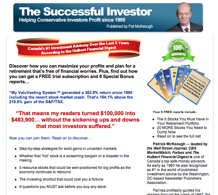
The Successful Investor tells you in the first paragraph that you’ll maximize your profits and plan for a worry-free retirement – benefits, not features. There’s an offer of free reports and several trust-builders above the fold, including a numerical return on the investing guru’s stock picks and several references: “Canada’s #1 Investment Advisory over the last Five Years According to the Hulbert Financial Digest,” and “Patrick McKeough – lauded by The Wall Street Journal, CBS Marketwatch, Forbes and The Hulbert Financial Digest…”

Landing page inspiration example #2
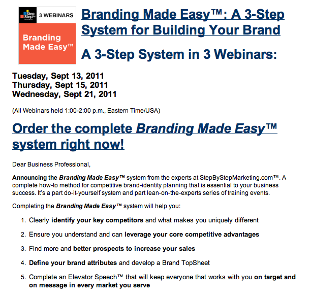
Step by Step Marketing boasts several easy ways to order its webinar, Branding Made Easy, right at the top, but most importantly, uses the bullet (or in this case, numbered) list plus bold action words to identify the benefits.
Completing the Branding Made Easy™ system will help you:
- Clearly identify your key competitors and what makes you uniquely different
- Ensure you understand and can leverage your core competitive advantages
- Find more and better prospects to increase your sales
- Define your brand attributes and develop a Brand TopSheet
- Complete an Elevator Speech™ that will keep everyone that works with you on target and on message in every market you serve

Landing page inspiration example #3
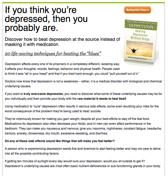
The Natural Health Advisory has an attention-grabbing headline on its landing page for a book called Beating Depression Without Drugs, in “If you think you’re depressed, then you probably are.” I might alter some of the text above the fold a bit to add more benefits, rather than features – for example, “Feel happier and healthier by treating depression at the source” instead of “Discover how to beat depression at the source.” But otherwise this is a strong sales letter, complete with bold words like “truly overcome depression” and “raw material it needs to heal itself.”
What’s more, it’s a long form sales letter that’s nicely optimized for search:
The phrase “remedies for depression” comes in at a healthy 3.68%, while the title itself comes in at 3%, and, as the title, falls into place naturally the way Google likes it.

Landing page inspiration example #4
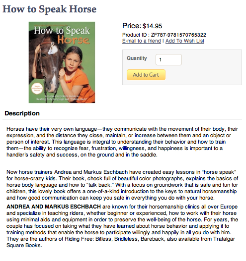
On its landing page for “How to Speak Horse,” My Horse Daily delivers an appealing image and a call to action right up front, and promises benefits: This book will help children train horses and stay safe in riding.

Whatever results you’re getting now without using these best practices, you could be getting much better results with them and should be testing them regularly. In fact, I’d love to hear from readers about any tests you’ve run that include these techniques so we can share them with the community.
In the meantime, I wish all readers a happy 2013, filled with testing, insanely great copywriting and publishing success.


Yes, design is an important part of the equation, but we like to be careful not to be too pretty — design for the Web is more science than art, in the sense that you must design for readability and the way the eye tends to travel on a web page. It also means including critical graphics which drive conversions, and these may or may not be pretty, too!
The reason I always emphasize copy over graphics is that in addition to actually selling the product, they can also be aimed at Google, which doesn’t care much about images (except for their tags — more words!). But this is a great topic for a future blog post, so thanks for the idea and stay tuned! And if you’ve got some examples of great design, please send them to me!
Good tips about focusing on the copy. It’s a good reminder to tell people how they’ll benefit from your offer. Lots of companies get carried away with excitement about their product, which is good and fine, but sometimes forgetting that the product only matters so much as it relates to it helping a customer.
Agreed on “No matter what your design team tells you, the first step to creating landing pages is the copy”… but would love to see some better design in the examples. I don’t think it’s an either-or thing with copy or design, it’s both.