The keys to magazine website design are function and familiarity, not bells and whistles.
I’m always surprised by how many publishers want to reinvent the wheel when they launch a new magazine website design. If they have the budget, they’ll try to do it when they create magazine apps as well.
But the secret to great design is not to create an interface that users need a “for dummies” guidebook to learn. What they want is something familiar that they already know how to use. If you want people to consume content, you can’t make it difficult for them.
The goal of good commercial magazine website design is to make the audience feel comfortable by making your destination look they way they expect it to look, and work they way they expect it to work.
[text_ad]
Let me review three examples of client sites we worked on, and why we chose the design elements that we did.
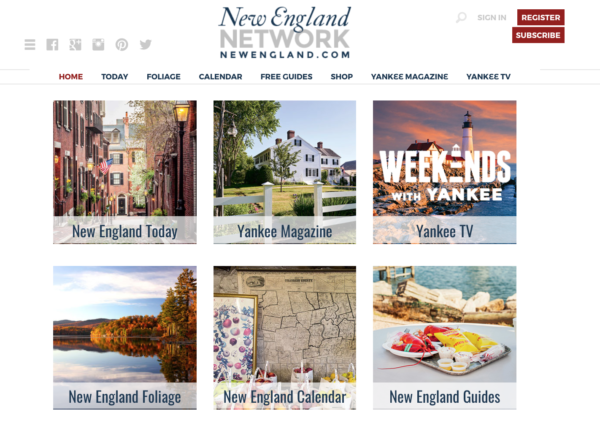
The first example is New England Today, which is the network home for Yankee magazine, a New England magazine focusing on food and travel in the region.
When you’re designing a website for a magazine that has been around for 100 years, you have to take that into account. Their magazine is very New England, with historic serif fonts and traditional New England colors that resemble foliage like burgundy. So the key with the design is keeping with tradition. To make the magazine website design decisions, our designers reviewed back issues of Yankee and tried to mirror the same feel. As the lead designer Lowell Allen put it, “When a print publication already has a strong visual identity its website should reinforce that rather than compete with it.”
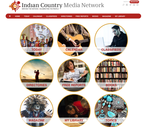
Next is Indian Country Media Network is the home of Indian Country magazine. They are a national news source for Native people in North America.
 In Native culture, nothing is ever square or has a sharp object, because the elements of wind and water rounds everything. So the color palette and typography we used in their design reflect the shapes of their culture and the overall aesthetic is culturally appropriate. Their logo has a loose, organic feel and we used it as a reference point for the rest of the magazine website design. Since all browser viewpoints are rectangular, there was no way to avoid designing to suit user devices but we did our best to include circular elements and rounded edges when possible except when it wasn’t possible, like in their Daily Story grid, but in that instance we used their logo as a background image to counter-balance the rigidity of the grid.
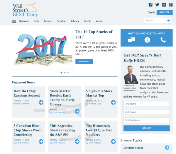
Finally, let’s look at Cabot Wealth Network, one of the oldest and most respected independently-owned financial advisory services in the United States. Cabot sells several premium advisory services, including specialized investment newsletters and memberships, and registrations for an annual Wealth Summit.
Our goal for their Daily homepage was to offer an interface that would feel comfortable for those who are mathematically oriented, and where a banker would be happy. Clean design was the goal, so we focused on a light color palette that had an open and airy feel to properly accommodate the relative density of information—and expected by users—in financial publications. The lead designer Dan Allen explains that light blue-gray boxes were chosen to provide a clear distinction between content areas, allowing for the content-rich experience anticipated by users of the site without distracting the eye with too much contrast. Icons were used in the place of “read more” links to add more energy to the page, echoing the high-stakes dynamism of the financial trade.
The average user expects professional websites to be clean-looking, information-rich, and intuitive. They respond best when the aesthetics of the site support the purpose of the site and are consistent with the user’s mental model. Is the design appropriate for the firm or organization the website serves? Layout, colors and typefaces determine the site’s personality and image. Are you choosing the right ones?
If you’d like to discuss how we can help you increase your audience, revenue and profits with a new magazine website design, please reach out to schedule a no obligation chat with Don Nicholas, our Founder, Chairman & CEO.


