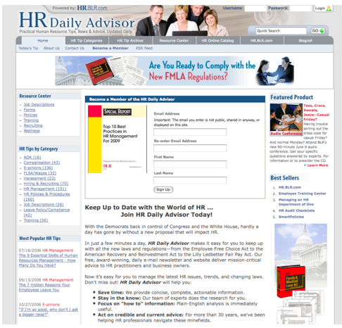
An example of how to de-clutter your rapid conversion landing page template
How many of you have a primary goal of converting casual website visitors to email subscribers?
Chances are if you’re a content marketer, online publisher or author, you use this audience development strategy.
At Mequoda Daily, we allow all our landing pages to act as conversion pages through the use of OFIEs (order form in editorial), OFINs (order form in navigation), floaters and inline text ads.
We use the term ‘rapid conversion landing page’ to classify our landing pages, as they can quickly convert casual visitors into email subscribers with one requirement: a valid email address.
Since many online publishers do use conversion architecture within their landing pages, I want to present an example of how some landing pages have been made more efficient by testing a few different designs to yield the highest converting option.
Clearing the clutter on a registration page with an A/B test
How would you consider your registration page? Is it simple and easy to understand? Or is it cluttered?

Let’s imagine your registration page looks like the above image. You have all the information your audience needs to sign up, but the page may be a bit busy to the visitor.
Busy, cluttered pages, although they may hold a lot of information, should be avoided on landing pages specifically designed to obtain conversions. If you do not avoid this, potential audience members may be overwhelmed or confused by all of the information, and leave without taking action.
For the webpage included above, the conversion rate was 66%. Many would be happy with this number, but the professionals at HR Daily Advisor wanted to test this landing page to see if they could increase this number.
[text_ad]
Two changes can make a difference
After testing multiple changes, HR Daily Advisor came to a landing page design that had a conversion rate increase of 20.2%, for a total conversion rate of 80.2%.
This conversion rate increase of 20.2% was achieved by making only two changes:
-The run of site (ROS) navigation was removed
-The page was transformed into a pure registration page

Both of these changes helped remove the clutter from this conversion landing page. Instead of entering the page and seeing a banner advertisement with links, copy and images in both the right and left navigations, the page was simplified to have the free report be the primary content. The associated image is in the middle of the page and the registration fields are to the left of it. Below the registration info and image there is information on HR Daily Advisor and the content they provide.
Isn’t it wonderful to see how simplifying landing pages can have such a drastic improvement on conversion rates? This example shows how a few, minor changes may help you improve your conversion rate greatly.
The complete process for testing and optimizing landing pages
While covering the topic of landing page testing and optimization over the last few weeks, I’ve stated multiple times that simple changes can yield significant results.
If you want to learn how to perform A/B and multi-variate tests, specific website components to test and examples of the results you can achieve by performing landing page tests, join us tomorrow for our Landing Page Testing & Optimization live webinar.


