 Analyze your landing pages through the eyes of your customers
Do you shop online? With online sales continuing to rise each year, chances are very likely that you do. And so do your customers. 
So after making the decision to buy something, what is it that made you commit to a sale from one online retailer over another?
- Simple design with easy to read fonts or a bright flashy design?
- Clean, uncluttered page or lots of annoying banner ads?
- Easy to follow links or confusing, unclear directions?
When you think of these options, can you think of some examples you’ve encountered recently? Now go to your companies landing page. Would you buy something or click away after a few seconds?
[text_ad]
Test the Offer
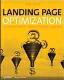
Everyone is in agreement, testing is the key to success. Initially, the offer must interest them, and there are many ways to influence visitors to take action. Here are some items Tim Ash, author of Landing Page Optimization: The Definitive Guide to Testing and Tuning for Conversions recommends testing and tweaking:
- The primary offer
- The total solution surrounding the offer
- Headline
- Sales copy
- Images chosen
- Call-to-action text and graphical element
- Repetition of the call-to-action in multiple screen locations and formats
- Offer context (by bracketing the desired action in a bronze/silver/gold set of options)
- Limited availability or other scarceness indicators (deadlines, remaining inventory)
- Pricing
Tim Ash also answers the following questions about landing page design and optimization: What does a landing page look like from your perspective? How does it fit into the overall marketing picture? Can you really convert every single visitor? Are you devoting enough attention to your landing page?
Read more from Landing Page Optimization: The Definitive Guide to Testing and Tuning for Conversions by Tim Ash at Amazon.com


