When Writing Landing Page Copy, it’s Important to List all Benefits and Avoid Using Jargon and Terms Not Commonly Understood by the User
Make your website navigation friendly and familiar. Experienced Web surfers are familiar with what have become the traditional “road signs” of well-designed webpages.
Most of us have come to expect hypertext links (not graphic buttons) to move us from one page to another. Links connect to additional information. We expect graphic buttons only to initiate processes, such as “Click here to join!” Buttons create action.
We have grown accustomed to hypertext links that are the color blue, that turn red when moused-over and finally become purple after we have clicked on them. Traditionally, hypertext links are underlined. These are our expectations after nearly 10 years of online experience with the best designed and most successful websites. Violate these familiar navigation standards and you go against the norm, taking us out of our “comfort zone” and perhaps detracting from your website’s credibility.
[text_ad]
More people write for The Associated Press than for any single newspaper in the world. For 50 years, The AP Stylebook and Libel Manual has been an invaluable resource. Now the journalist’s bible has been reissued and is available online.
The AP Stylebook is an A-Z guide to usage, spelling and punctuation, as well as a reference book for terms and topics commonly encountered in journalism. The spiral-bound style manual is an essential handbook for all writers, editors, students and public relations specialists.
The 2005 edition of the AP Stylebook and Briefing on Media Law is available in both print and electronic forms at APStylebook.com.
Watch Your Language – an important aspect of landing page guidelines
Clear language and good grammar are part of good storytelling and so is telling the truth. Don’t try to bamboozle your prospect with tired ad copy clichés.
Have you ever seen a sales letter that included a bulleted list of items… and the last item in the list said, “and much, much more?” Well, nobody with an IQ higher than room temperature believes that there is “much, much more.” If you actually have more benefits or features, put them in the list.
If you sell information products, whether in print or online, you’re in the direct response marketing business. It doesn’t matter what your product is, if you can’t describe its features and write glowingly about their benefits, you can’t sell it effectively.
Some tips on labeling and language:
- Write for the reader.
- Break up long copy with sub-headlines.
- Use power words to create excitement and urgency.
- Avoid using jargon and terms not commonly understood by the user.
- Proofread for errors.
Good writing is consistent in the use of spelling, abbreviation, terminology, grammar and punctuation. Web copy is no exception. Does consistency matter? Definitely, because inconsistency confuses readers and makes you look uncertain of what you’re doing. Words drive the brain. Good copywriting compels the reader to take action. Form follows function.
Noteworthy Examples of Labeling and Language
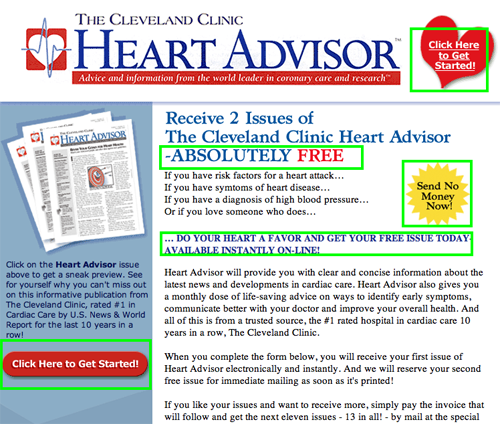
The Cleveland Clinic Heart Advisor landing page uses clear language and terms commonly understood by the target user. Terminology is consistent, and “power words” (e.g., “absolutely free,” “Request your FREE issues today!”) appear throughout to encourage ordering.

The Cleveland Clinic Heart Advisor landing page
The Investment U Course landing page sales letter uses clear language and good grammar. There is no professional jargon or intimidating “investment speak” that might dissuade the user.
The 21st Century Investor landing page uses clear and easy-to-understand language, even though it is a financial services website. Not overtly hard sell or “hypey,” the use of the language gets the user excited about the cutting investments that are on the horizon.
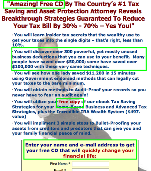
Throughout the promotion at the Tax Loopholes of the Rich landing page, the language is in terms that online shoppers understand and respond to, e.g., “Order Now,” “Yours Free” and “Enter your name and email address to get your free CD that will quickly change your financial life.”

Tax Loopholes of the Rich landing page
The American Writers and Artists Institute (AWAI) landing page offers great headlines, good old-fashioned features-and-benefits sales copy, numerous testimonials and excellent readability throughout. Of course, you would expect that a landing page sales letter that sells a copywriting course would be a powerful display of language, and it is.


