The Only Sure Way to Know How Many Links to Place on Your Landing Page to Increase Conversion Rates is to Test the Variations and Go with the Winners
Links and buttons are the vehicles that allow a prospect to navigate your landing page. Your objective should be to make them as easy as possible to understand and use.
There are two schools of thought when it comes to the links to the order flow. In regular text email promotions, some publishers want the whole story told before taking the user to the order page. In many cases, the user doesn’t even know the price of the product or service until taken there.
Guerilla marketers believe that in long copy, if the prospect “gets it” and is ready to order, then she should be taken immediately to the order page.
[text_ad]
They argue that when the user is ready to buy, nothing should get in the way. They believe there should be “Convinced? Want to order right now?” buttons throughout the landing page. Why make the prospect read any more than she needs to before making the decision to buy?
We say it depends. Our testing shows that eight out of 10 times, response rates are neutral or higher when peppering order buttons and links throughout the copy.
What makes the difference? Here’s our best guess: if the product is well-known, easy-to-understand and cheap, the “pepper them everywhere” approach almost always wins.
But we also believe that for each unique combination of product, buyer and the hundreds of different elements on the landing page that may cause them to buy or click away, the only sure way to increase landing page conversion rates is to test the variations and go with the winners. Testing the variations is one of our landing page guidelines we recommend engaging in.
Regardless of how long your landing page sales letter is, or how many “order” buttons you imbed in the copy, clicking on the link or button should bring the user to a simple, easy-to-follow order page. Too many order options for too many offers and products can be confusing. And the confused mind always says “No!”
Buttons should be well designed and easy to identify and use. In one test, order button color proved to have a significant impact on response. An orange/blue button out-performed red/white, green/white, and yellow/black buttons.
The winner.

The losers.


Noteworthy Examples of Links to Order Flow
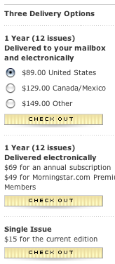
The landing page for Morningstar® FundInvestor™ includes several well-designed buttons on the landing screen.

Morningstar FundInvestor’s landing page
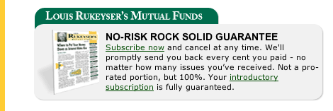
The various links throughout the Rukeyser Mutual Funds landing page promise a 100 percent risk-free trial to the newsletter when you click on the link. Clicking brings you to a simple, easy-to-follow order page where you can sign up for that trial.
The one flaw—and it’s a big one— is that the offer of a “100% risk-free trial” is not repeated or explained on the order page. It is explained in the closing text of the right-hand column, but if you click on a link before that and go to the order page, you won’t see it.

Rukeyser Mutual Funds landing page
The Investment U Course landing page includes a well-designed button at its conclusion.

The 21st Century Investor landing page has excellent links to the order page strategically placed throughout the site. There is a strong call-to-action on each page.
At the Tax Loopholes of the Rich landing page, the sequence of events is clear, logical and easy to follow. First, you go to the front-end short landing page and enter your email address. Second, you click to the long copy landing page. Next, you click to the order page where you can make a selection, choosing from one of two offers. Finally, you are taken to the transaction page where you can use your credit card to pay for the offer you selected.
[text_ad]


