The Key to Creating an Aesthetically Pleasing Landing Page is to Know your Target Market and Create an Appearance that Conforms to your Visitors’ Mental Model
Beauty is relative, cultural, genetic and ever-changing. Beauty is in the eye of the beholder, and aesthetic judgments are subjective. So how can you decide on the right design for your website?
The answer is to know your target market and create an appearance that conforms to your visitors’ expectations. We call it the “user’s mental model.”
Landing page guidelines
The way a landing page looks and feels is almost as important as what it says. A favorable decision to purchase your product or service is usually the result of a sales effort that made the customer feel comfortable and safe.
The graphic design of your website should be comforting and trustworthy for the target user, and consistent with his mental model. The look and feel of the landing page should support and reinforce the sales letter’s flow, as well as the product or service brand.
[text_ad]
Visitors instantly judge your credibility by the way your site looks. If it looks good, a visitor might take the next step, reading some copy or clicking a link. But the site design itself is the first hurdle.
There are innumerable options here. So many, in fact, that it’s easy to get overwhelmed and lose all direction. Before you settle on a design, take a good look around at other site designs.
Start by visiting CoolHomePages.com. Here you’ll find thumbnails of dozens of sites, with links to the actual pages. Each site is rated, with the rating shown attached to the thumbnail, so you can see which designs are considered good and which are bad.
As you consider designs, keep in mind your main objectives: a professional look, without clutter, that’s easy to navigate.
On writing for the Web: Your objective should always be to eliminate instructions entirely by making everything self-explanatory, or as close to it as possible. When instructions are absolutely necessary, cut them back to the bare minimum. (pg 470)
On homepage design: As quickly and clearly as possible, the homepage needs to answer four questions I have in my head when I enter a site for the first time: What is this? What do they have here? What can I do here? Why should I be here—and not somewhere else? (page 101)
On the fifth question: Once I know what I’m looking at, there’s still on more important question that the homepage has to answer for me: Where do I start? (page 108)
On testing: Testing one user early in the project is better than testing 50 near the end. (page 142)
Don’t Make Me Think!
It’s a fact: people won’t use your website if they can’t figure out their way around it.
Don’t Make Me Think! A Common Sense Approach to Web Usability is an indispensable 200-page essay by Steve Krug. It makes a strong case that the navigation systems, main pages, labels, buttons, etc. on your website can either make using it easy and obvious—or they can discourage users by making them think too much.
Mr. Krug has done a lot of hard thinking about what works and what doesn’t, so we don’t have to. And unlike many graphic designers, he can write intelligibly and even whimsically. His book is filled with illustrations, examples and pithy statements, making it a fast but thought-provoking read. Some observations:
- People don’t read, they scan.
- Users don’t make the best choice, they select the first “good enough” solution.
- Visitors don’t figure out how things work, they “muddle” through.
Krug’s clearly explained, easily absorbed principles will help you arrive at both the right questions to ask the experts you hire, and practical answers so you can make difficult technical, aesthetic and structural decisions.
Design Matters to Credibility
In 2002, the Stanford Persuasive Technology Lab, a think tank, and Makovsky & Company, a New York-based public relations agency, surveyed more than 1,600 people from the U.S. and Europe about website credibility.
Some highlights:
- Pop-up ads were regarded harshly, seriously damaging the perceived credibility of the site.
- One of the surest ways to create a credible site is to arrange the site in a way that makes sense to the users.
- One of the surest ways to lose credibility is to make it difficult to navigate.
The researchers compiled six overall design implications, each of which will help boost a website’s credibility.
- Add value to each Web visit (fresh content, quick responses to customer questions, search capabilities, printer-friendly pages and contact information).
- Guard the integrity of your content. (High marks to site content that identified its sources and provided its authors’ credentials.)
- Make it simple to get around. A site’s navigational system can directly impact perceptions of credibility.
- Appearances matter (a clear link between solid design and site credibility).
- Make sure everything works. Broken links and unexpected downtime received some of the lowest marks.
- Watch your reputation and your affiliations. A company’s standing in the real world impacts the credibility of its website.
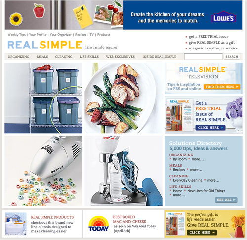
Example of A Beautiful Landing Page Design
Real Simple.com is both practical and beautiful. The website designers have taken great care in translating the look and feel of the award-winning magazine into an elegant website. Typeface, colors and use of white space all combine to create a website that is both full of useful content and that is pleasing to the eye.
Compare it to another site that holds good design in high esteem, The American Feng Shui Institute. The comparison is stark. Real Simple is pleasing, while its counterpart is merely unobjectionable.

AmFengShui.com
As a hybrid website that makes money from subscribers and advertisers, the one distraction from Real Simple’s overall look and feel is the occasional banner ad that clashes with the website’s calming design. With that exception, Real Simple is one of the most aesthetically pleasing sites we’ve seen.

RealSimple.com


